Southern Comfort
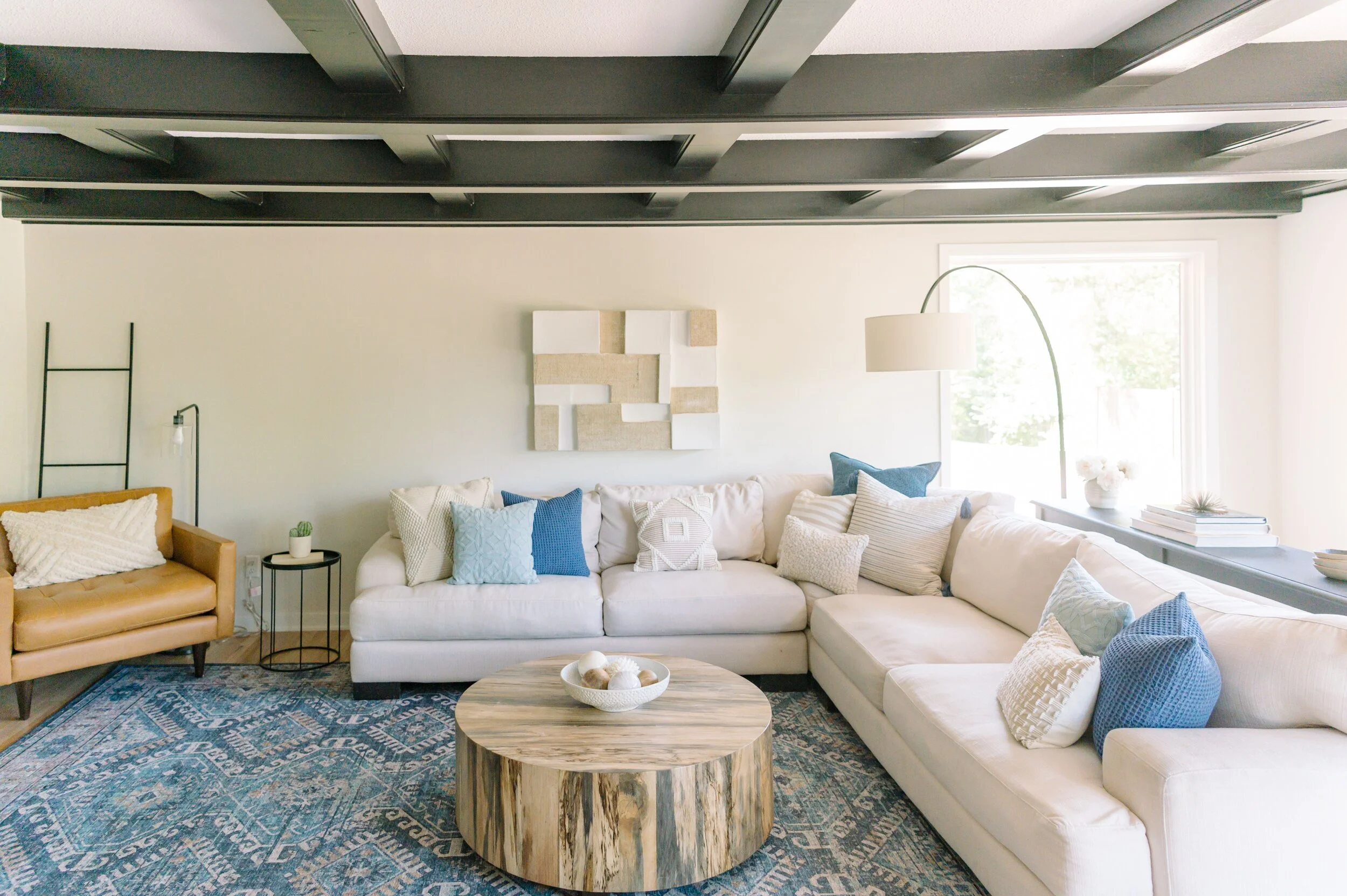
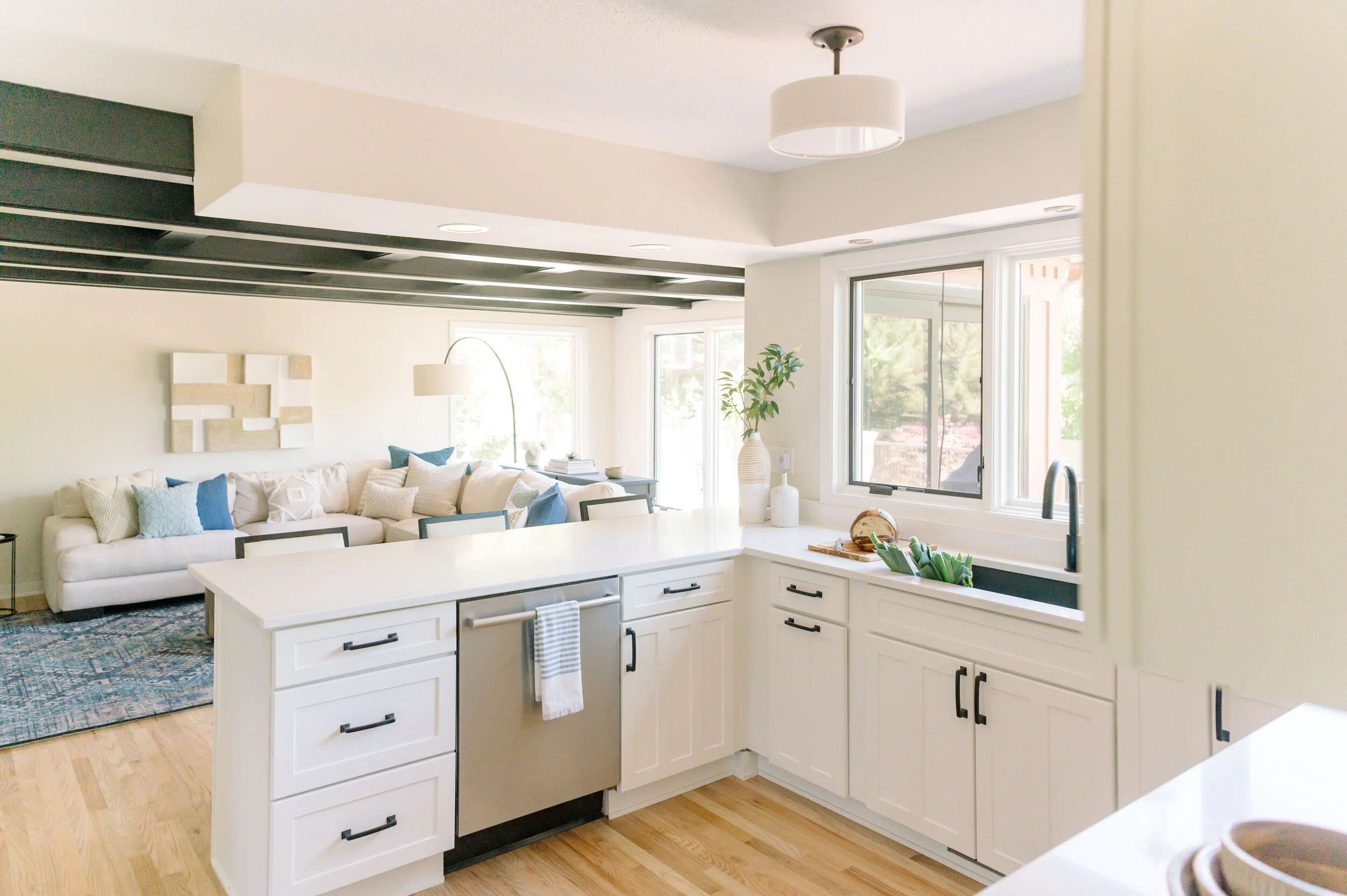
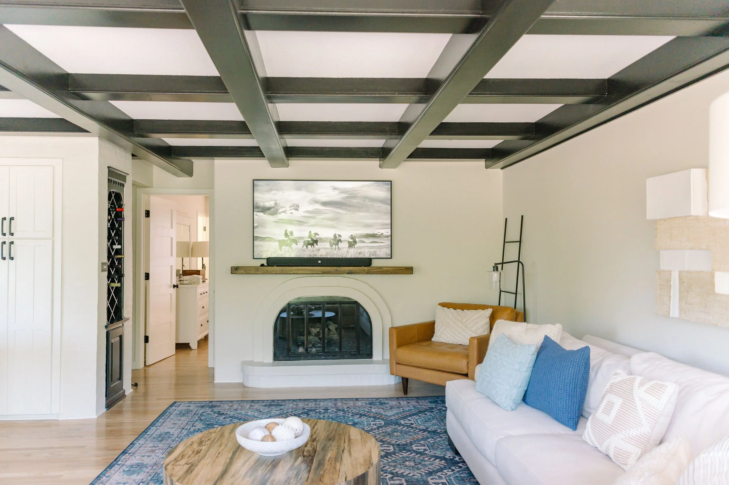
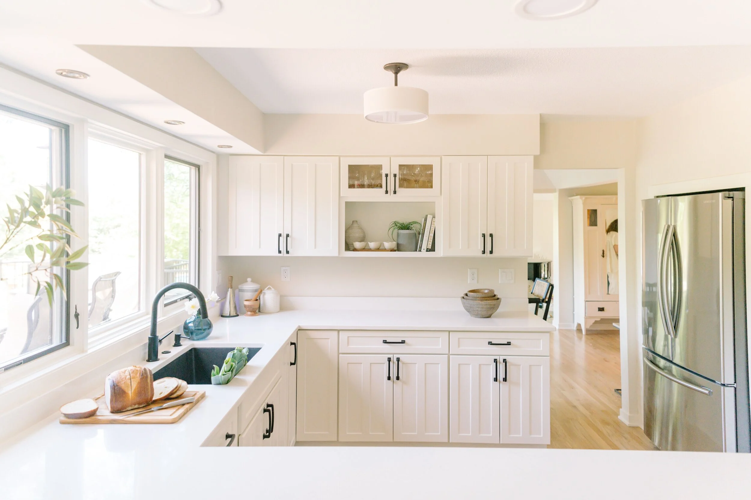
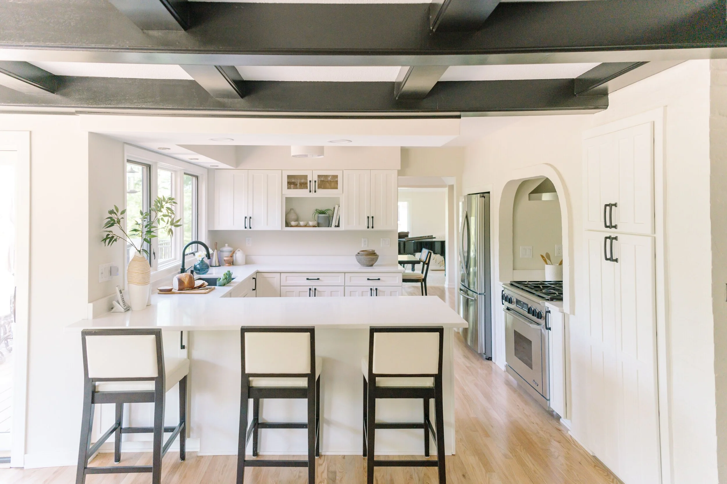
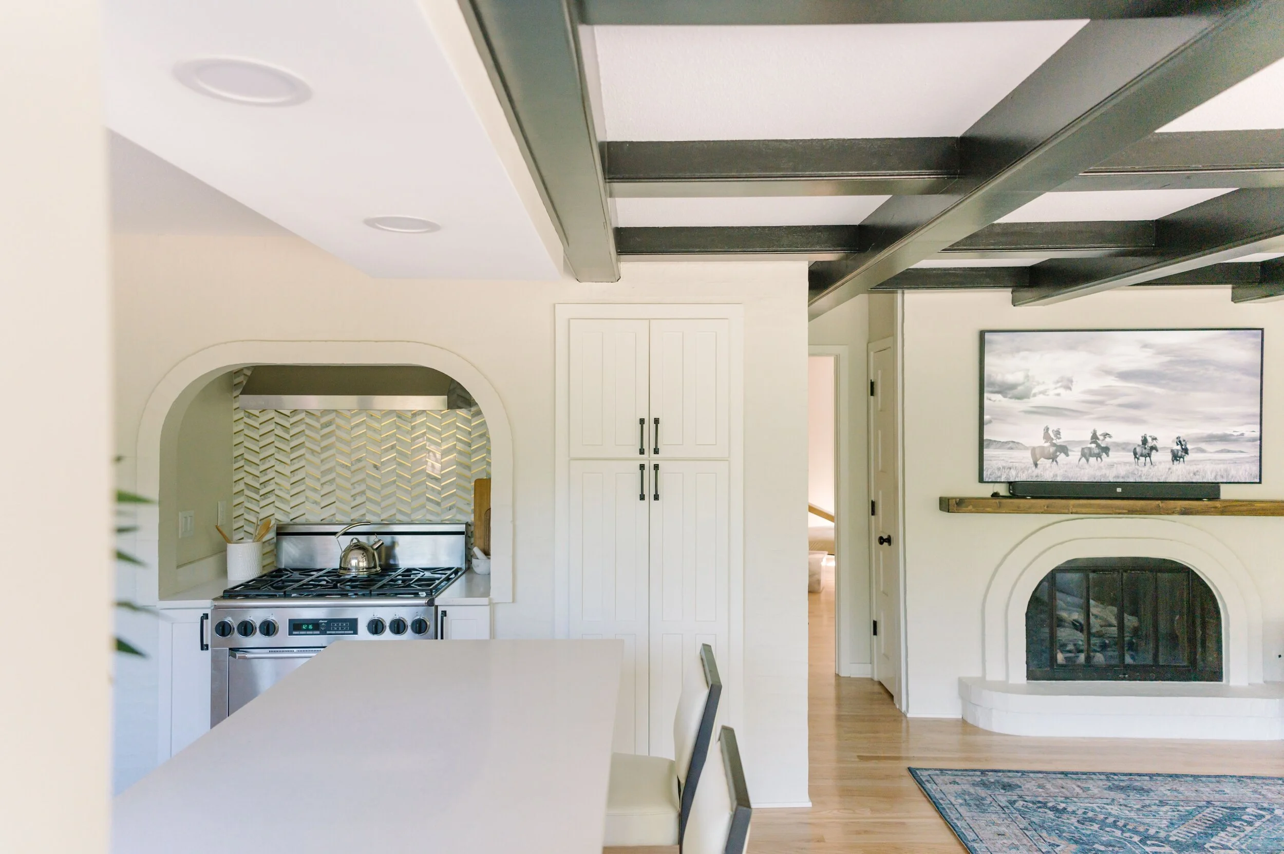
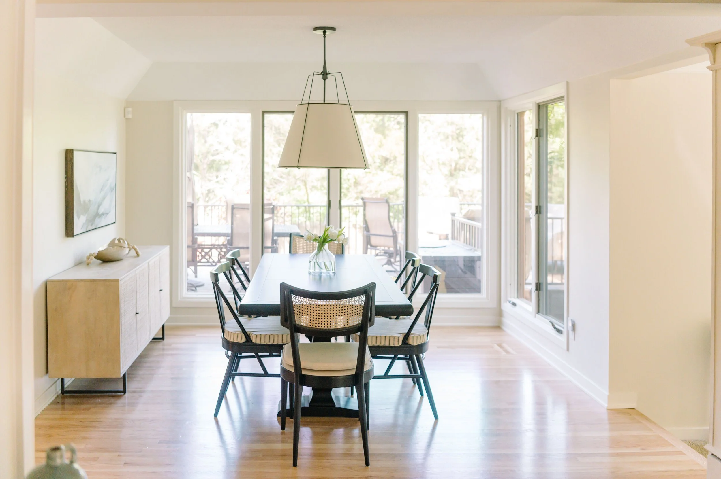
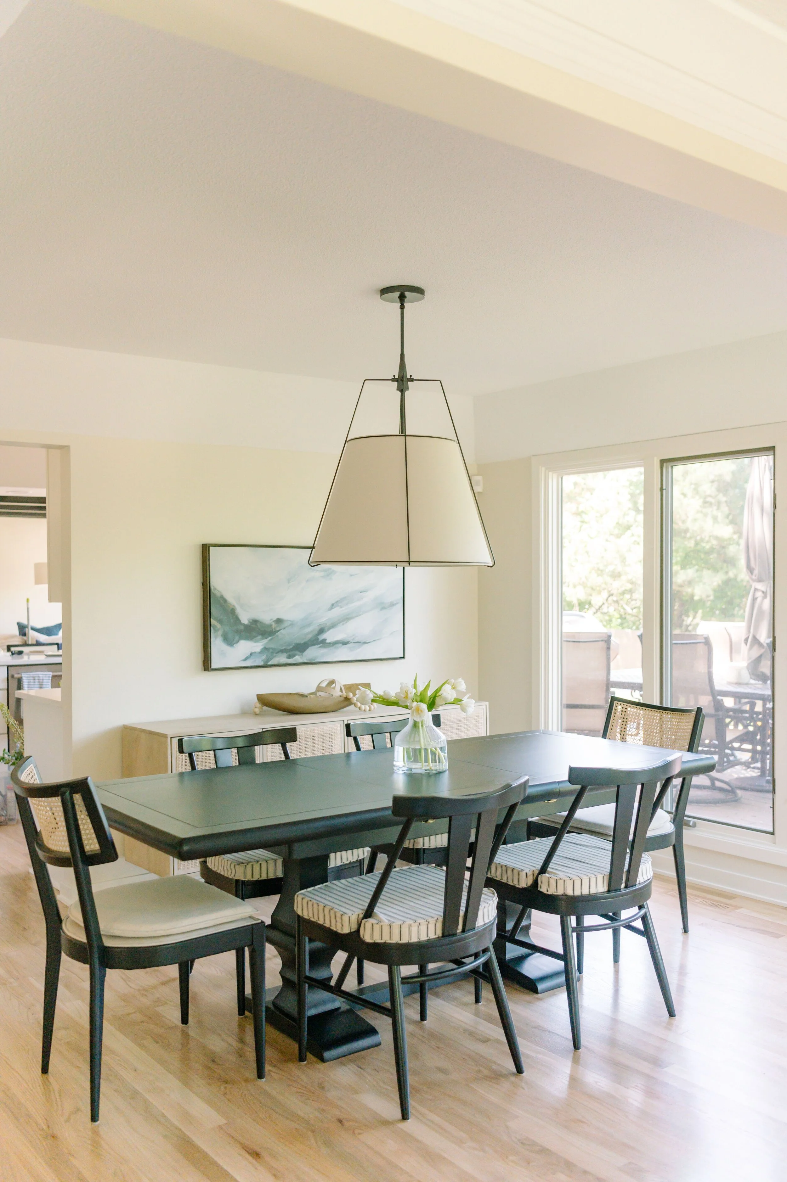
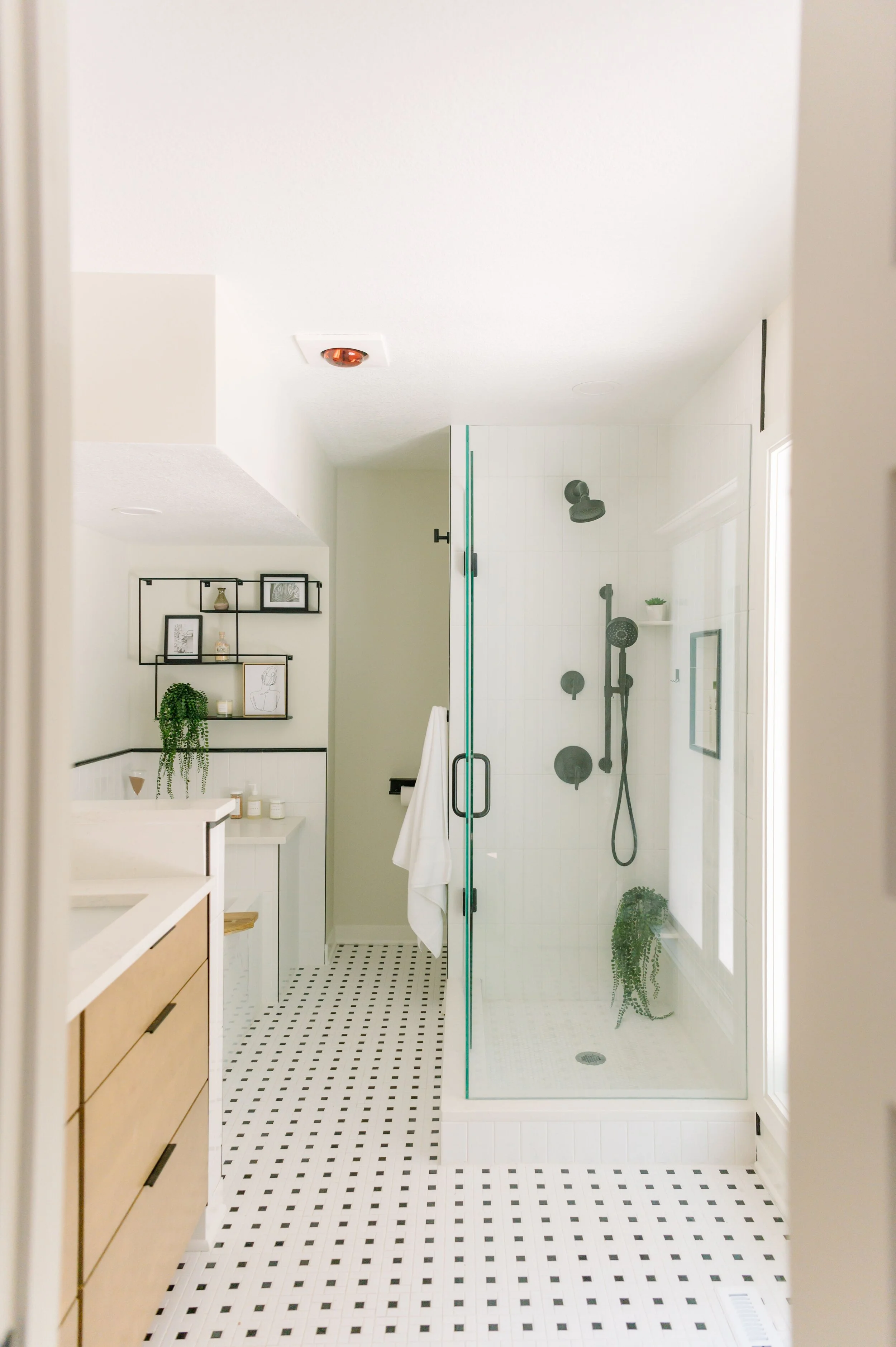
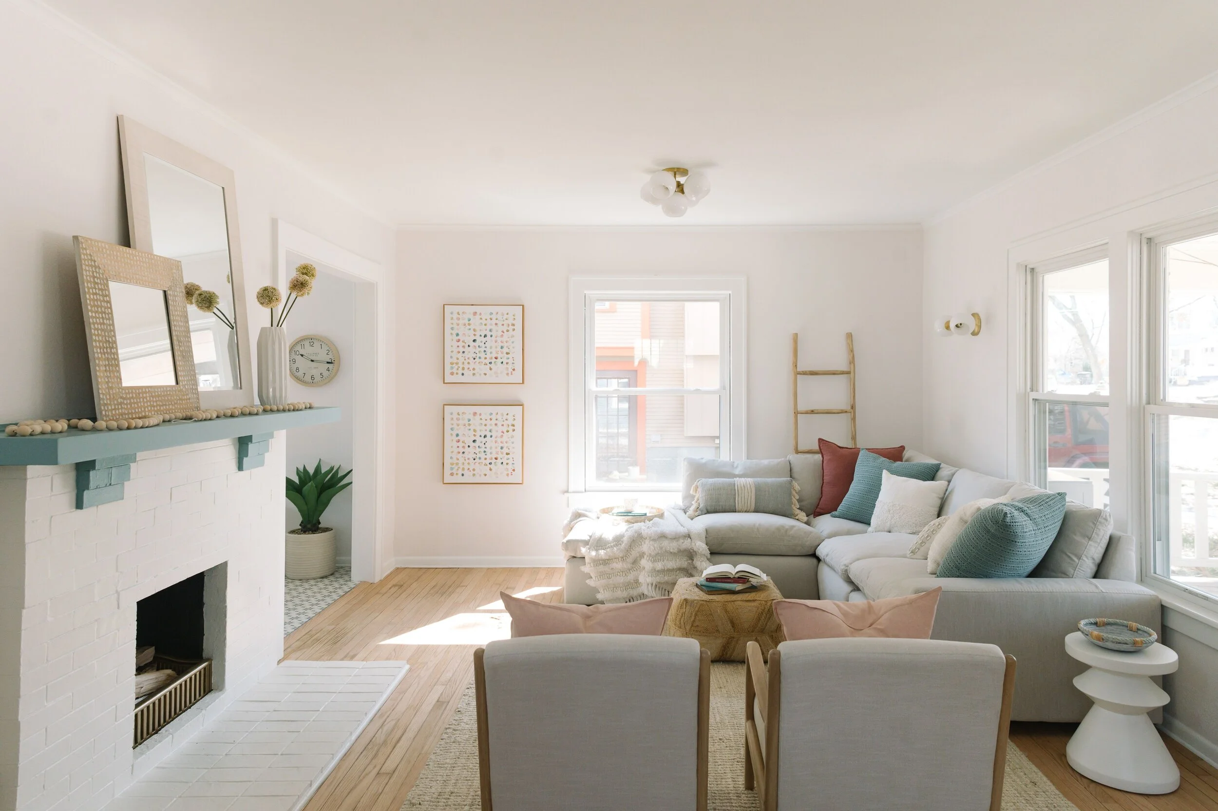
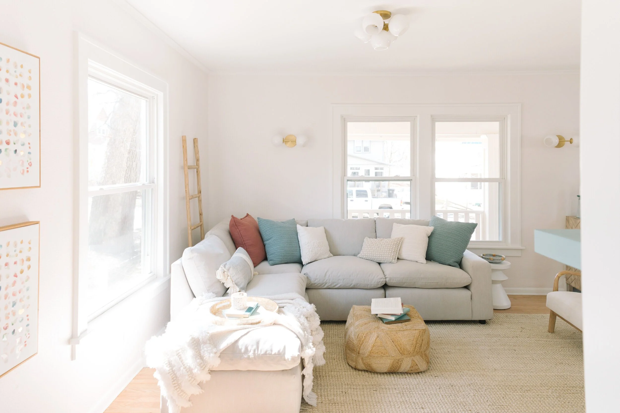
I am not sure where to start with this stunning South side private remodel and I know the homeowners would agree. It was a total roller coaster! I first stepped inside of their home back in December after they won one of my Black Friday giveaways. Obviously, I had no idea what I was walking into and they had no idea what the outcome would be :) We knew the slate floor had to go, cabinets needed to painted, new counters and a master bathroom upgrade. This snowballed into all new paint, (trim, walls and ceilings), all new lighting, two major bathroom remodels, all new flooring and new furniture and accessories. Instead of just painting the brick and presented the idea of a plaster treatment (more details on that later). I couldn’t be more happy on how this turned out. I am actually get emotional due to the beautiful outcome. Believe me, home renovations are not easy- The homeowners were tested in more ways than one with having to move out, dealing with Corona Virus, home-schooling kiddos and general stress that any private remodel brings. However, they kept their eye on the prize and knew they would have their dream home in a few long months - three to be exact :)
Please soak in the before and after overalls of this new beautifully, relaxed charmer. Yes it’s the same house, I promise. You can’t miss the beams ;)
Remodel by True Interiors
Wall paint - Oyster White; Trim and cabinets - Greek Villa; Beams - Tricorn Black; Master bathroom vanity - Cabinet Boutique, Area rug - Lulu and Georgia; Coffee table, King chairs and Buffet - Joybird; Dining table and side chairs- Ballard Designs; Barstools - Wayfair.
Photos by Justin Sale Meyer
Charming Craftsman
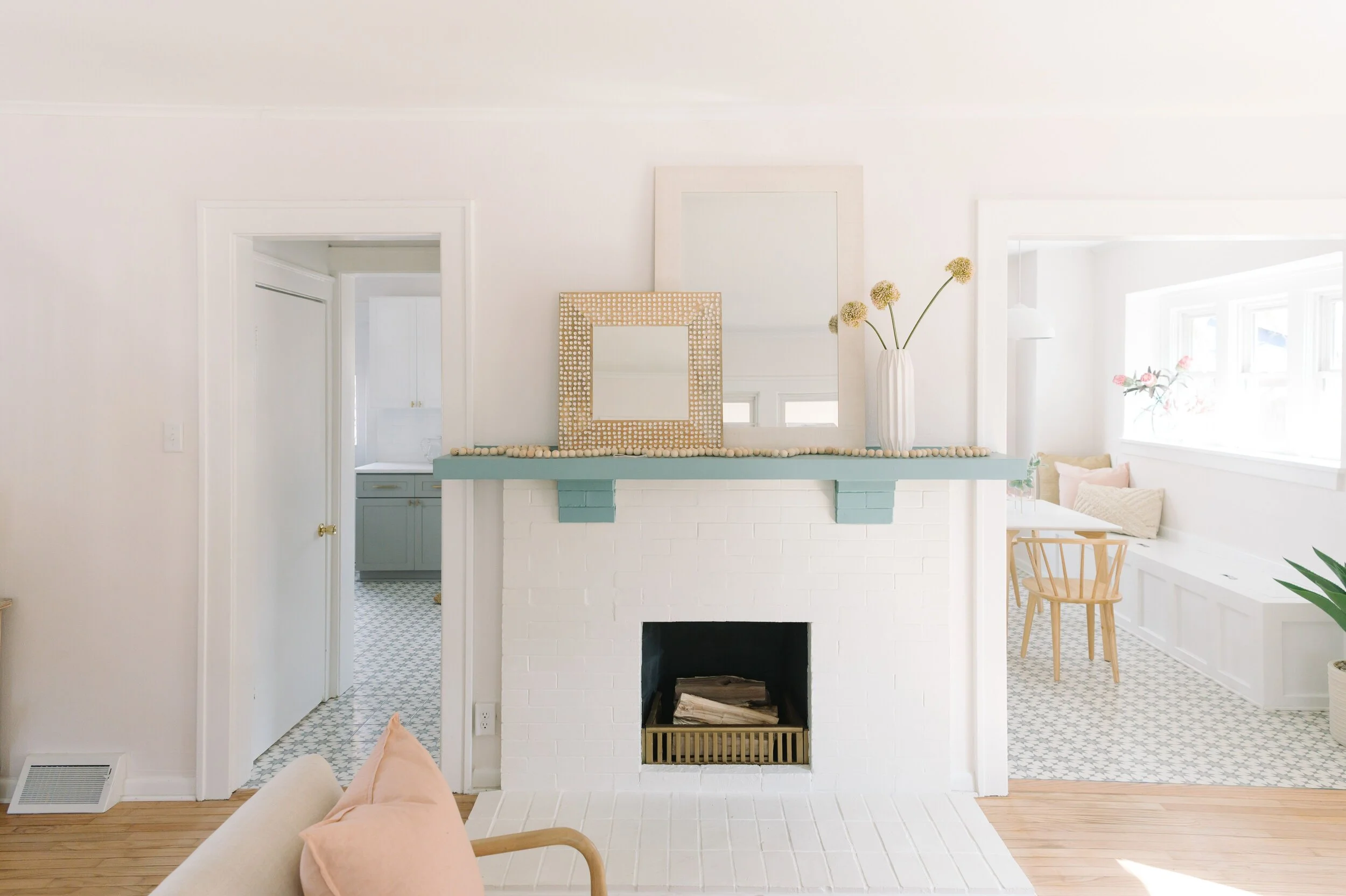
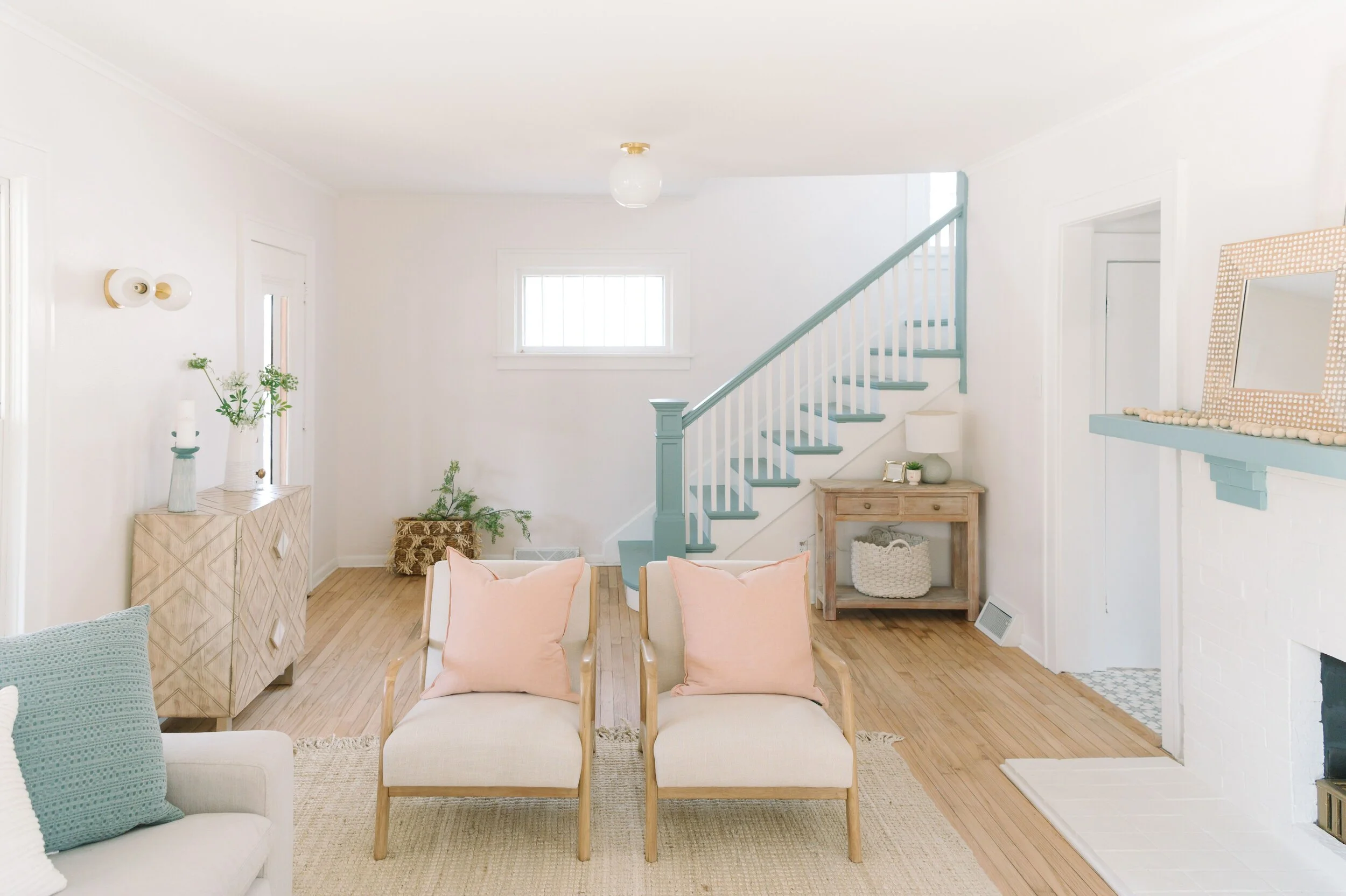
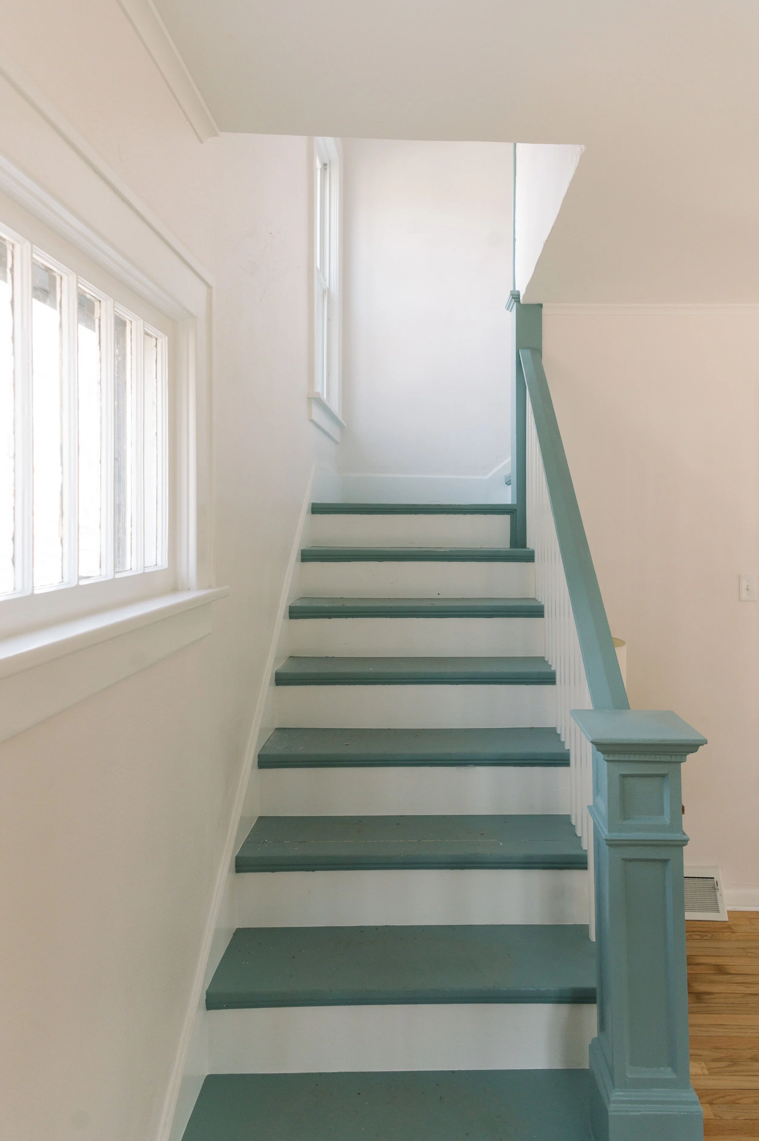
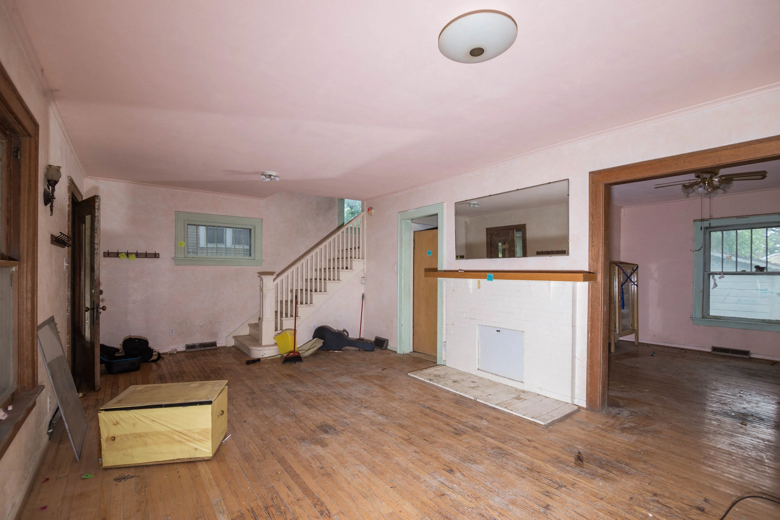
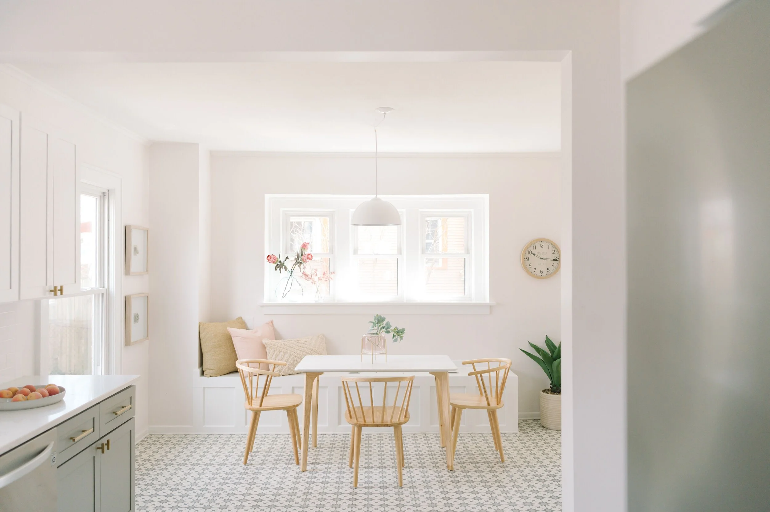
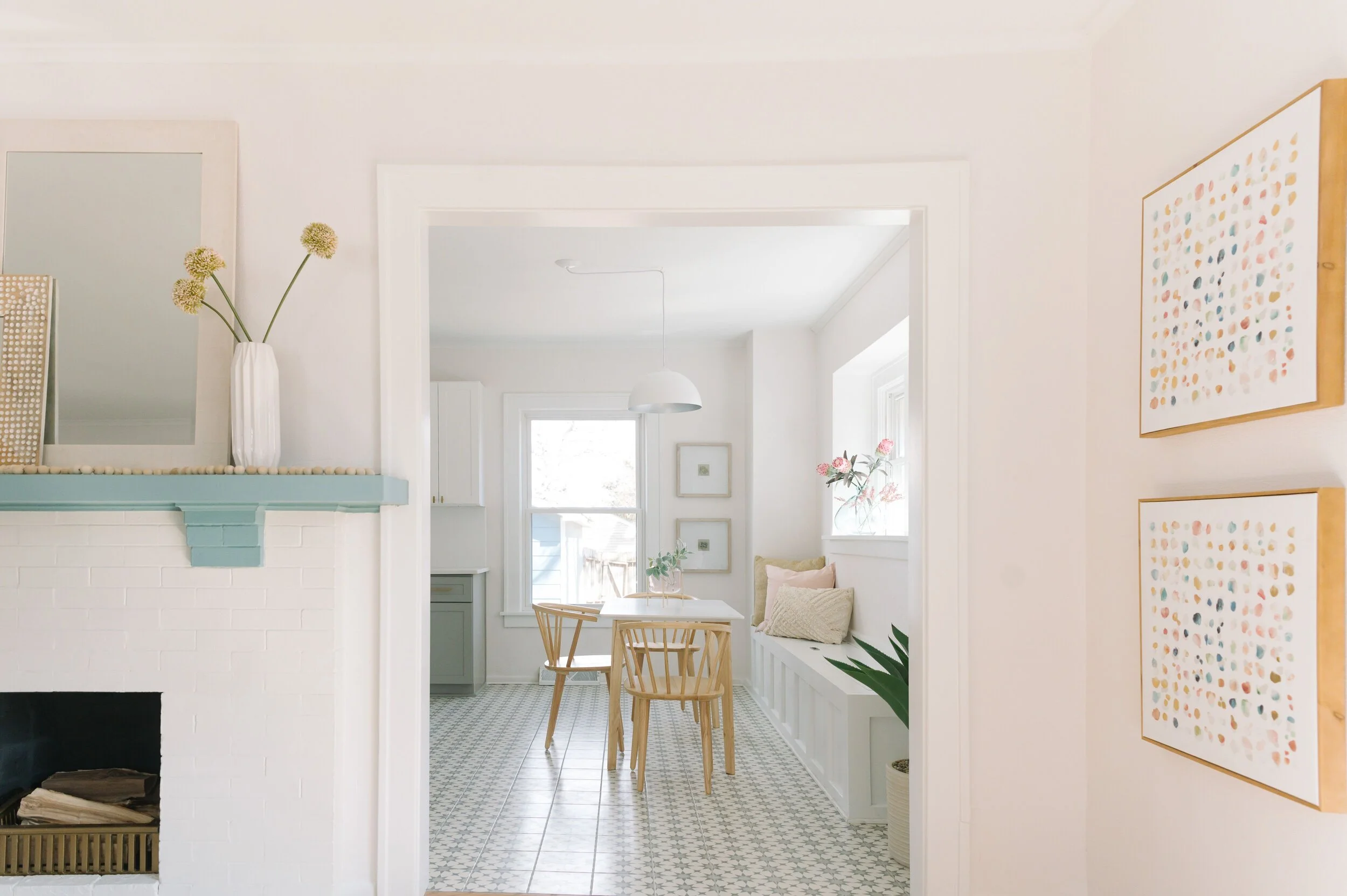
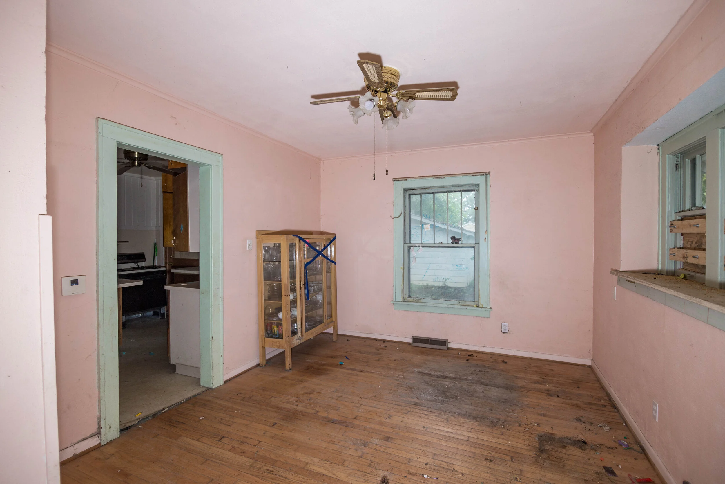
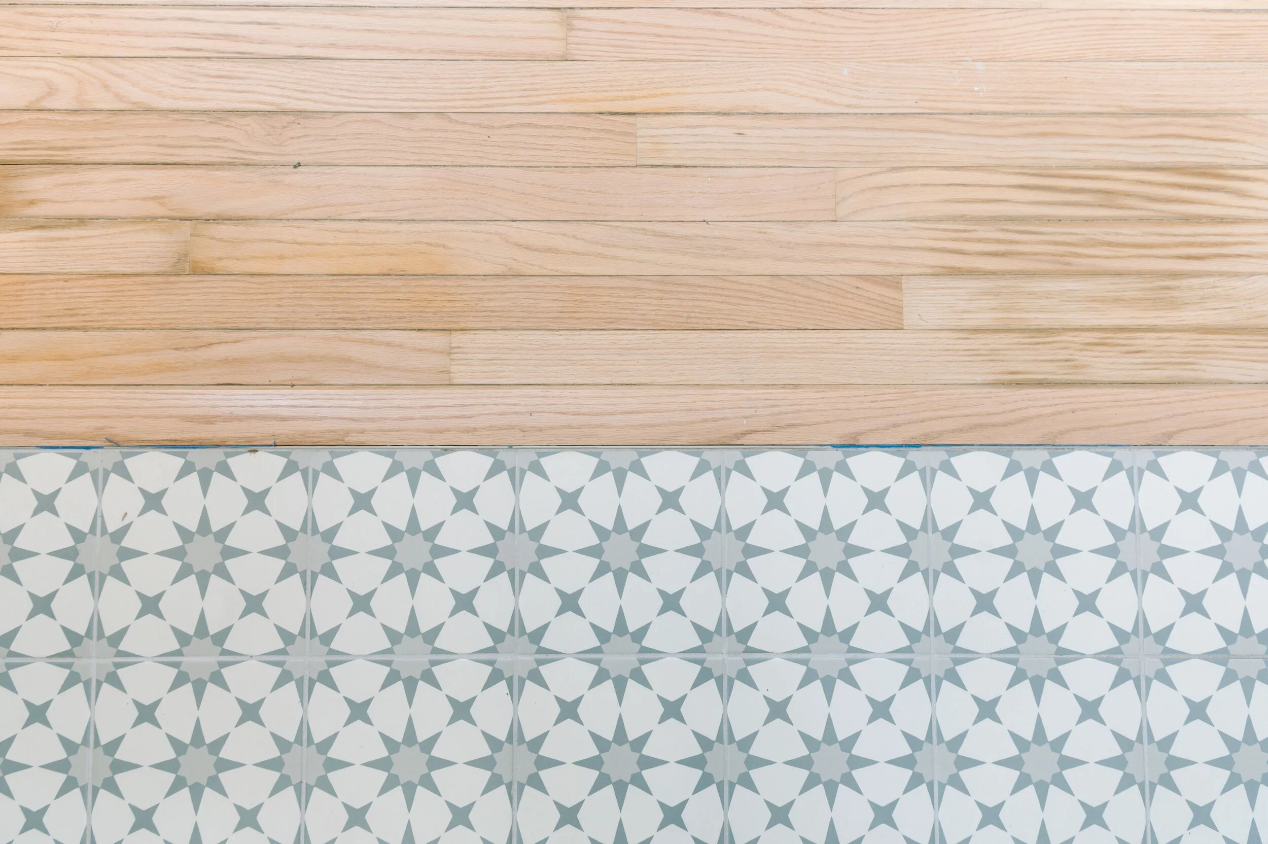
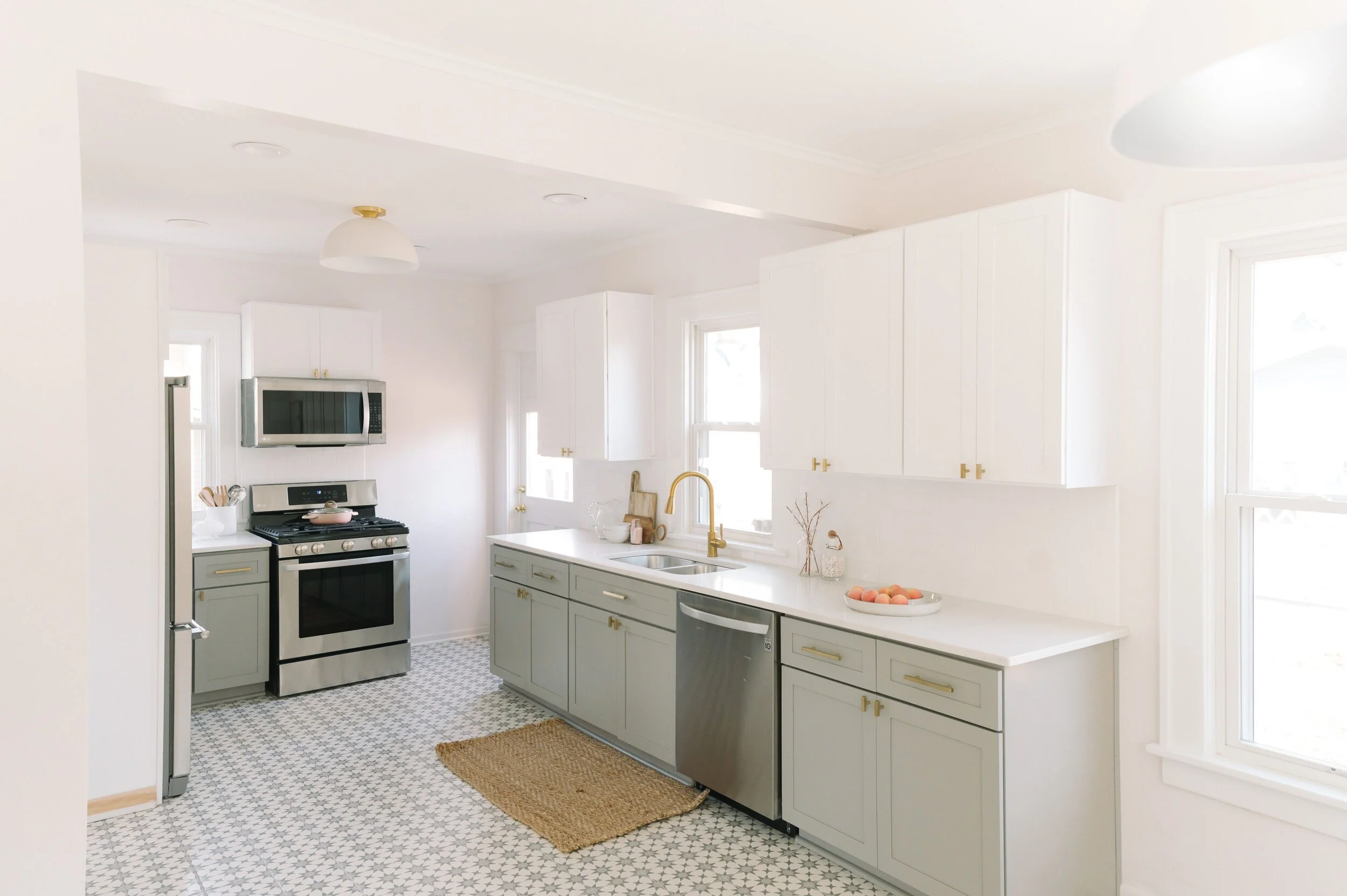
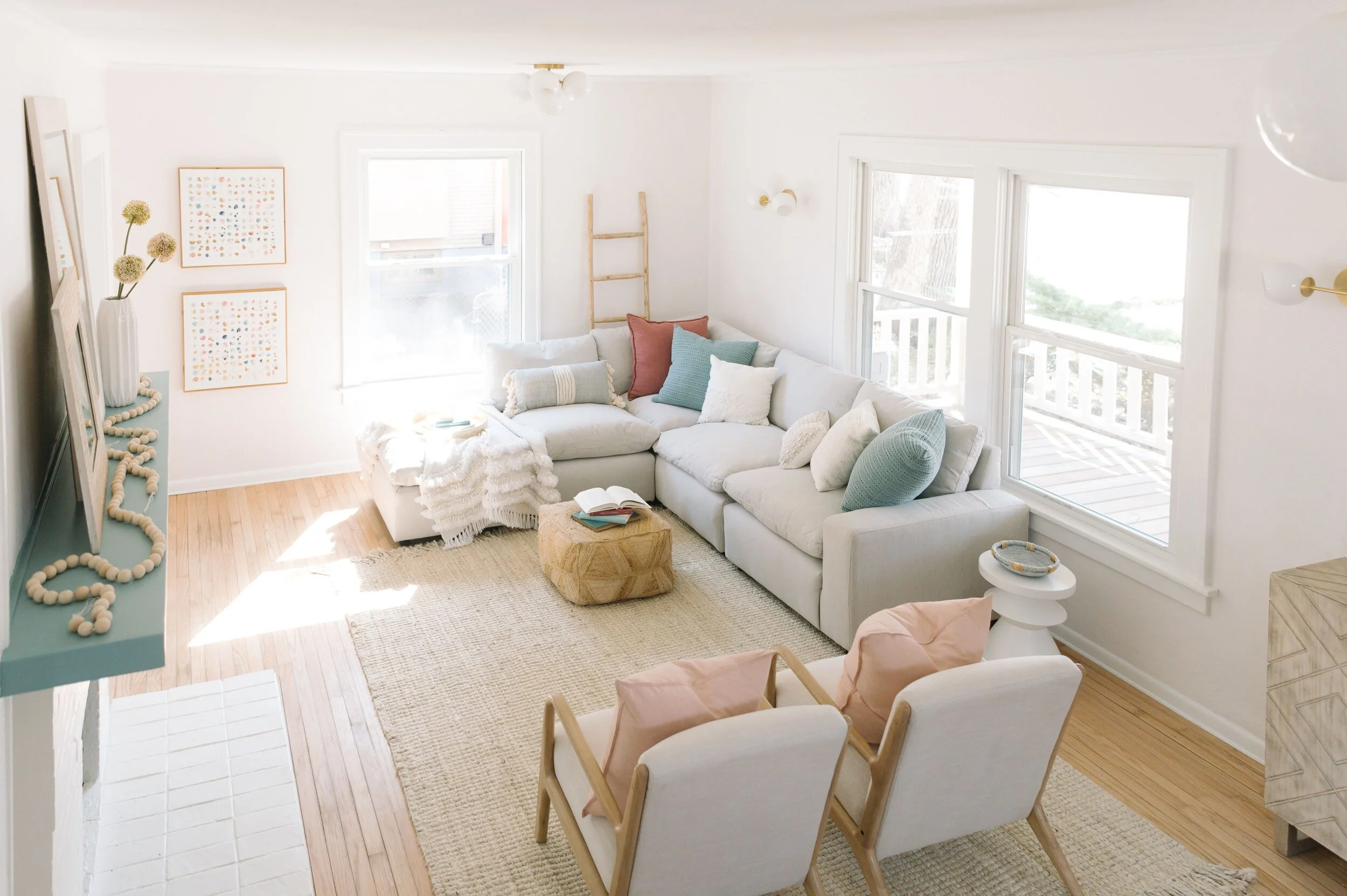
I believe every home has 9 lives. I’m just happy I got to be apart of one of them with this lil’ kitschy, charming baby. This house got a compete renovation inside and out thanks to Archway Properties. We removed the wall in between the kitchen and dining room. Restored all the hardwoods and added a fun statement tile in kitchen and bath. I went with all gold lighting and plumbing fixtures. I decided to repaint the walls SW Ibis White (pink tint) because I loved the original pink. The blue mantle and steps? Yep again with the kitsch. That’s SW Delft. It’s the most perfect soft blue.
Fortunately and unfortunately, this charmer already has a new owners. Can’t wait to hand over the keys to this lil baby. Now, it’s time to renovate the next home and give it the love and attention it deserves.
Lighting - West Elm
Cabinet Pulls - Amazon
Wall Paint - SW Ibis White
Trim - SW Pure White
Mantle and Steps - SW Delft
Tile - Home Depot
Totally Drab to F#%&*^! Fab Kitchen
HI!
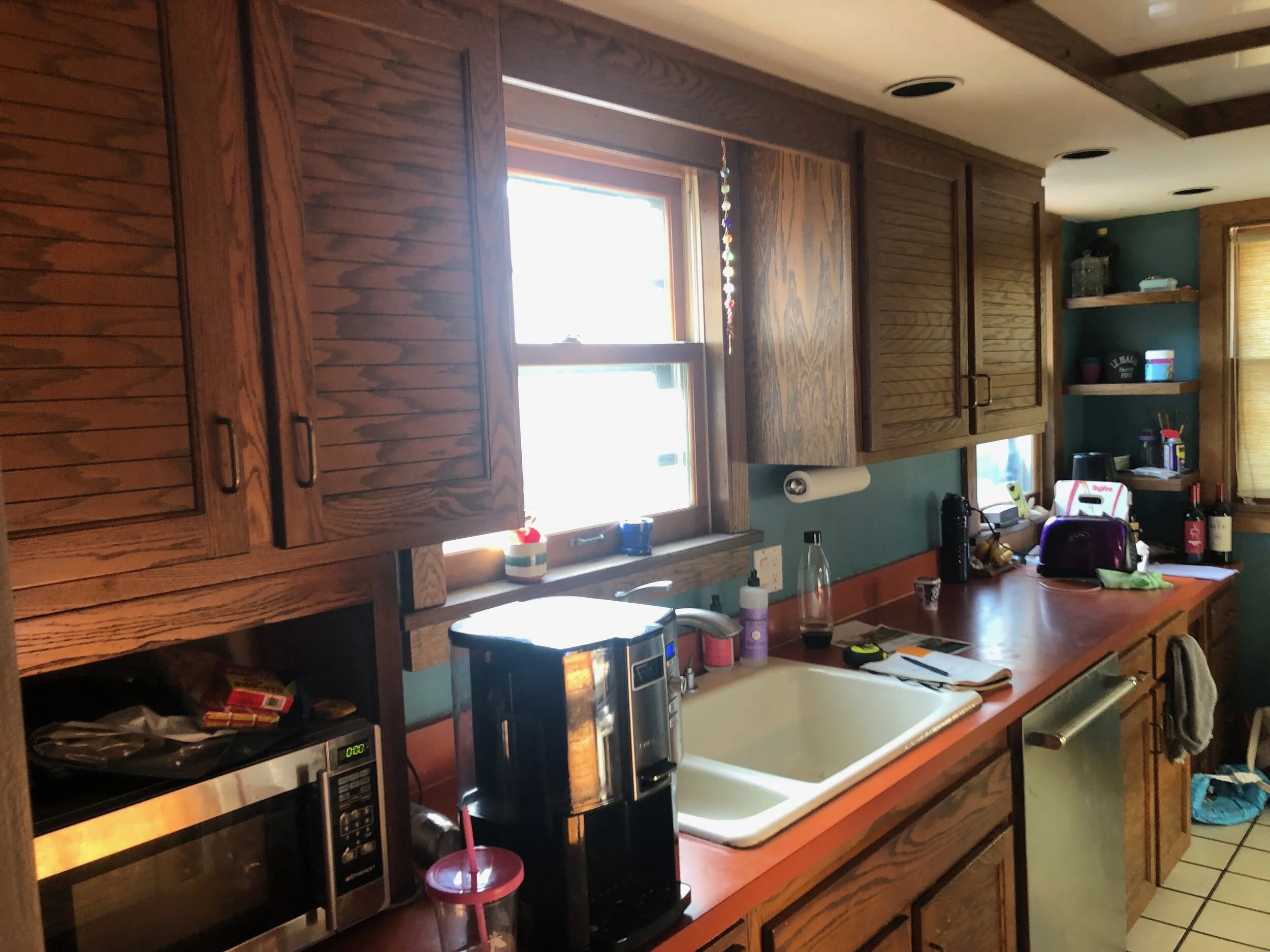
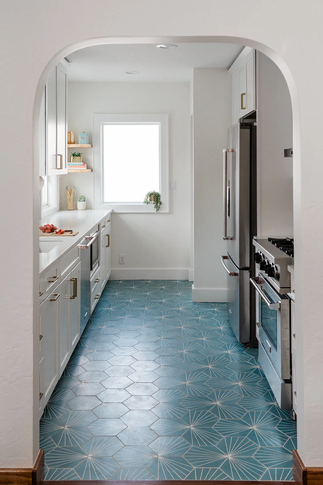
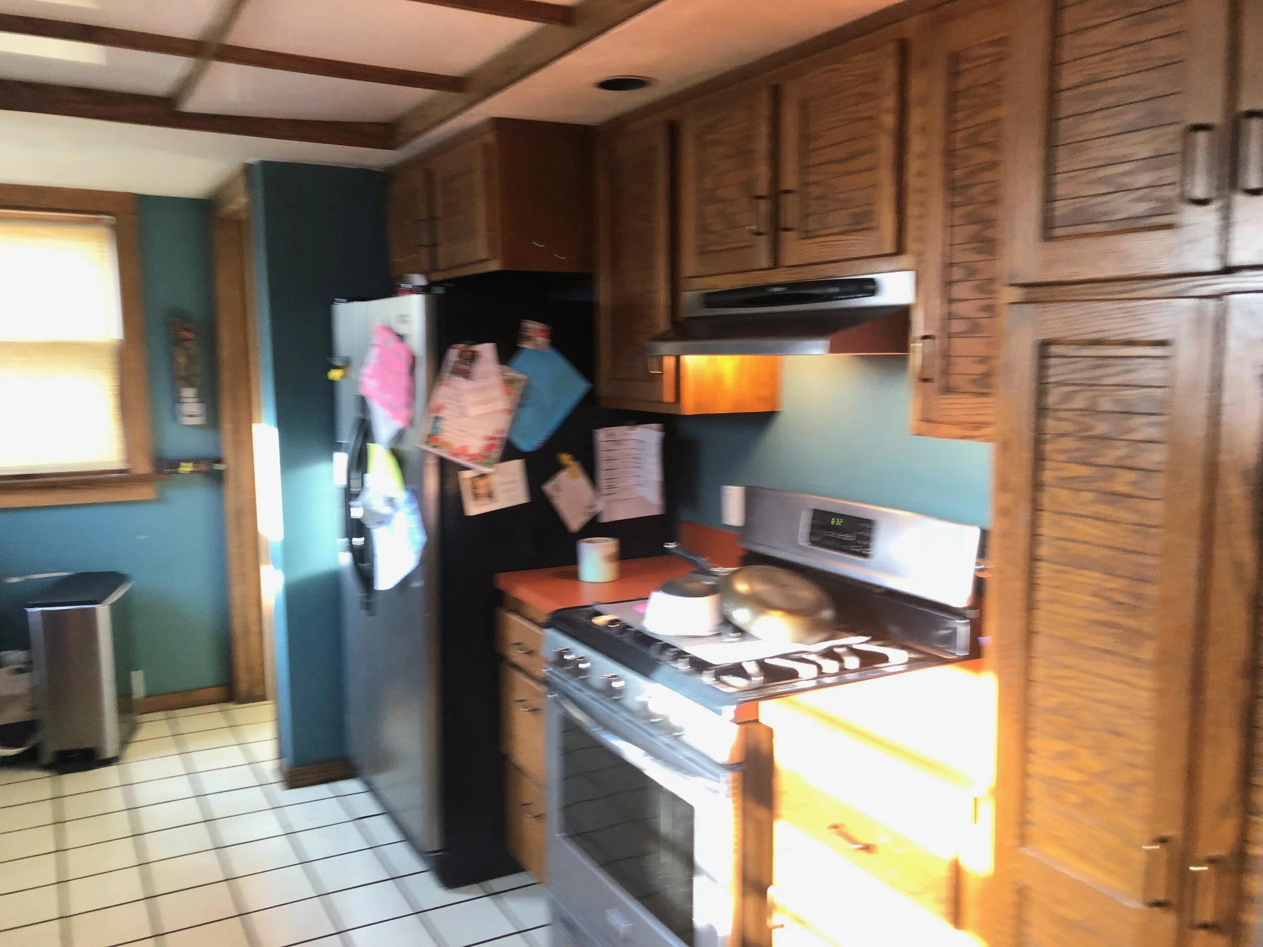
First off I want to make something clear- this is the same kitchen…I promise :)
This Beaverdale Brick galley kitchen needed some major TLC from Zenith Design + Build and me. All the brown, the orange, yellowed floors and the ceiling was so drab and totally sad.. As you could tell, I wasn’t digging the cave vibe and either were the Collins’, the homeowners. It was time to get Collins out of the dark and into the light stat.
The first thing I asked the Collins was “Can we do a fun floor?!?” Due to the smaller footprint of the kitchen installing a statement tile felt right and just. They said yes. Due to the nature of the floor it needed to be the main act and everything else needed to support it. From there, we needed to keep it simple and white but add in some texture (my favorite). The 3D subway tile elevated the look, added interest without being distracting. The gold hardware provided the needed warmth that was missing with all the white. We also widened the entry and added the arch to match the rest of the home’s character. By removing the florescent light box, we were able to rise the height of the ceiling which also made a huge difference. The kitchen literally looks double the size which is really incredible for not altering the original footprint of the kitchen.
Who’s next?!
Best,
Jess
Photography by Lauren Konrad Photography

