Totally Drab to F#%&*^! Fab Kitchen
HI!
First off I want to make something clear- this is the same kitchen…I promise :)
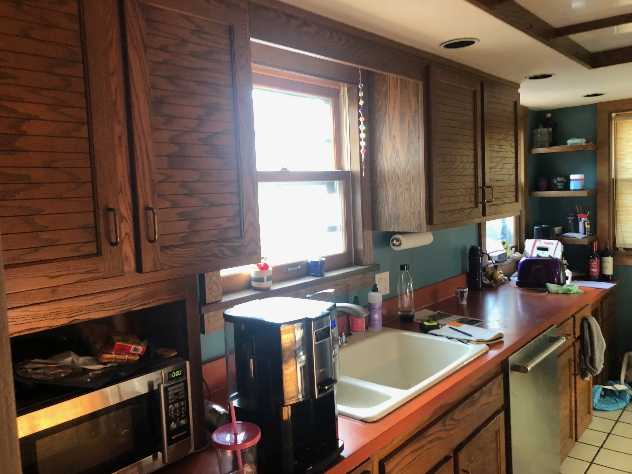
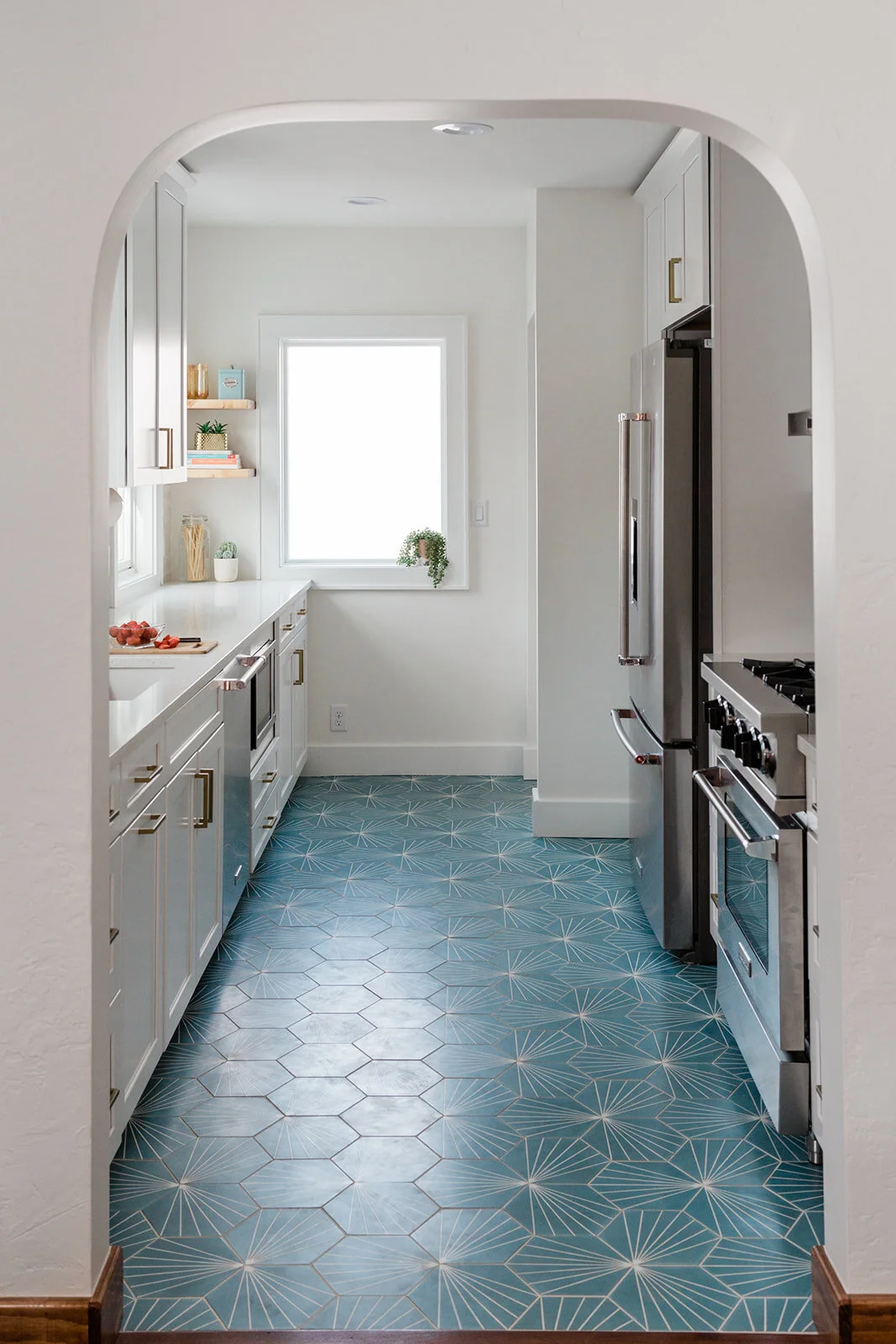
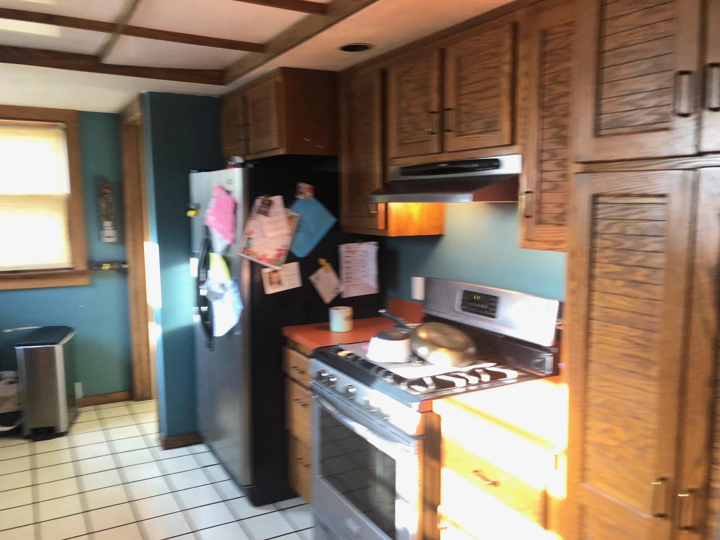
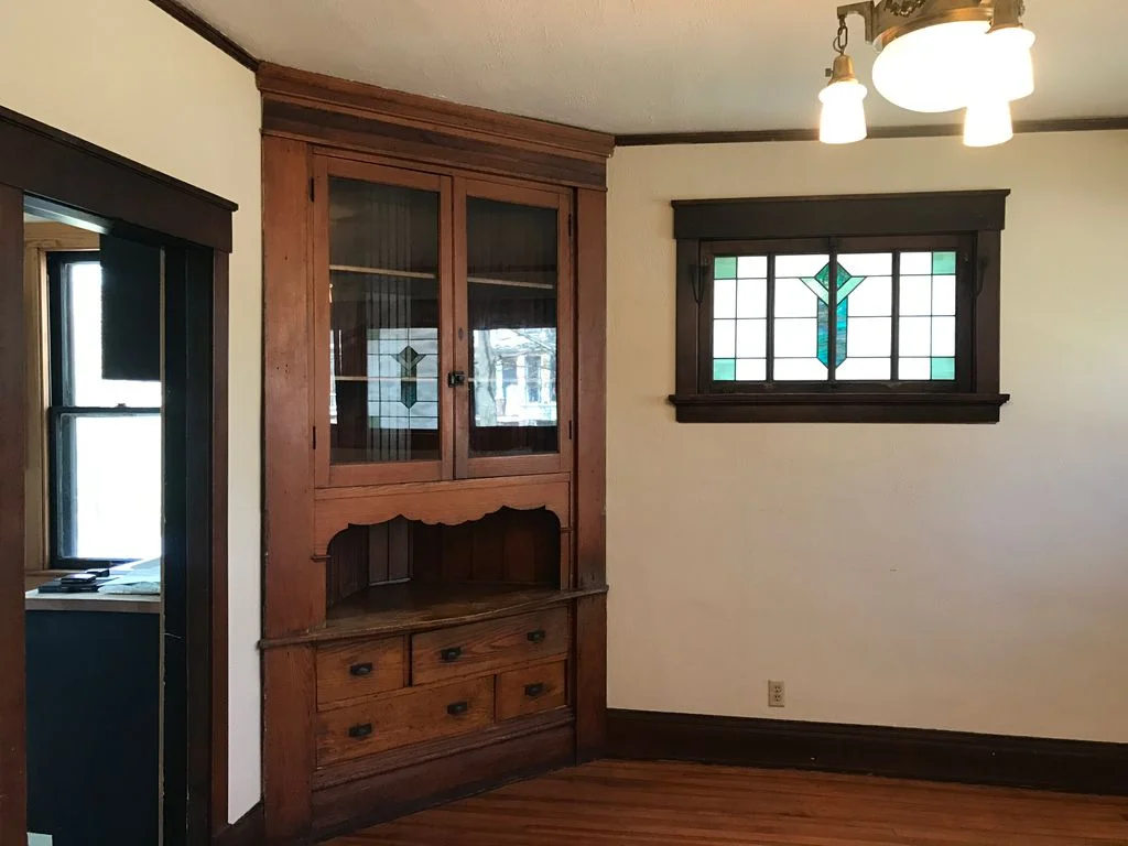
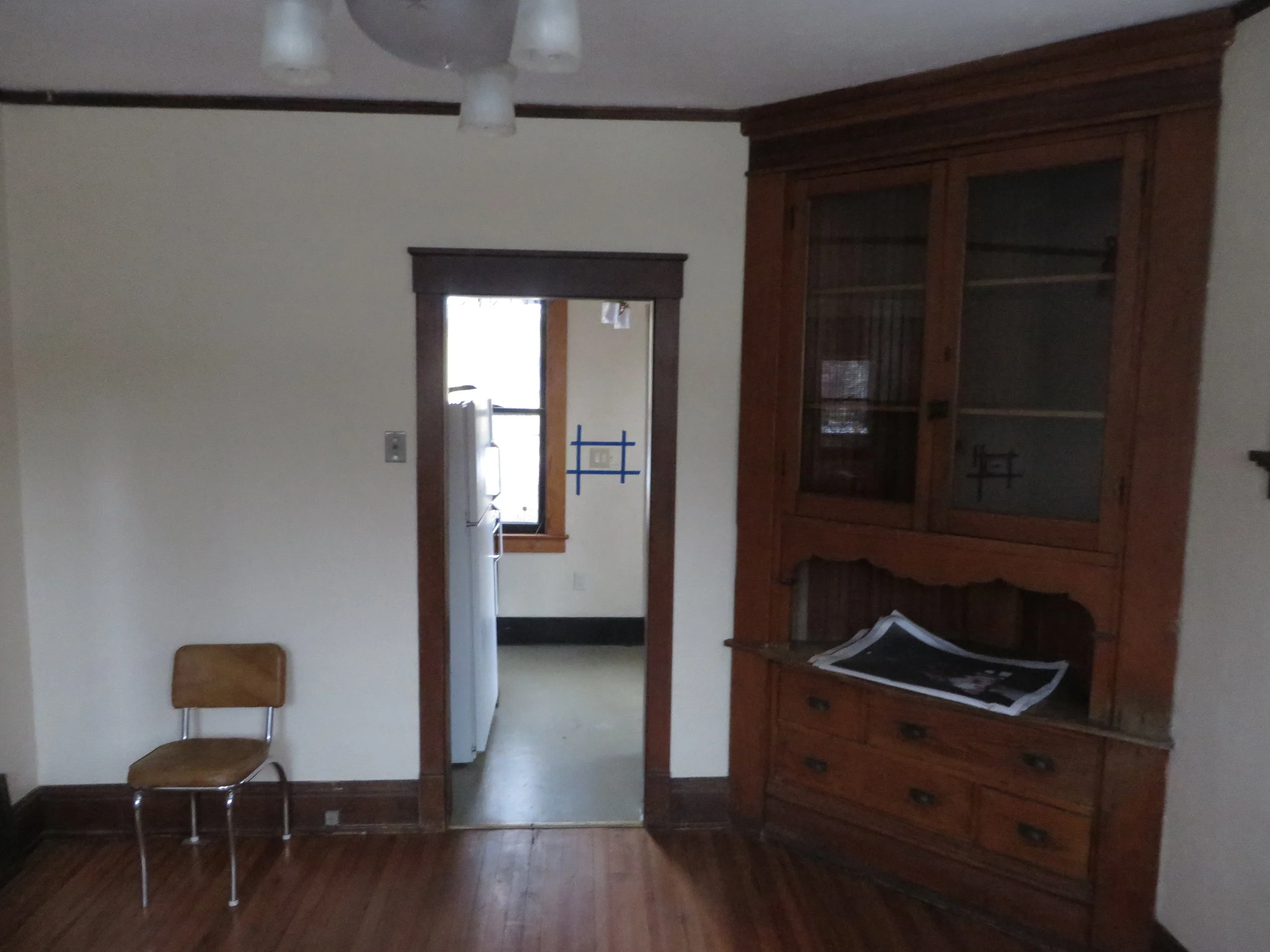
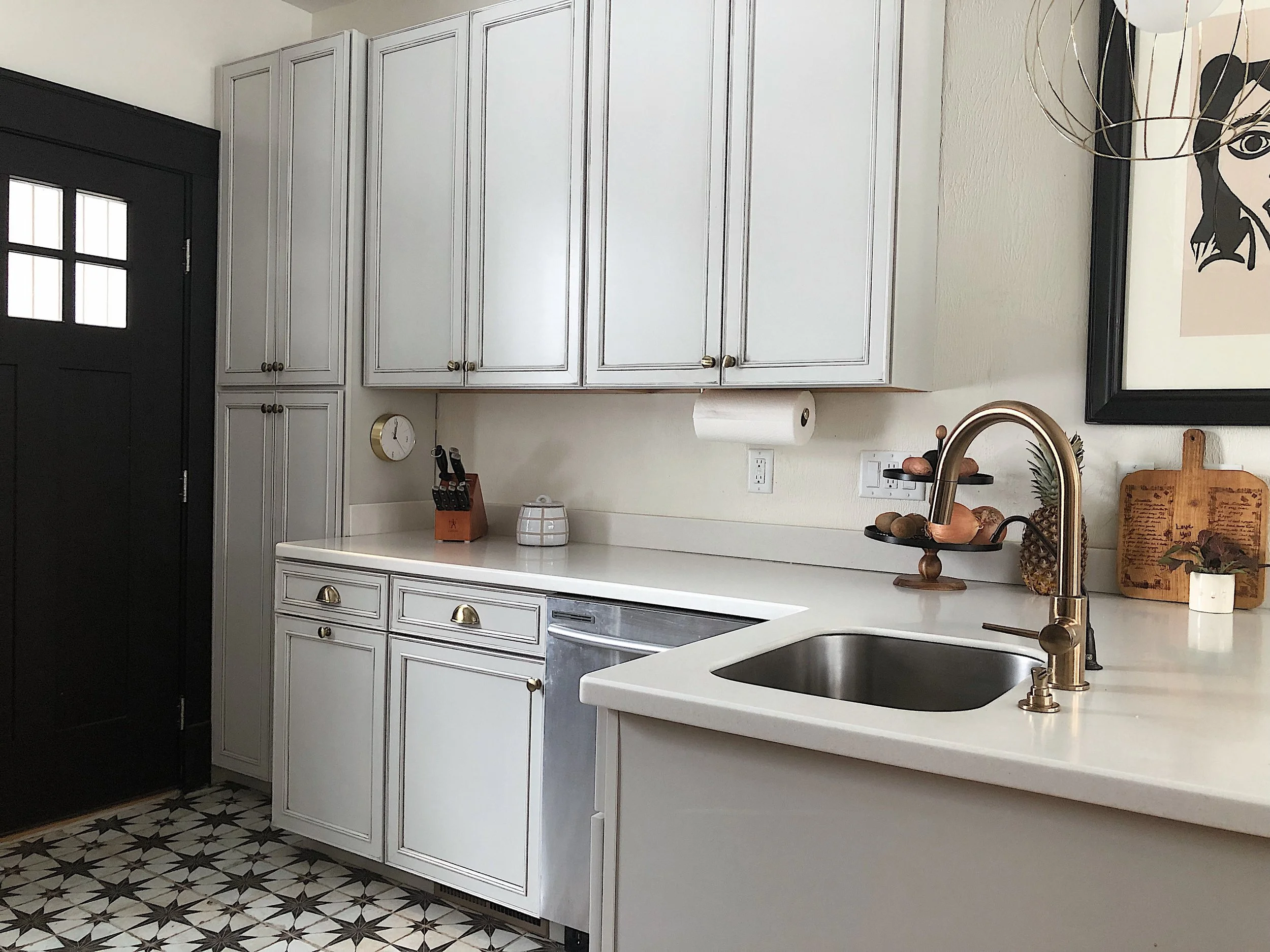
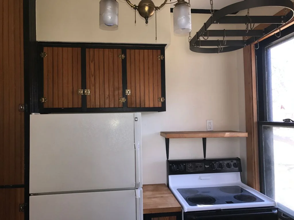
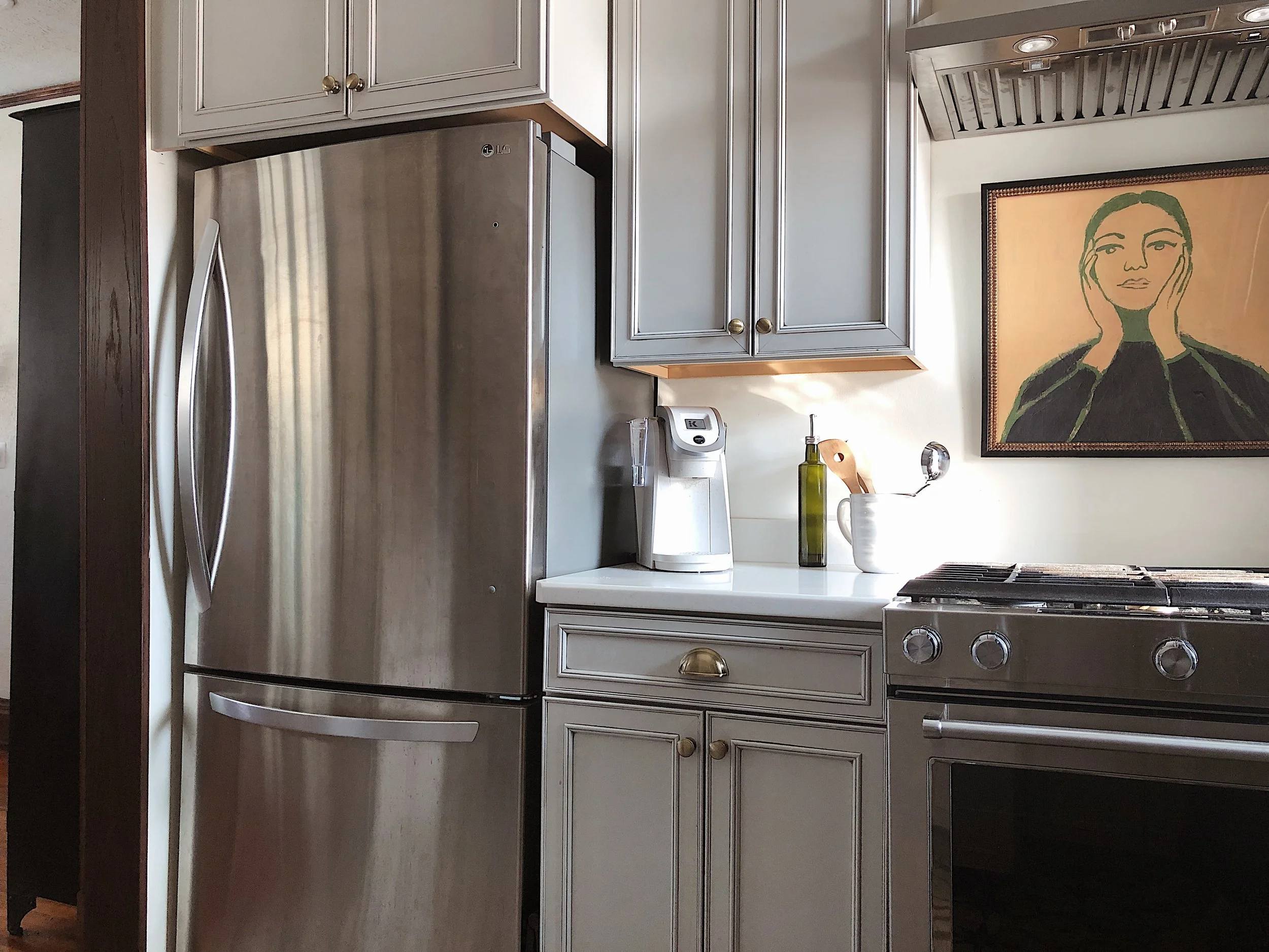
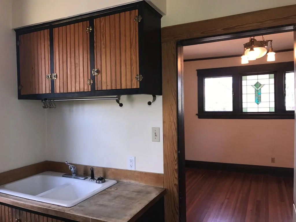
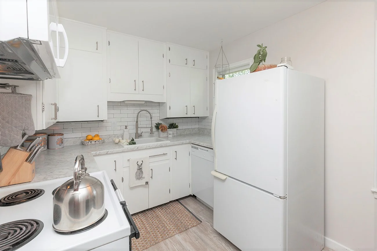
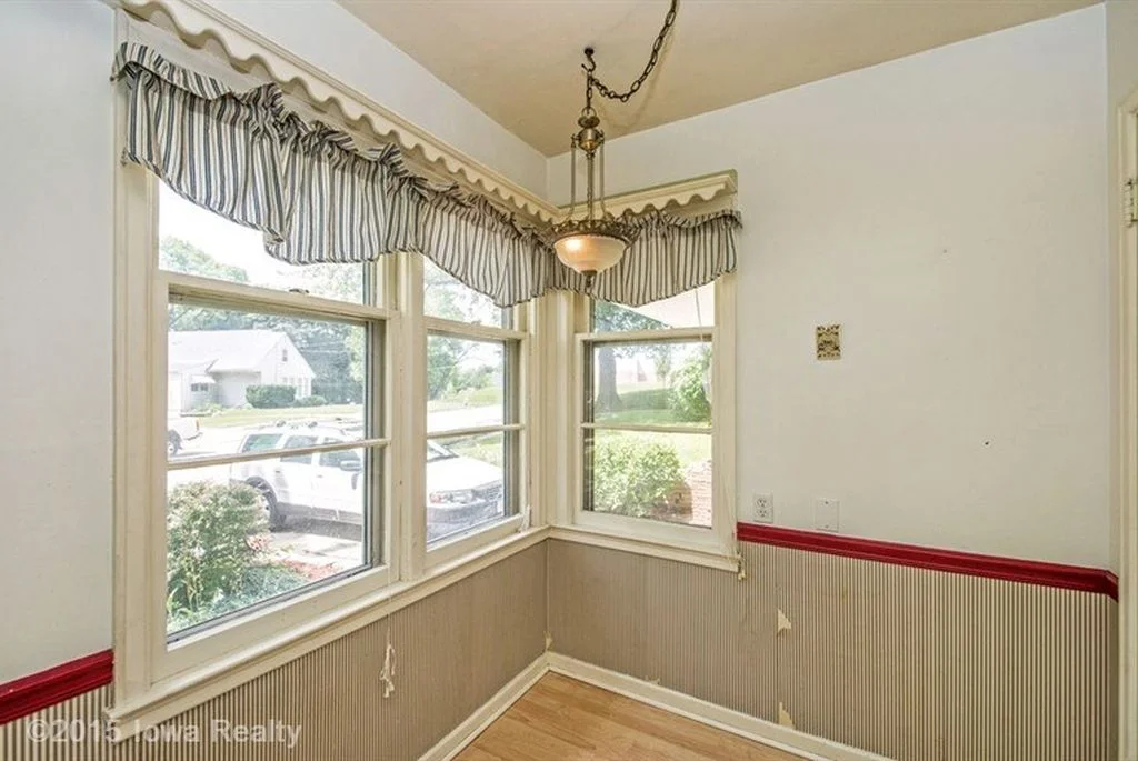
This Beaverdale Brick galley kitchen needed some major TLC from Zenith Design + Build and me. All the brown, the orange, yellowed floors and the ceiling was so drab and totally sad.. As you could tell, I wasn’t digging the cave vibe and either were the Collins’, the homeowners. It was time to get Collins out of the dark and into the light stat.
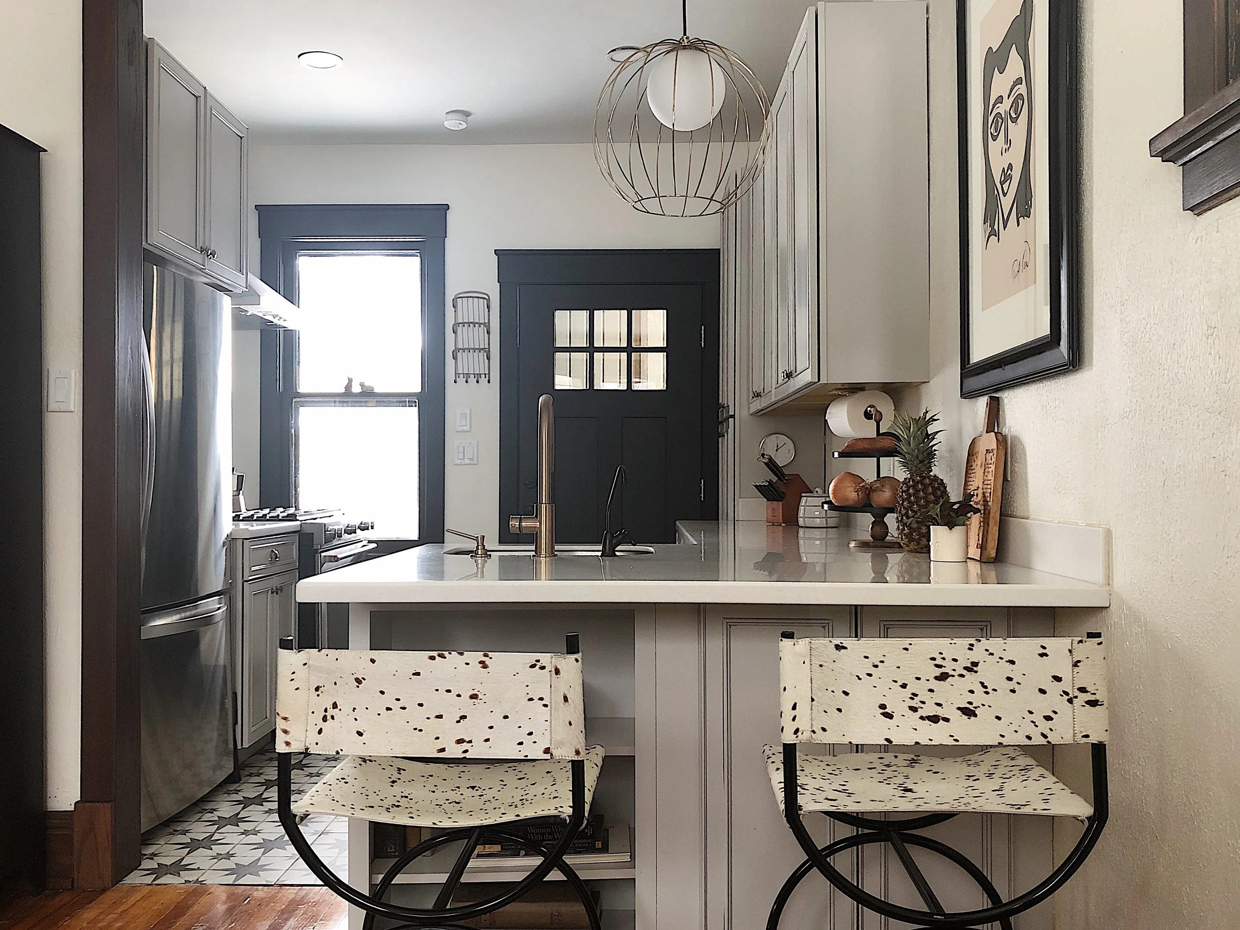
The first thing I asked the Collins was “Can we do a fun floor?!?” Due to the smaller footprint of the kitchen installing a statement tile felt right and just. They said yes. Due to the nature of the floor it needed to be the main act and everything else needed to support it. From there, we needed to keep it simple and white but add in some texture (my favorite). The 3D subway tile elevated the look, added interest without being distracting. The gold hardware provided the needed warmth that was missing with all the white. We also widened the entry and added the arch to match the rest of the home’s character. By removing the florescent light box, we were able to rise the height of the ceiling which also made a huge difference. The kitchen literally looks double the size which is really incredible for not altering the original footprint of the kitchen.
Who’s next?!
Best,
Jess
Photography by Lauren Konrad Photography
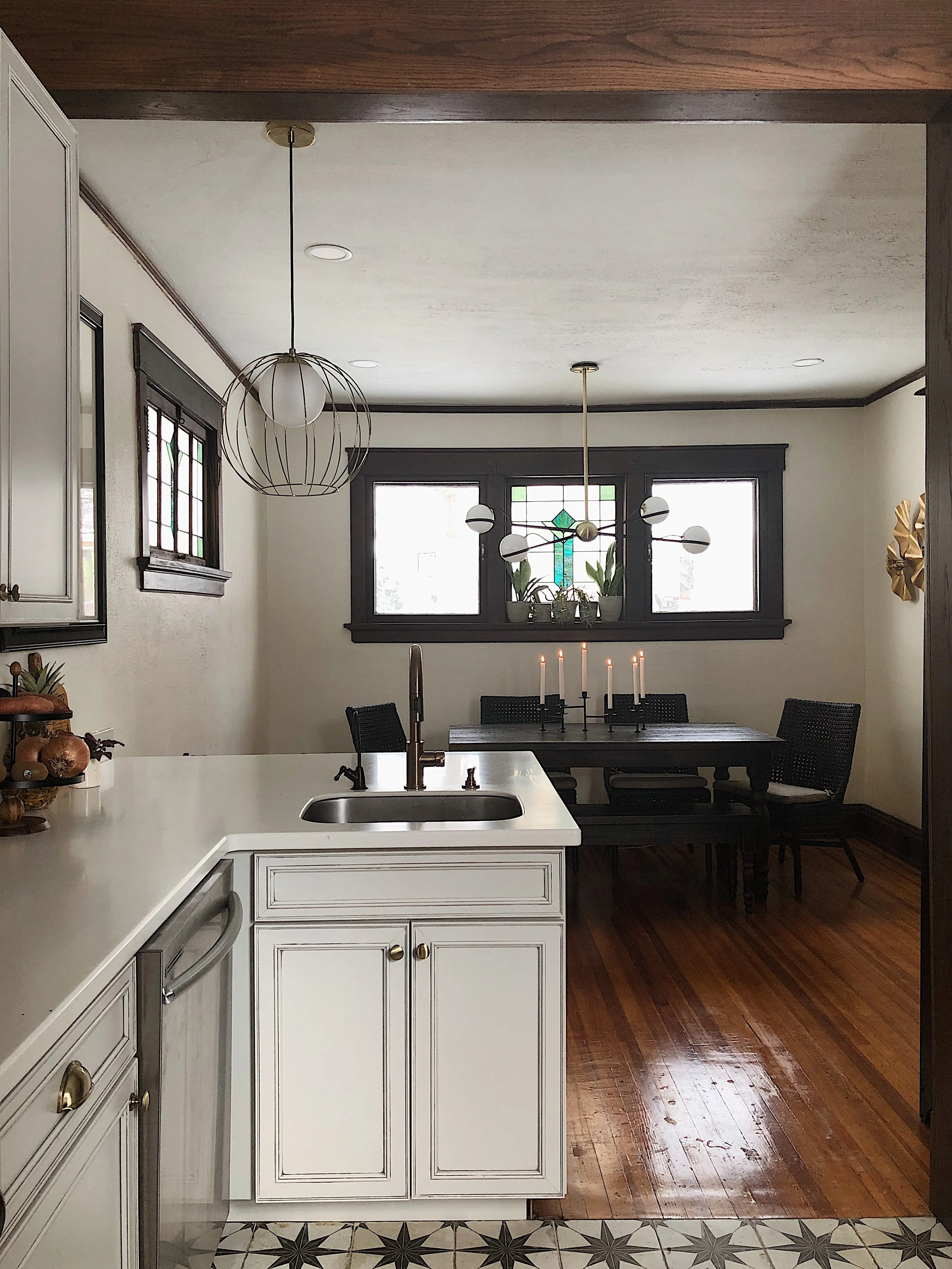
A Craftsman Kitchen
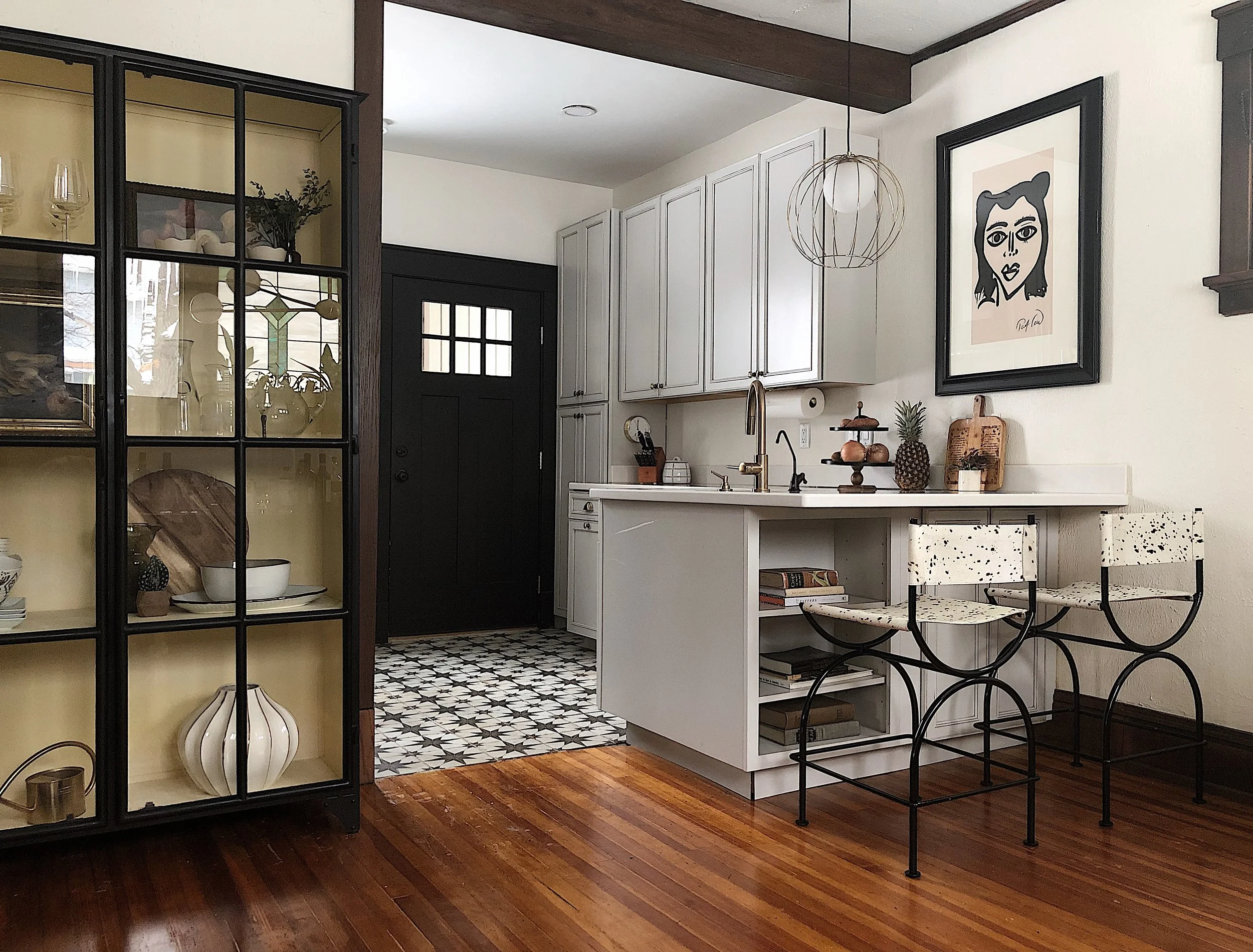
Our historic home in Sherman Hill was built in 1880 and came equipped with a 5 by 5’ kitchen —teeny tiny. At some point the main kitchen was located outside the home which is now our neighbor’s garage about 20 yards away. The internal “prep” kitchen was virtually left untouched besides some cosmetics for the past 139 years so it was time for a big change.
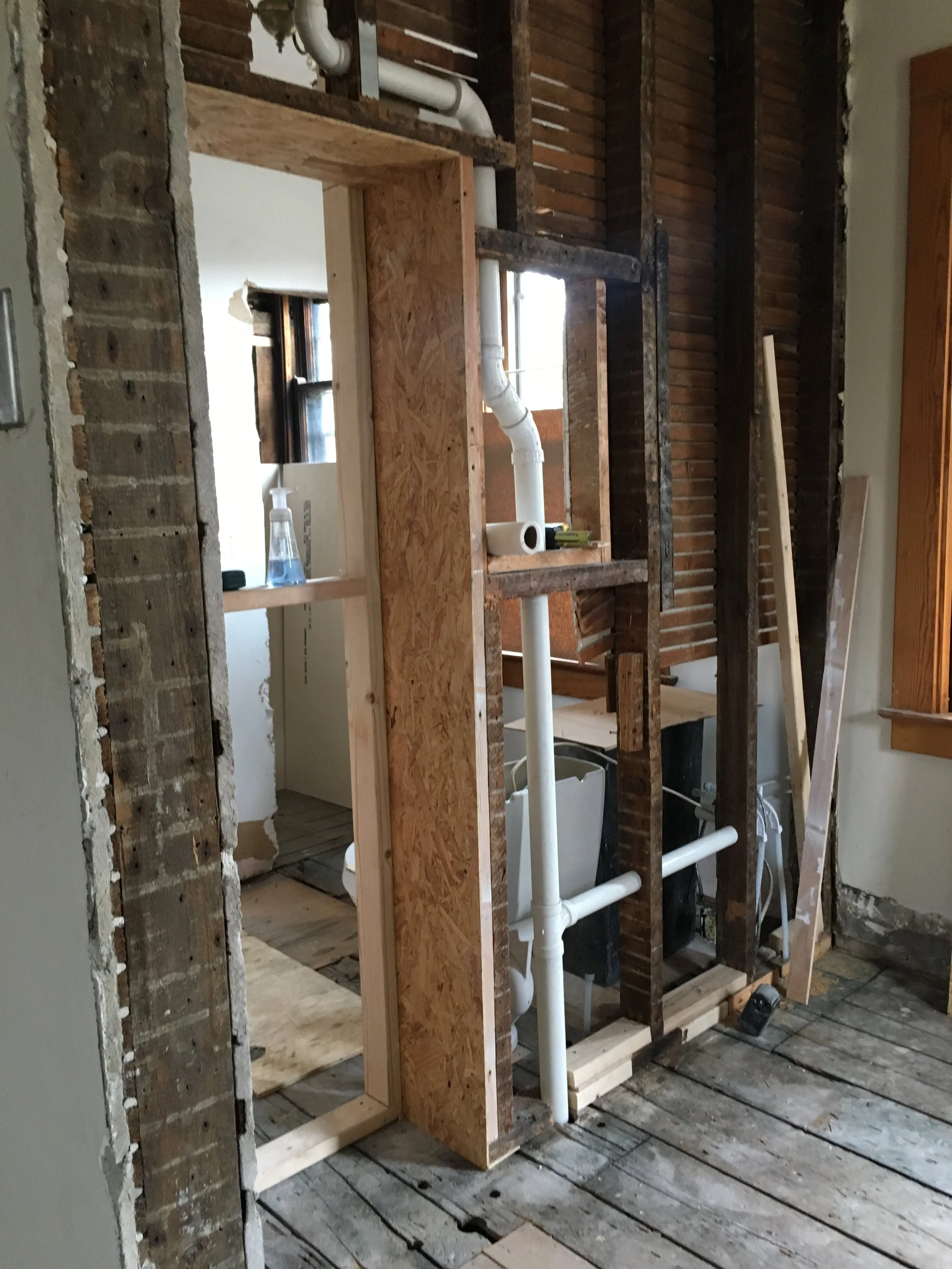
We removed the built-in hutch, removed the wall, moved the back door over a few inches (every inch counted in this small space), moved plumbing, added can lights, new cabinetry, flooring and appliances. It’s still small but way more functional with the peninsula.
The original kitchen was so small it made it tough to even get before photos but check out what I got below. Shopping list provided below as well. Enjoy :)
Cabinets - Lowe’s Custom Shenandoah - Irvington - Painted Ember Glaze
Faucet - Build.com
Hardware - Build.com
Flooring - The Tile Shop or Wayfair
Paint - Sherwin Williams Creamy and Tricorn Black
Lighting - CB2 and Lamps Professional
Barstools - CB2
Metal Cabinet - Homemakers’ clearance room
Dining Table - Wayfair
Dining Chairs - Crate and Barrel
Small Lady Artwork - Anthropologie
Large Lady Artwork - Peter Keil
Home Sweet Home
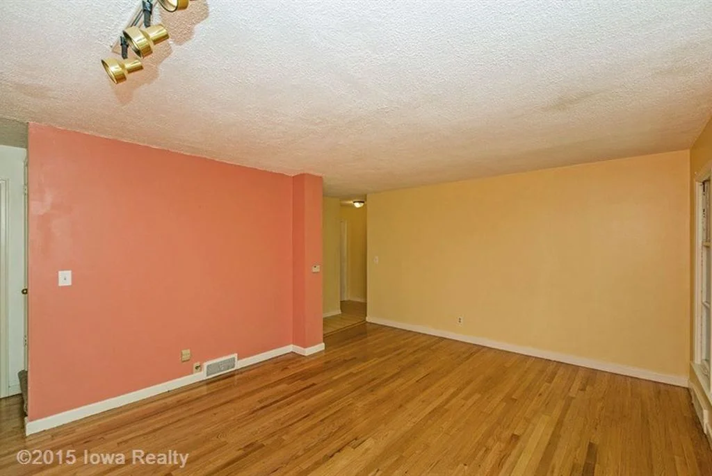
Well the last seven months around the Miller/Lemmo home has been eventful to say the very least. Last Fall, when we found out I was pregnant we dove head first into home renovations. Luckily for me, Tony (my partner) is hybrid between Martha Stewart and Bob Villa. And luckily for him, I am really talented general contractor i.e. - picking out interior finishes, furniture and decor. Here's an overall view of everything that has been completed thus far in our 66 year old Waveland Woods home. Stay tuned for room by room details with progress photos and details of what was used and where we found it.
After photos by Doty Photo Company


