Photo Tour: A Look Into Our New Office

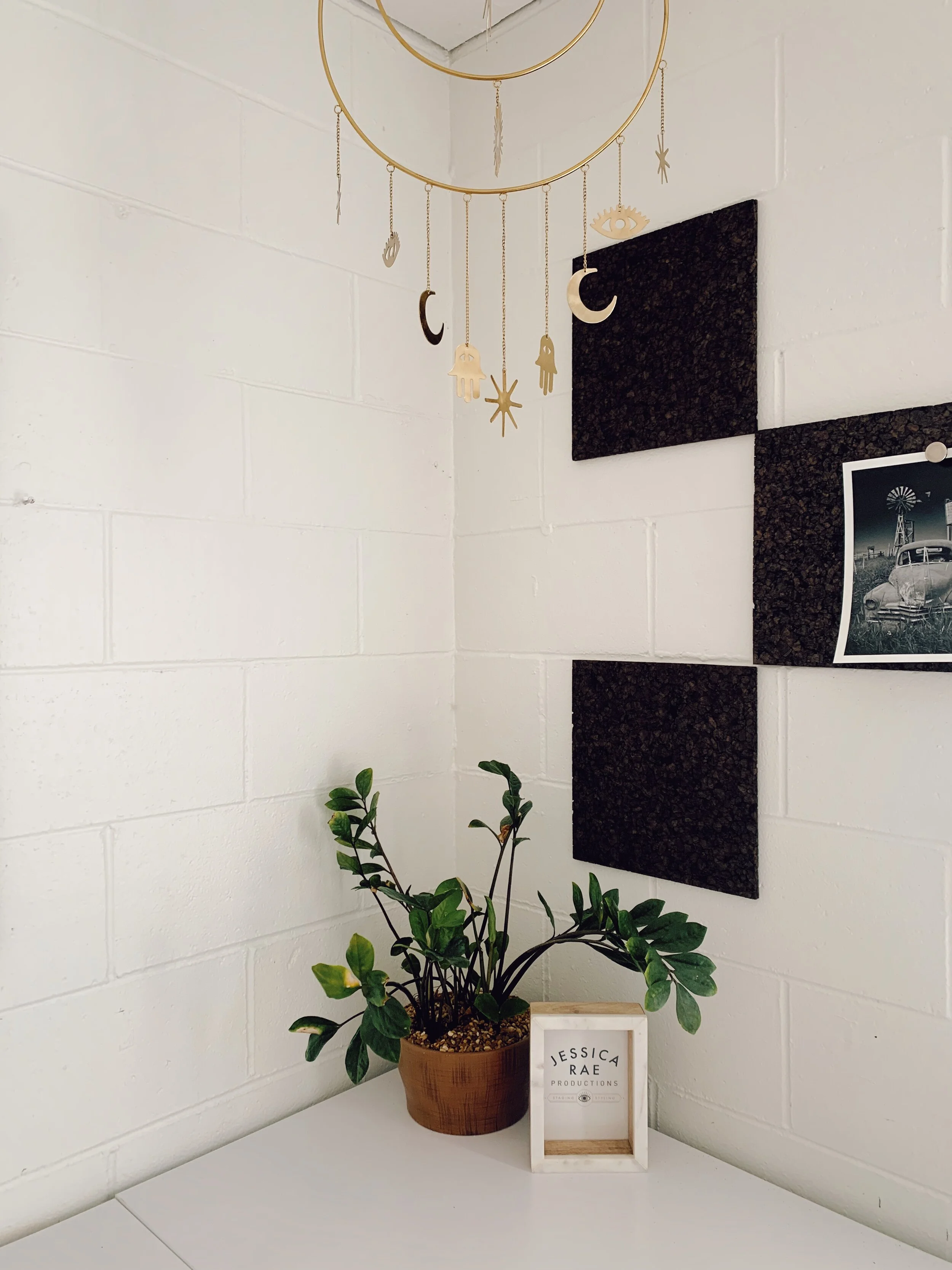
Our new office is finally done! And we are doing a photo tour to celebrate our new JRI headquarters.

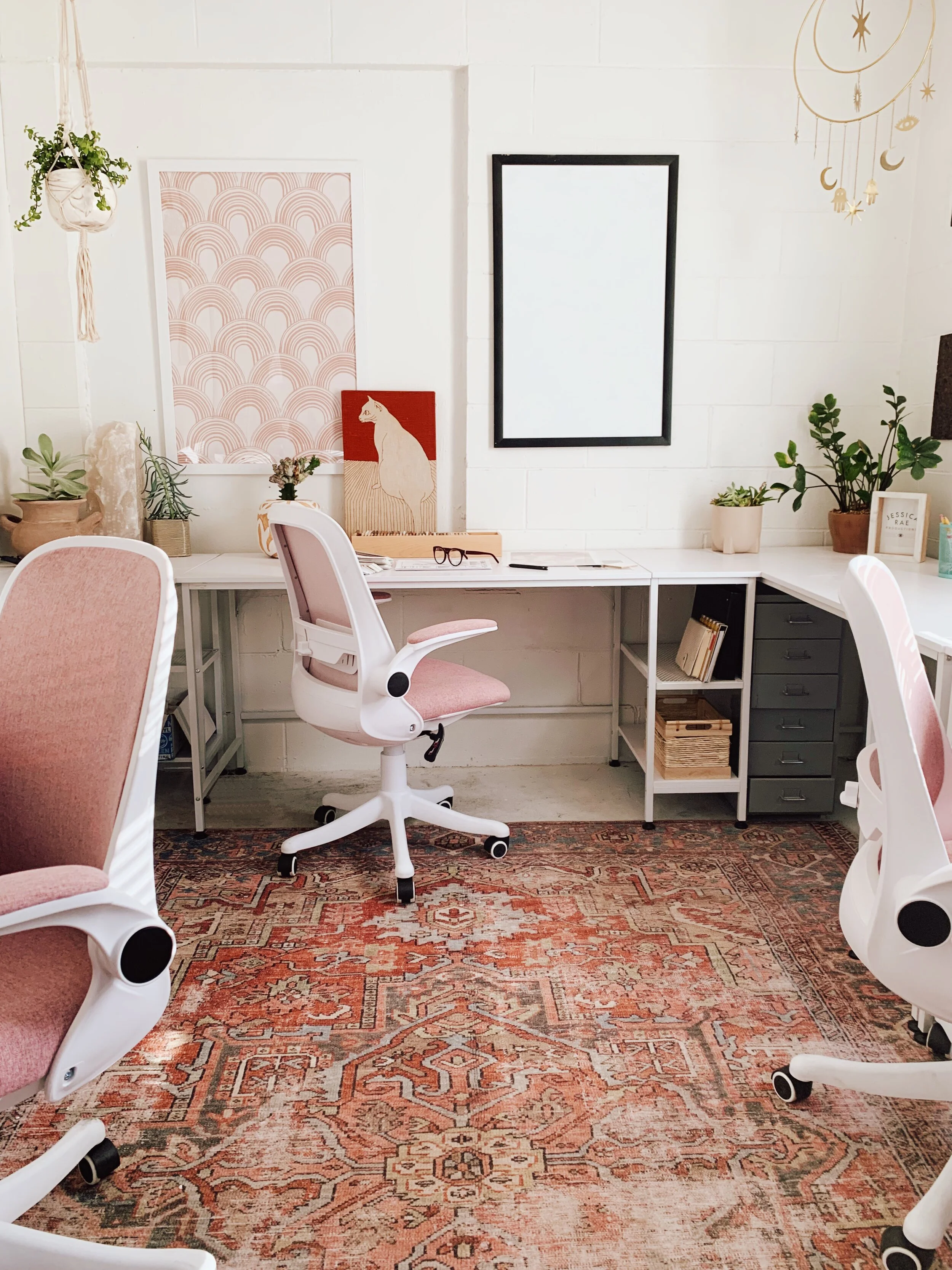
What was once a dark and dusty warehouse back room, is now a bright and colorful studio office. We knew we had to work around the space a bit in order to house three big desks and office supplies. The room was essentially one big, narrow rectangle, but with a little bit of planning we were able to fit everything we needed!

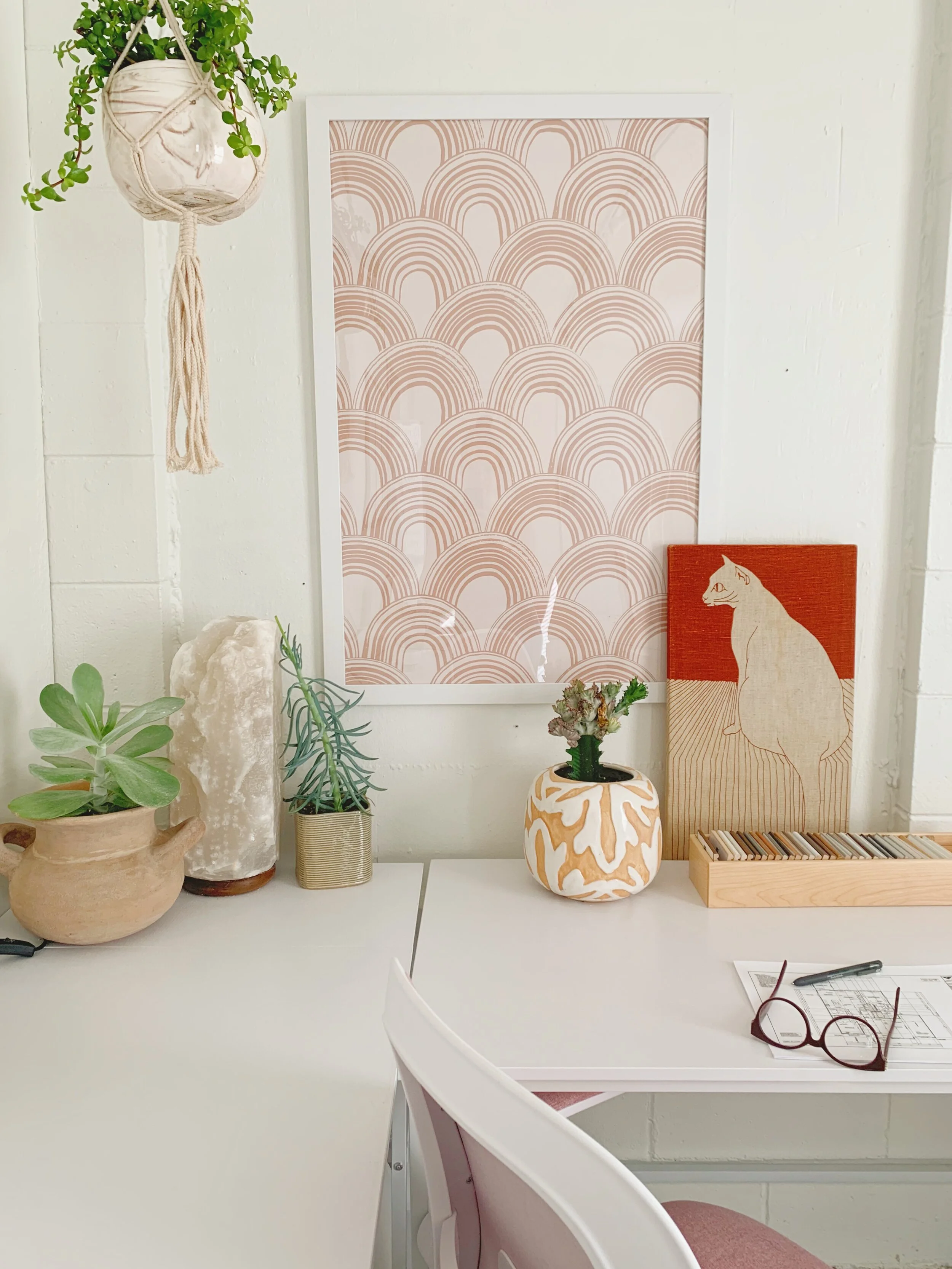
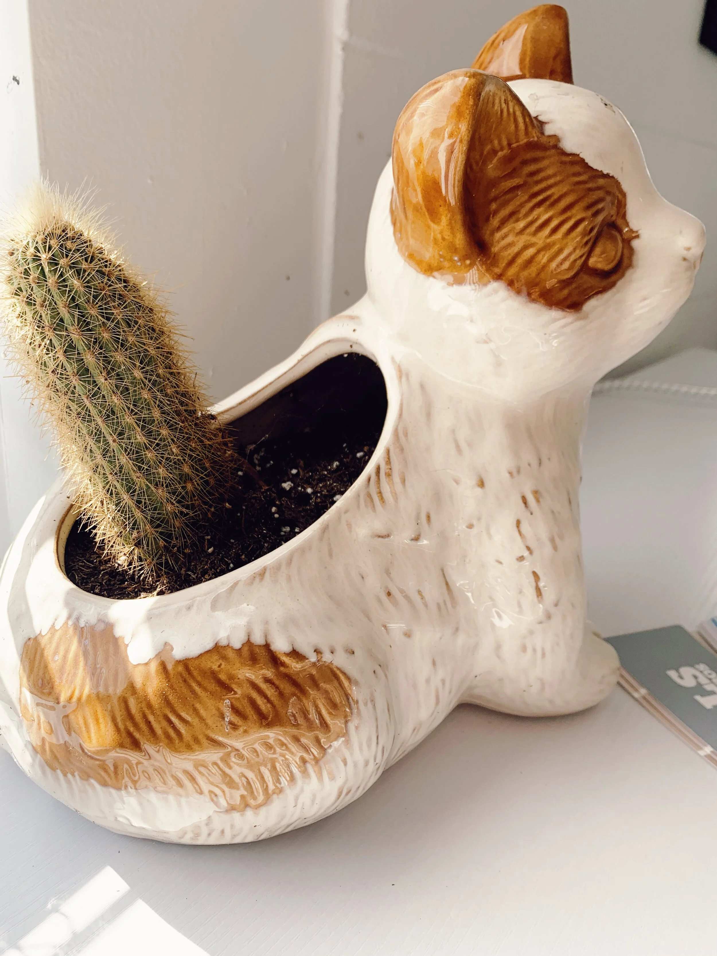
When you walk into the office, you are instantly greeted by lush green plants and our ever growing collection of cat artifacts (which can all be found in several places around the building). It doesn’t feel too “office-y”, it feels more like a home! Our mobile desks offer plenty of space to store our office supplies. They are topped with pretty art and decor pieces.

The most handy woven baskets for storage and display. My personal favorite is the large colorful rug to really bring some color and character to the room.

This is where all the magic happens!

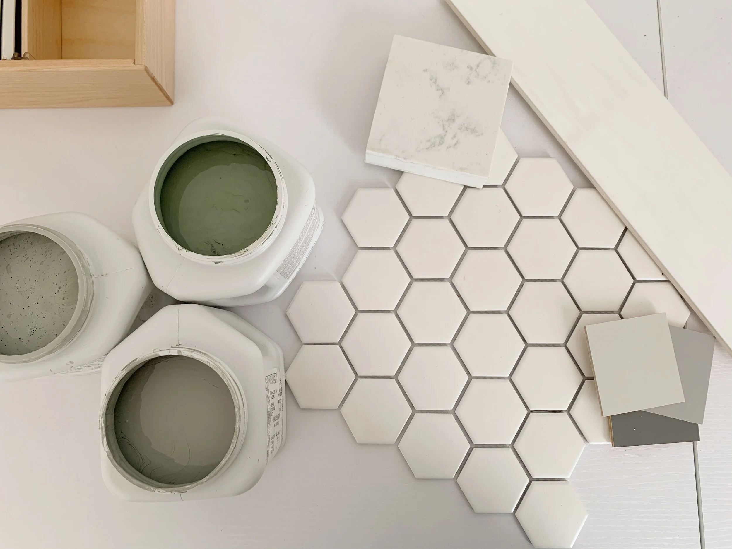
We also created a mood board to help us pick out pieces that we loved. We are still busy perfecting our office, so there is definitely more to come.

We spend a lot of time here, so we want it to feel like a second home. That’s all! Thanks for taking the tour! Don’t forget to follow us on our social to keep up to date with everything we are currently working on.

Creating A Sophisticated + Modern Mood Board

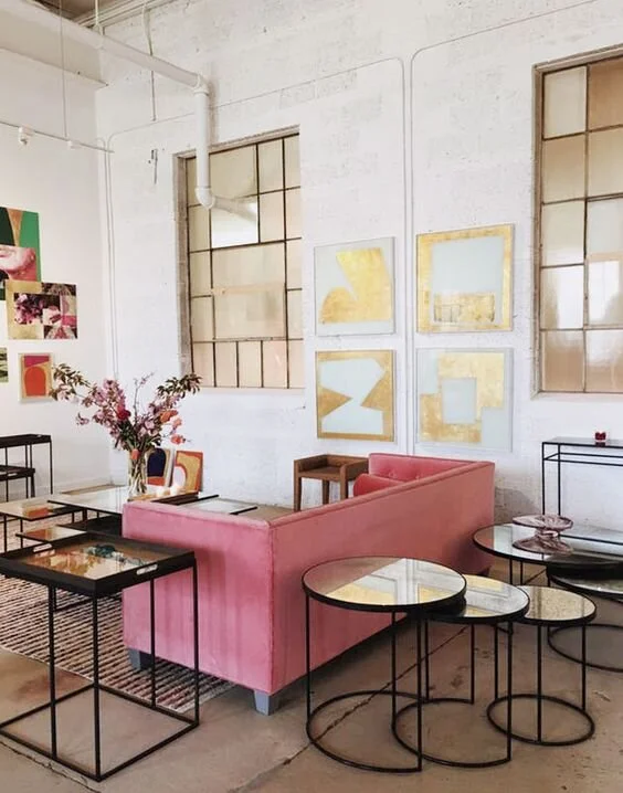
Inspiration Pic: (Image credit: Charlotte Parker)

Inspiration Pic: (Image credit: Charlotte Parker)

Hello friends! and happy Monday. This week we created a few mood boards for a client which we will be sharing with you today. One of the biggest challenges for homeowners is that when they embark on a home design project, they are quickly overwhelmed by the amount of options available. That’s where we come in! One way we help narrow down those choices is through planning of a mood board. Mood boards are essential in the planning process because it helps clients visualize the style, textures, pieces of furniture, lighting, etc. in a design proposal. Creating a clear design concept from the very beginning helps client get a real understanding of the design and feel of a room. 

The goal for the mood boards was to carry the pink, blue, black or cream from front living room into both the sunroom and family room. We also wanted to add some flair by incorporating prints as focal points for each of the rooms.

Check these out bellow!

Before and After: Bringing a Dated Colonial Kitchen to Modern Times

Hello! It’s been a while!

We are so excited to share these before and after photos of this breathtaking 1920’s colonial house remodel. Everyone loves the before shots because they are fun and they make you appreciate the after so much more. This project was all about numbers- it’s 5300 soft, 6 bedrooms, 8 bathrooms, 80 years old, 75 new light fixtures, 40 hours of wallpaper removal, 80 gallons of paint, and was 3 years in the making. This now modern colonial home is our biggest remodel yet! Originally built & owned by American philanthropist, David Kruidenier, and his wife, Elizabeth, this home embodied and reinforced progressivism in Iowa. Kruidenier’s leadership and personal philanthropy in support of music and visual arts were integral in Des Moines’ success in the development and expansion of the Des Moines Art Center and in the construction of the Des Moines Civic Center.

We will be breaking down this massive house by room into several posts so we can share even more details about the process, including layouts and selections!

Kitchen: Before and after

Of all the rooms, the kitchen went through the biggest transformation of all. What was once a dim and closed off space, is now a bright and open oasis. This dollhouse kitchen had so much potential and charm. Once the kitchen and butler’s pantry were demoed, drop ceiling was removed, and one of the doorways was enclosed we had all the room to make this spacious and fully functional kitchen.

We refreshed the kitchen by upgrading to a large kitchen island, open floor plan with full view to dining room, and modern fixtures. This kitchen is hardly recognizable from the before photos.

We created unison by using the same brass finishes in both the kitchen and dining room.

We will be sharing more of this house soon, so stay tuned!