1115 35th St Fabulous Home Photo Tour

Hello everyone! Today we are sharing part 1 photo tour from our newly completed 1115 35th St flip home project!

One of our goals with this project was to create a balance between bright and moody, and the kitchen and living spaces are the expressions of that idea. We worked with Rally Cap Properties on the construction of this project, and together we were able to create something truly beautiful. 

Filled with mixed materials, unexpected pops of color, and whimsical elements, this property is all about the details!

dsc_0691.jpeg
dsc_0702.jpeg

The Kitchen

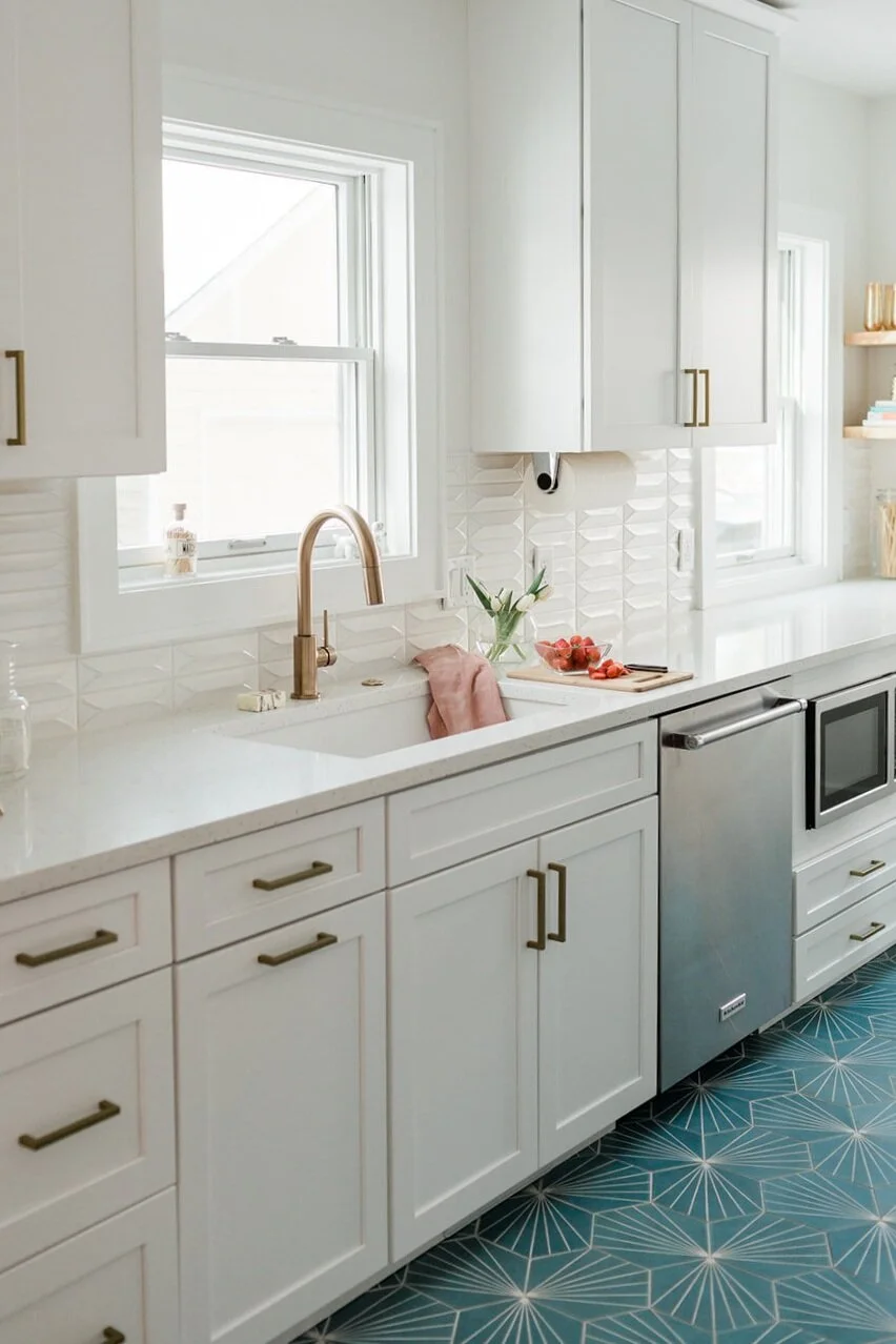
One of our favorite rooms in the house is the kitchen. We love dark kitchens, oak kitchens, and light kitchens, but for this property we wanted to create something was a perfect family gathering space and a cooking space that felt open and airy. We added gray cabinets, white marble tops, and mixed in natural and dark elements such as rustic wood shelves and a dark floor tile.

The kitchen truly felt like the right balance of everything we were hoping for, and a natural and curated look for this space.

To style this beautiful kitchen we incorporated organic shaped vases, brass accents, and topped it off with a rich rusty red runner that both added warmth and beautiful texture to the room.

Living room + Entry

dsc_0947.jpeg

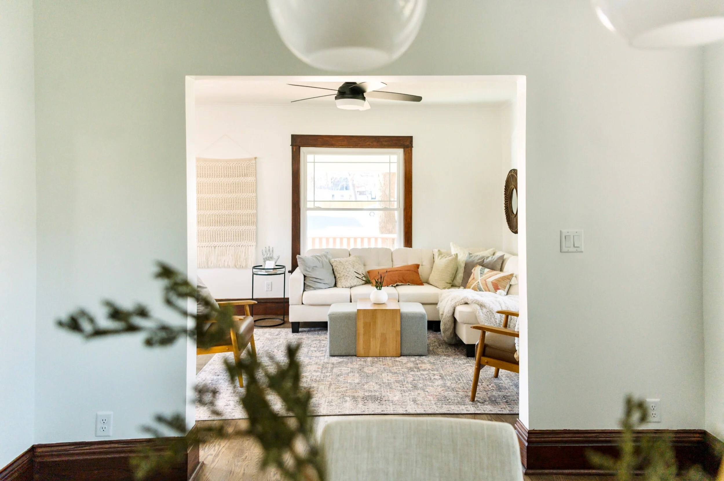
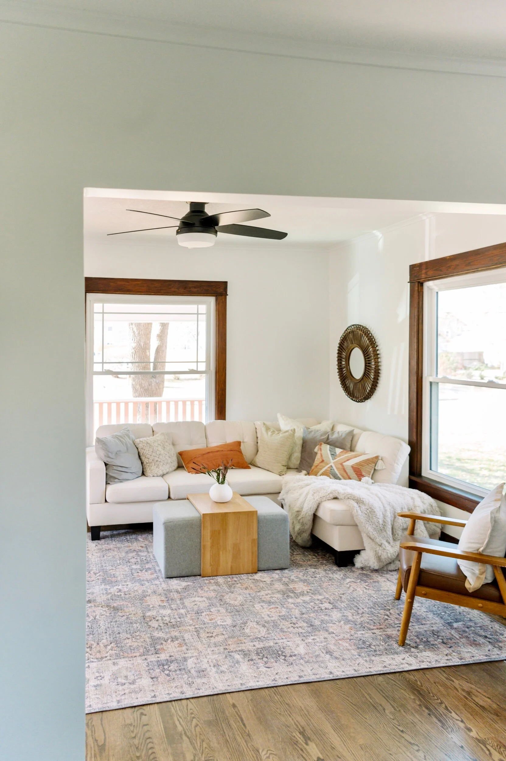
One of our favorite things about this home is the open floor plan and it has such an amazing flow. The living room is accessible from both the dining room and a doorway going through the kitchen. We didn’t want to disrupt this flow but we also wanted to make sure this living room area felt like it’s own little space.

dsc_0911.jpeg

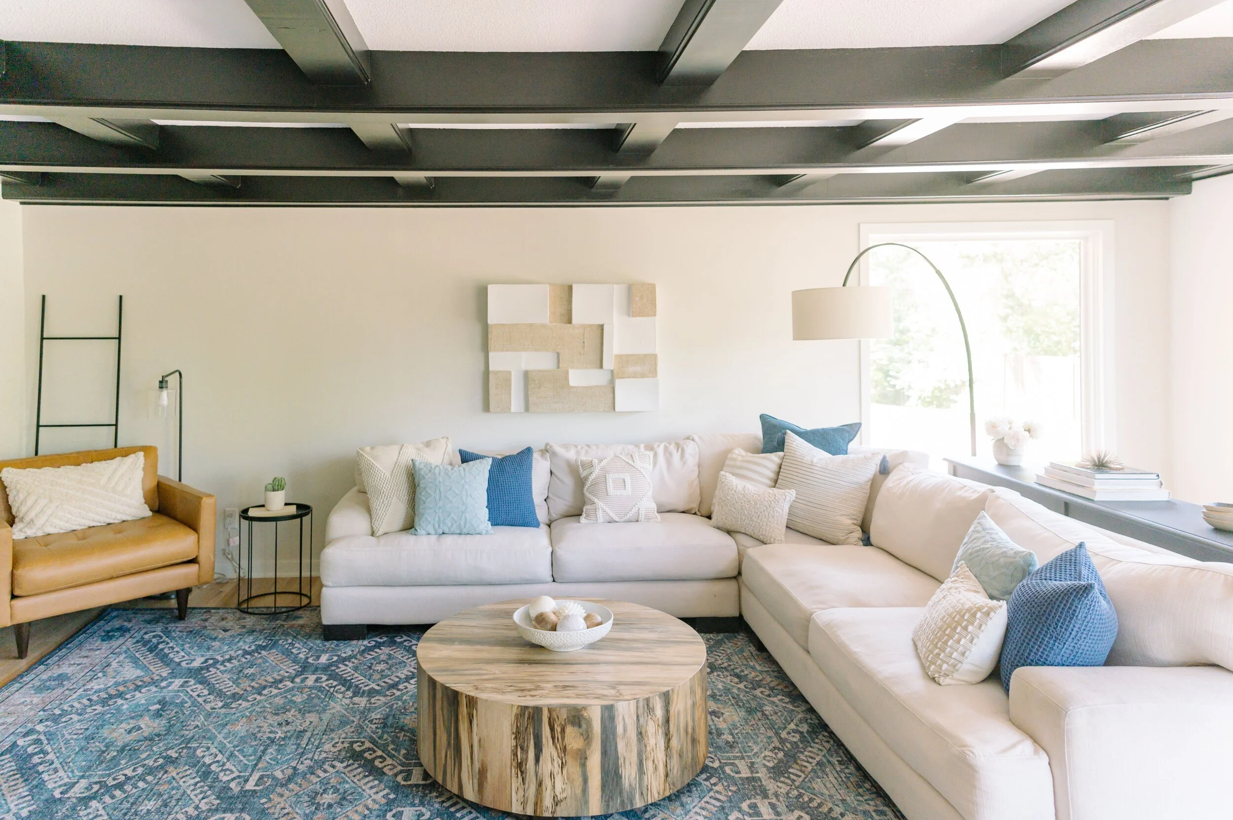
We chose a sectional that felt cozy and faced the dining room area, we also layered in low-profile seating around it. The ottoman/coffee table combo, leather chair, blush and blue rug, were the perfect pieces to fill in the space and bring a textural dimension.

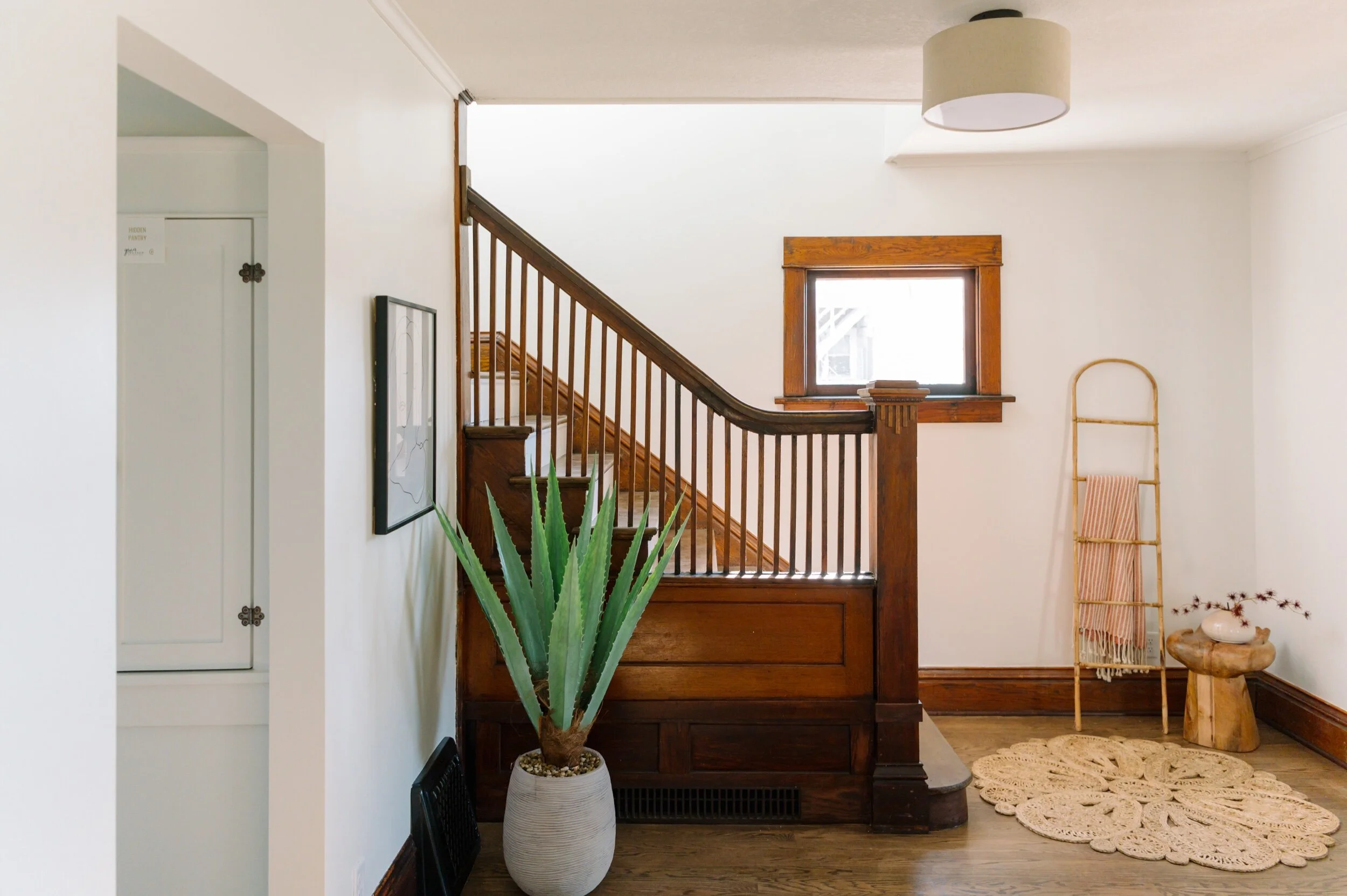
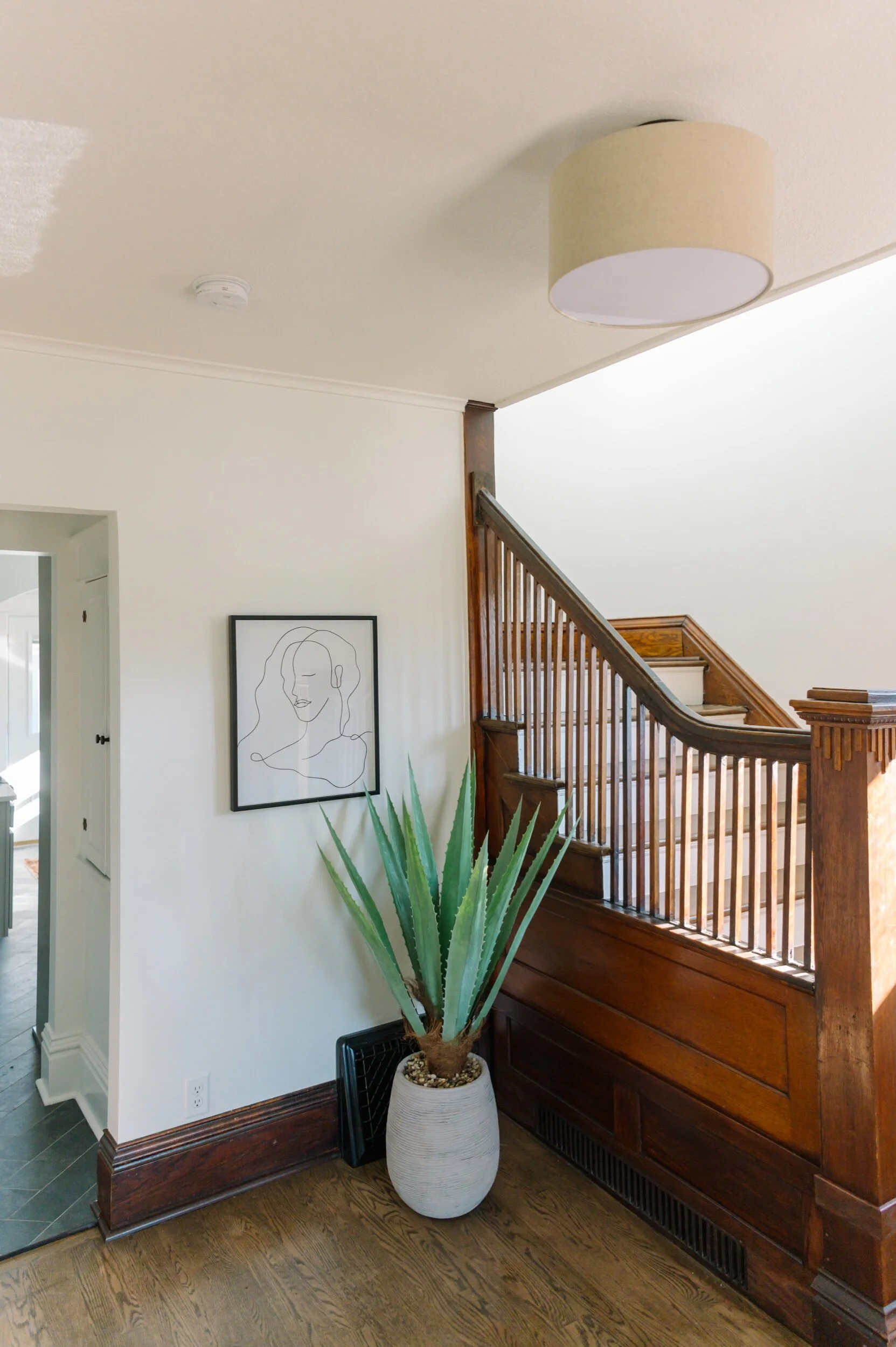
With the entry being right next to the living room, we wanted to make sure that both spaces felt cohesive and functional. We added a little side table and fun ladder/throw right next to the door, which both serve as accessories and landing area.

dsc_0964.jpeg
dsc_0972.jpeg

Dining room + Home Office

dsc_0729.jpeg
dsc_0905.jpeg

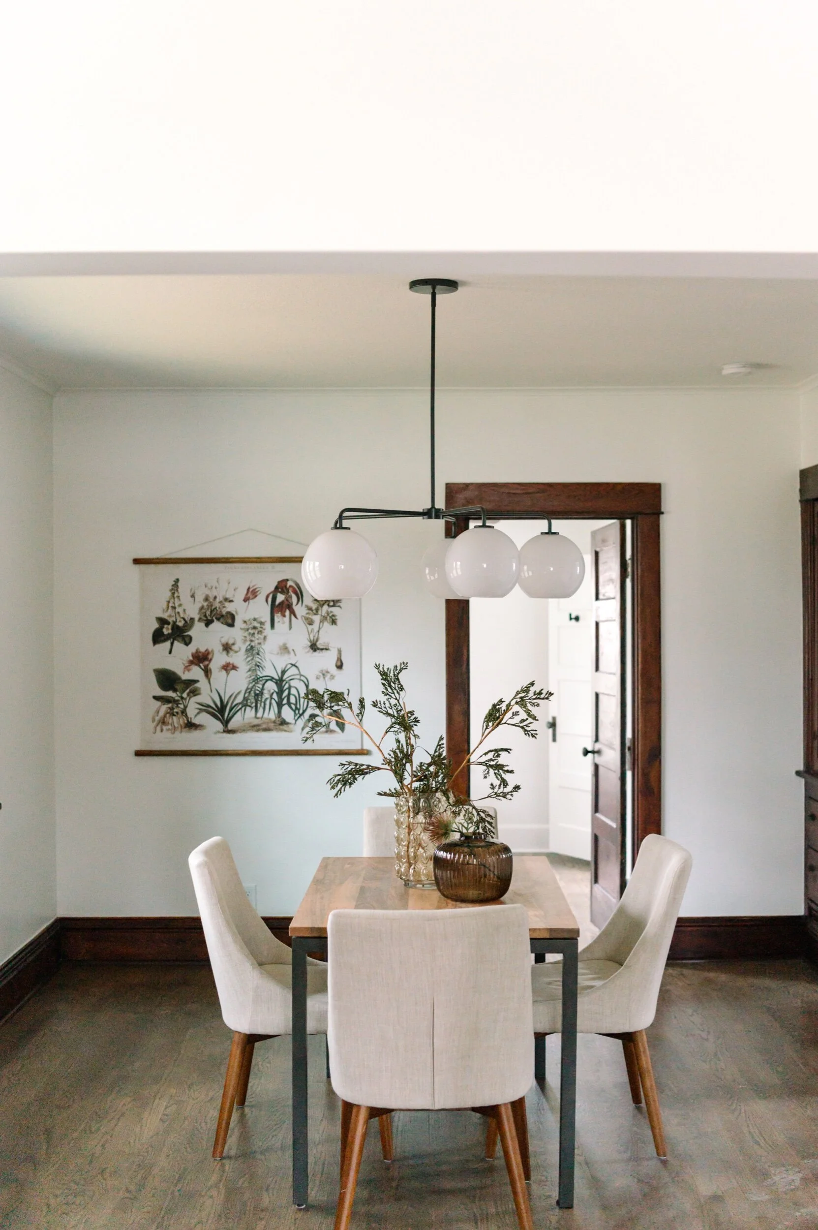
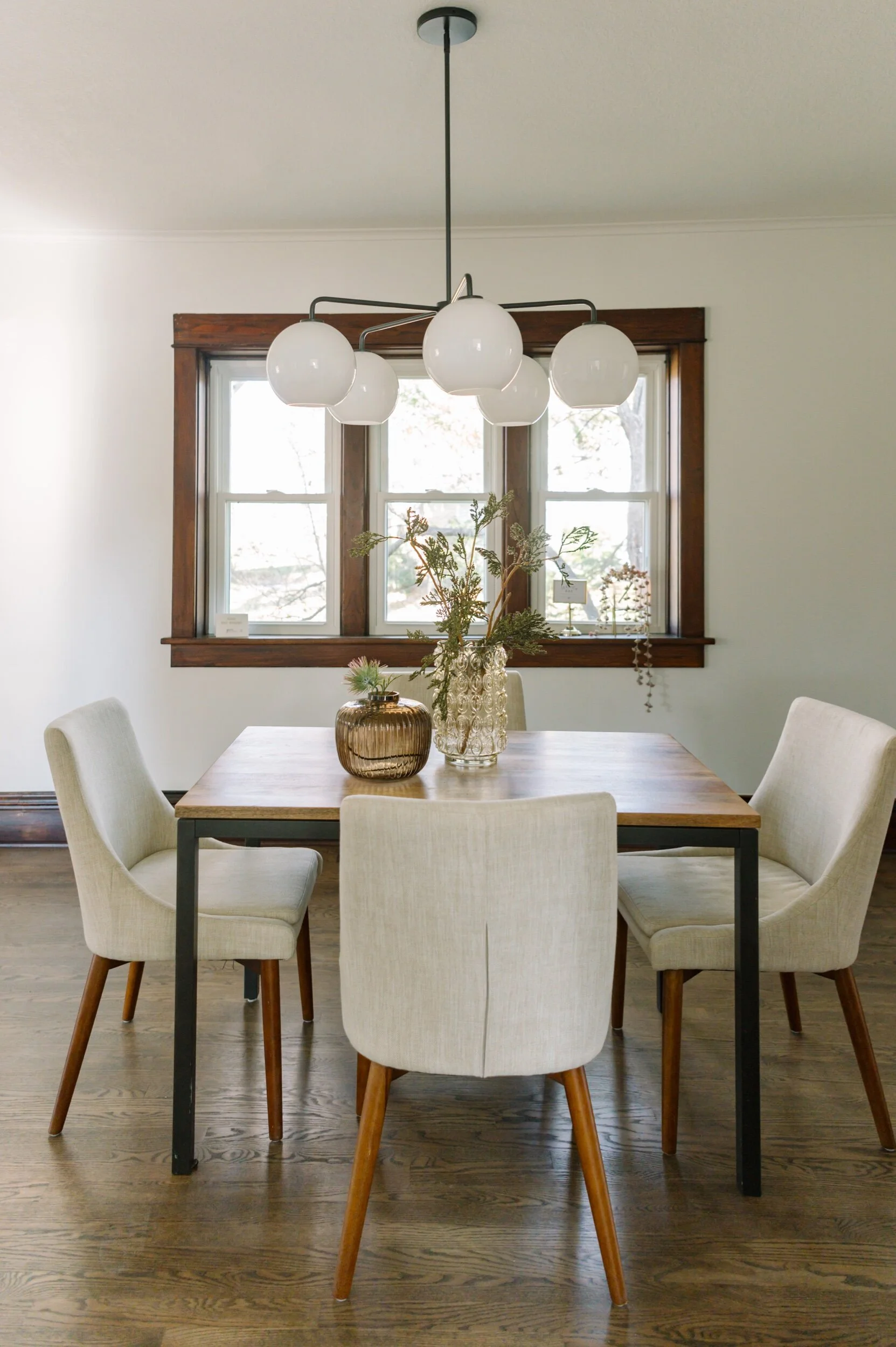
Since there is no dining space in the kitchen, this space had to be big enough to hold a lot of seating. Our goal was to bridge a beautiful formal and casual look together so it could work for any dining situation. We added a sculptural chandelier above the dining table to draw the eye in and finished off the dining table with some simple glass vases with flowers.

dsc_0913.jpeg

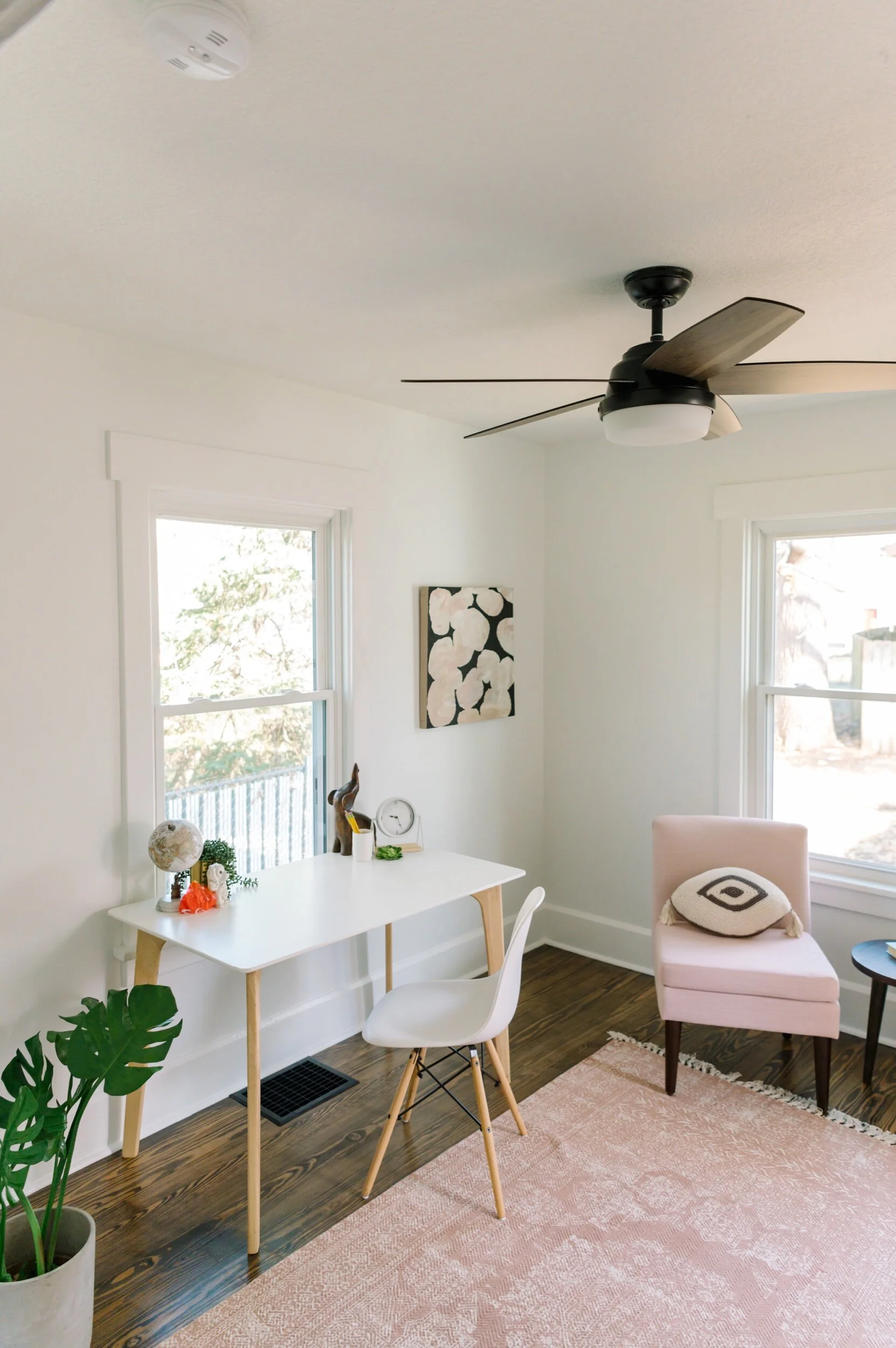
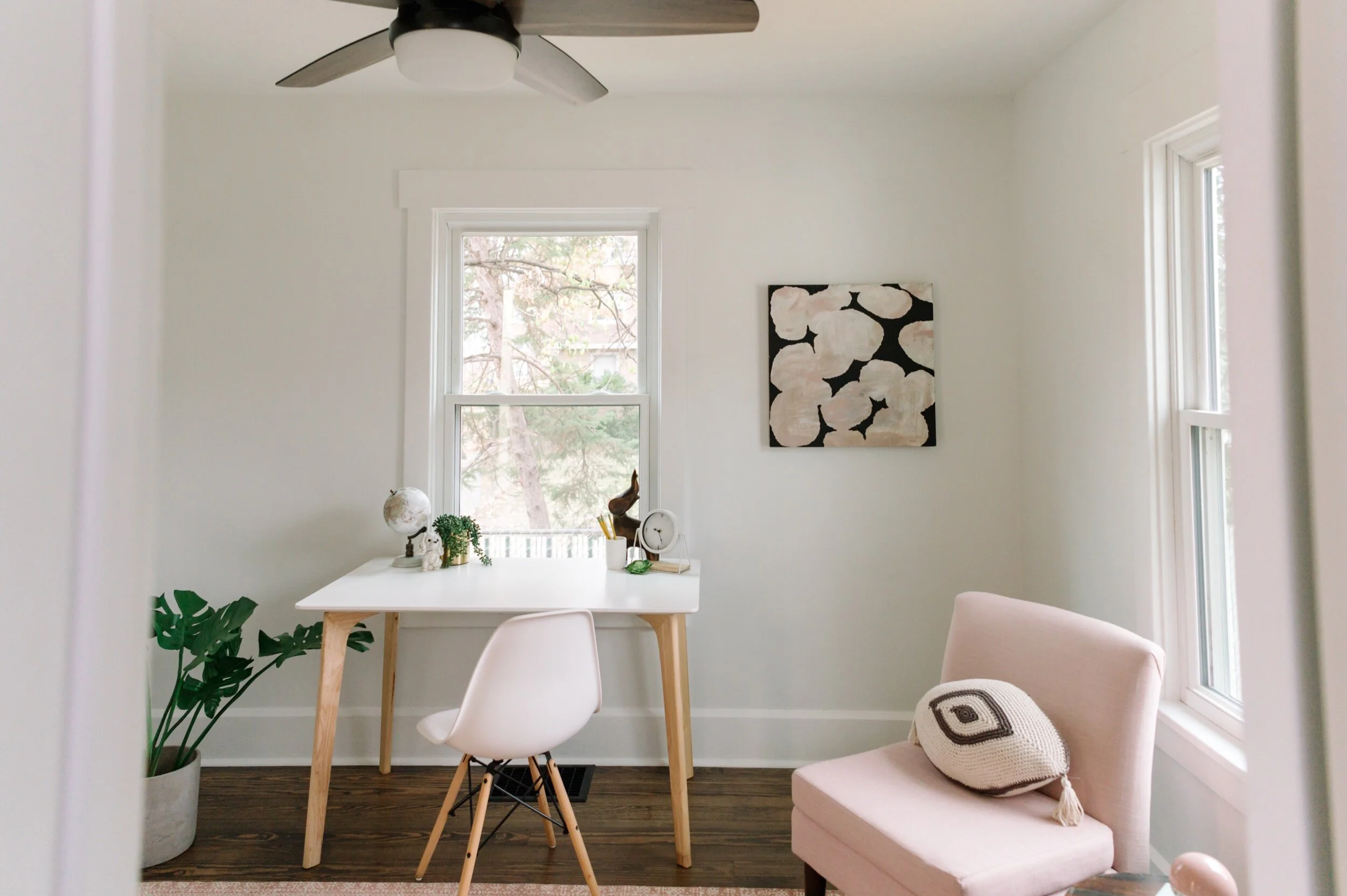
The home office is one of those spaces that often gets overlooked. For this home office we wanted to offer a retreat that was filled with natural light and pops of color. To do so we added low profile furniture to focus on the outside view from this room and layered in a colorful details such as this bright blush rug, pink accent chair, and dramatic artwork!

dsc_0788.jpeg

Thanks for following along on our journey through this project! Next, we're sharing the upper level so be sure to check back in soon for more of our 1115 35th St house tour!

Looks We Love: Art of Life Salon Mural

Happy Monday everyone! A fresh start to a new week and we are one week closer to holiday season (woohoo!).

Back at JRI the office, we have been collaborating on some really fun projects this month. This week we wanted to share an amazing mural collaboration we did for Art of Life salon in Urbandale. We partnered with Kat Rivera owner of Kats Painting, a super talented local artist to curate custom paint treatments for their spa rooms. The murals serve as show-stopping art pieces but they also help tie in the addition to the main salon area.

The Spa was a new addition that JRI helped design from top to bottom (we will be sharing more of this project later).

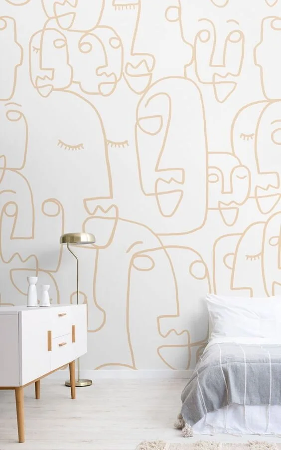
Below are a few inspiration pictures we pulled together for the mural designs.

Inspiration picture via Pinterest.

Inspiration picture via Pinterest.

Inspiration via Pinterest.

Inspiration via Pinterest.

Murals are one-of-a-kind art pieces that offer a unique opportunity to add drama and create a statement. Keeping that in mind, we used the mural designs strategically to highlight different architectural features of the salon and create a soothing, luxurious feeling within each room. The paint treatment in the Art of Life salon helped elevate the already beautiful main area.

Art of Life Main.

1O3A2846.jpg
1O3A2850.jpg
1O3A2910.jpg
1O3A2913.jpg

Spa Suites

1O3A2887.jpg
1O3A2875.jpg
1O3A2950.jpg
1O3A2959.jpg
1O3A2960.jpg
1O3A2967.jpg
1O3A2988.jpg
1O3A3004.jpg
1O3A3007.jpg
1O3A3017.jpg

The murals turned out amazing! Be sure to visit Art of Life Salon in Urbandale to see this real-life work of art in person. You can also follow Kat Rivera and Art of Life on their socials!

5 Easy Design Tips and Tricks For Any Home

Design shouldn't feel daunting, today we are breaking down 5 of our favorite design tips and tricks that we incorporate throughout our projects. These are easy to implement and can make all the difference in your home!

Keep reading for some of our go-to design tips.

  1. Every Room Needs A Focal Point.

    Focal points draw the eye in, they create interest in a room, and they also give your eyes a place to rest. A focal point in a room can be anything from an accent wall, to a large art piece, to a statement rug. Perhaps the focal point of your room may already be an original element of your home. For example, you may have a brick fireplace in the heart of a room that can be updated and implemented as the focal point!

DSC_6464.jpg
DSC_8726.jpg

2. Space Zoning.

While designing a room it is important to establish room function. One easy trick to designing small spaces is to remember to create “zones”. These are furniture grouping areas that feel separate but still cohesive to the rest of the room. One of our favorite ways of creating zones is by layering rugs for reading nooks/seating areas, console tables for drop-zones, and benches to divide living room-dining etc. Creating zones in a space helps establish seperate functions but creates unity.

DSC_6468.jpg
ZZ6_3094.jpg

3. Establish Your Traffic Areas.

This is what we call the “flow” of a room. When designing a space, we like to imagine high traffic zones, and find the best ways-in and out of rooms. Making sure you establish clear traffic zones first, helps determine the best placement for your furniture, which creates an overall sense of “flow’ in a room!

DSC_8581.jpg
DSC_8687.jpg

4. Finding the harmony.

In any design, it is important to use a cohesive colors and textures. This is especially true when trying to find the perfect balance of neutrals and warmer, richer tones. There are many ways to blend these two concepts, but one really good example of this would be to contrast a blue rug (cool tone) with a leather accent chair. A kitchen island can be crisp white but contrasting that with warmer cabinets or shelving can bring that perfect harmony into a space. Balancing these two can be tricky, but don’t be afraid to try different hues of cool and warm.

DSC_9754.jpg

5. Photo Finish

Whether we’re designing an entire home or doing a one-room update, we’re always thinking about how we can carry cohesive elements throughout a home. One of the many ways we do this is by telling a color story via artwork, pillows + accessories, or metal finishes. One helpful tip is to think of each room as a part of a whole.

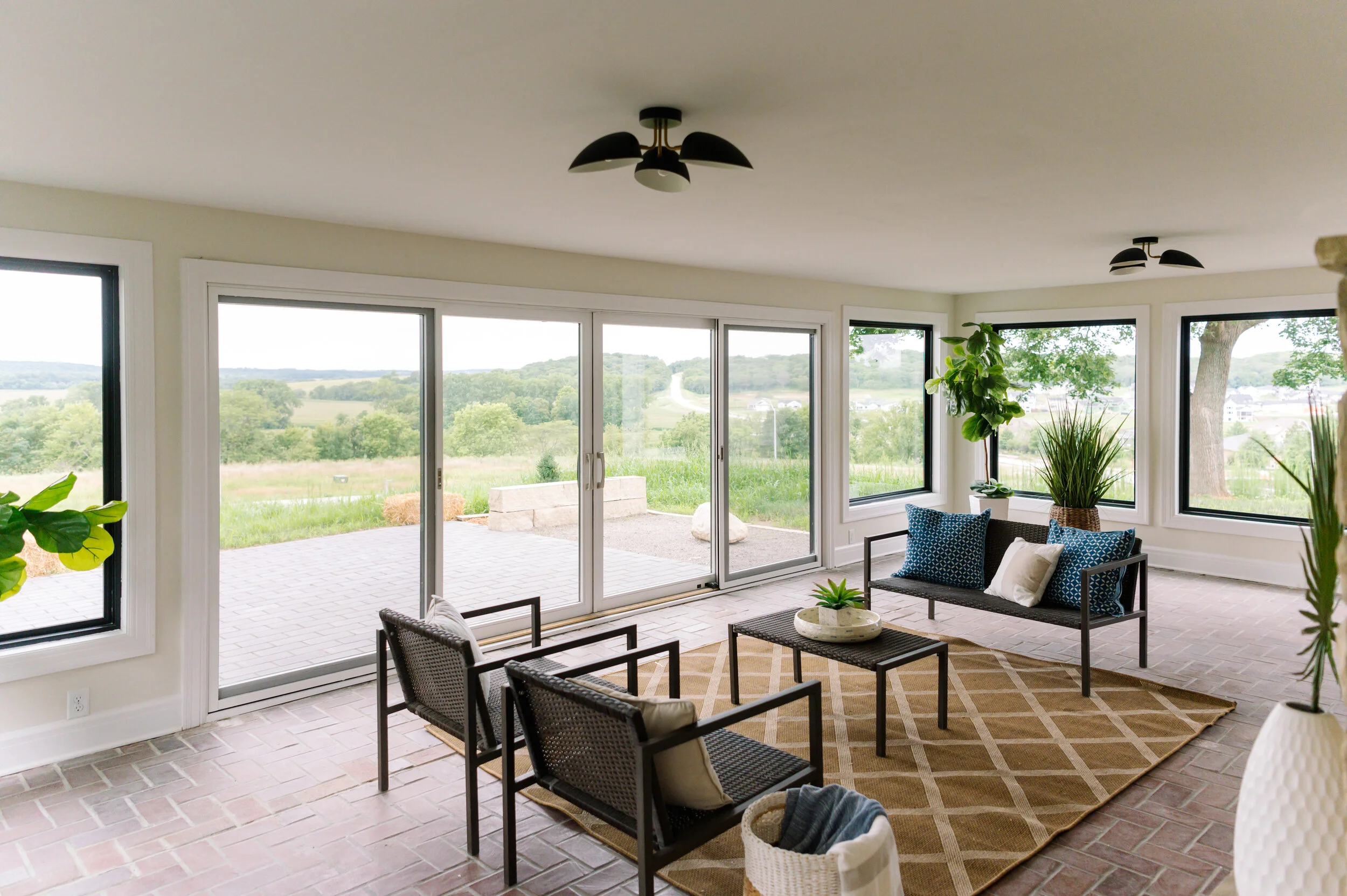
When designing kitchens, we will often carry hardware or appliance+ plumbing finishes to the rest of the house. Although two rooms look completely different, that repeating element ties them together!
DSC_9739.jpg
ZZ6_8352.jpg

There you have it! 5 easy tips for designing any home. We hope that these will be a guide for your next home project and stay tuned for more helpful tips and tricks from us!