Alt Design Studio and Alquist x Virginia Tech 3D Home Collaboration

We are excited to announce our collaboration with Alquist and Virginia Tech in designing a 3D-printed single-family home that is the first of its kind in the U.S. This project aims to solve the affordable housing crisis by bringing low-cost, sustainable, and resilient 3D-printed homes to rural communities across the U.S. Ground work on this home broke in early June at Richmond, Virginia, and is slated for completion in October. Beyond Richmond, Alquist is working to expand their planned projects to rural communities in Arkansas, California, Iowa, North Carolina, Pennsylvania, North Dakota, and more.

This three-bedroom, 1,550-square-foot bungalow-style home will have smart-home features such as emergency management: smoke/fire detection, security, and alarm: motion detection, and energy consumption optimization. The Richmond prototype is being built using a concrete pour mix in layers from the printer creating 3D printed exterior walls. The natural thermal properties of concrete mean the home will be sustainable as well as cost-efficient.

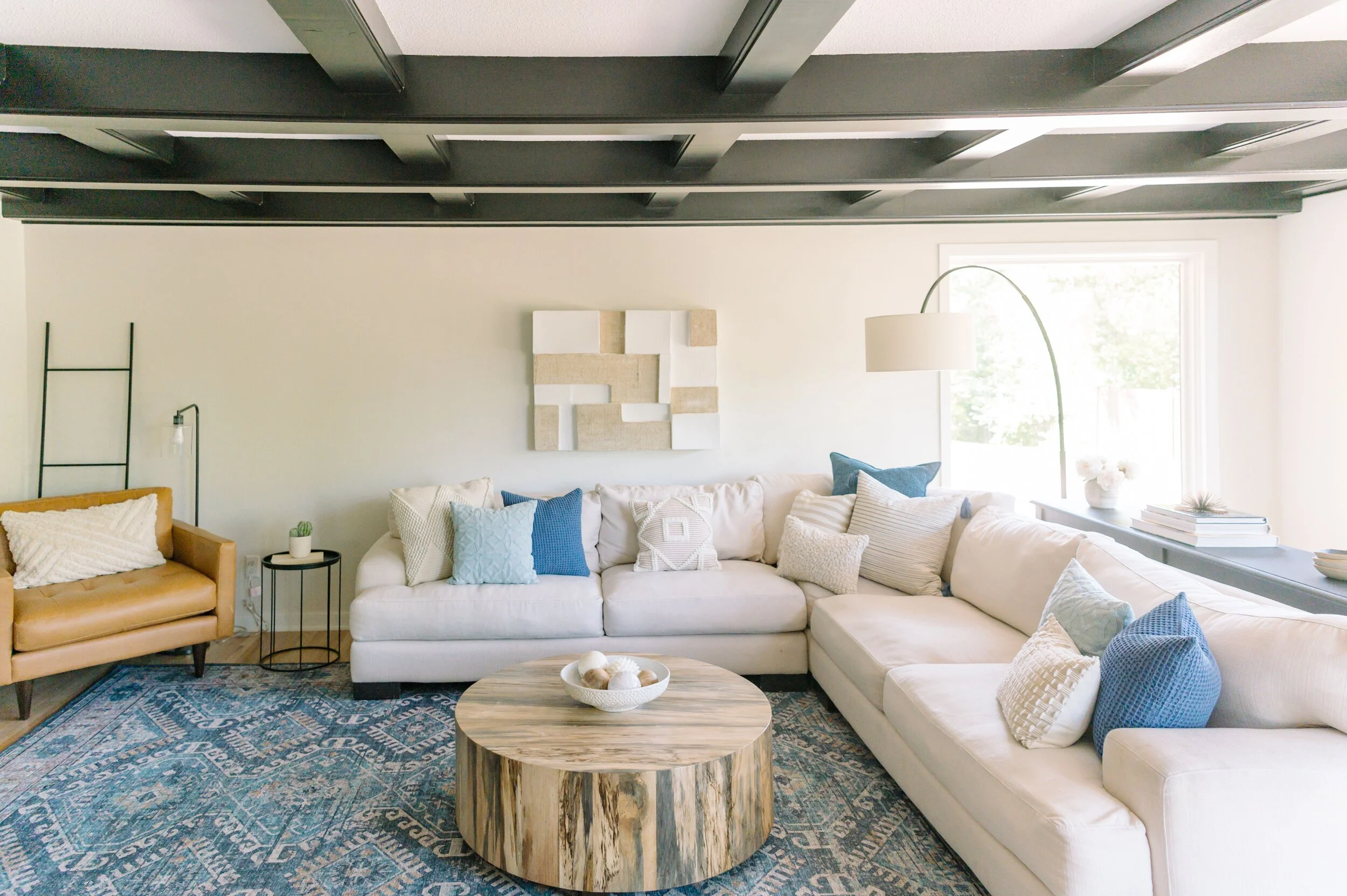
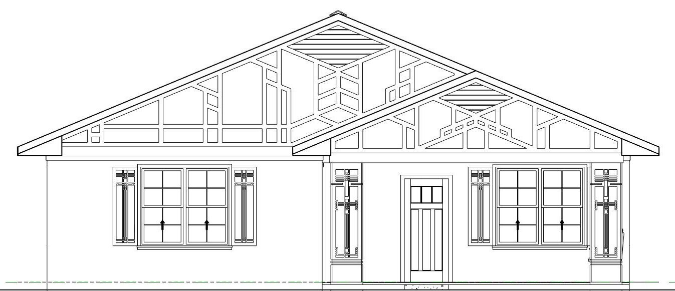
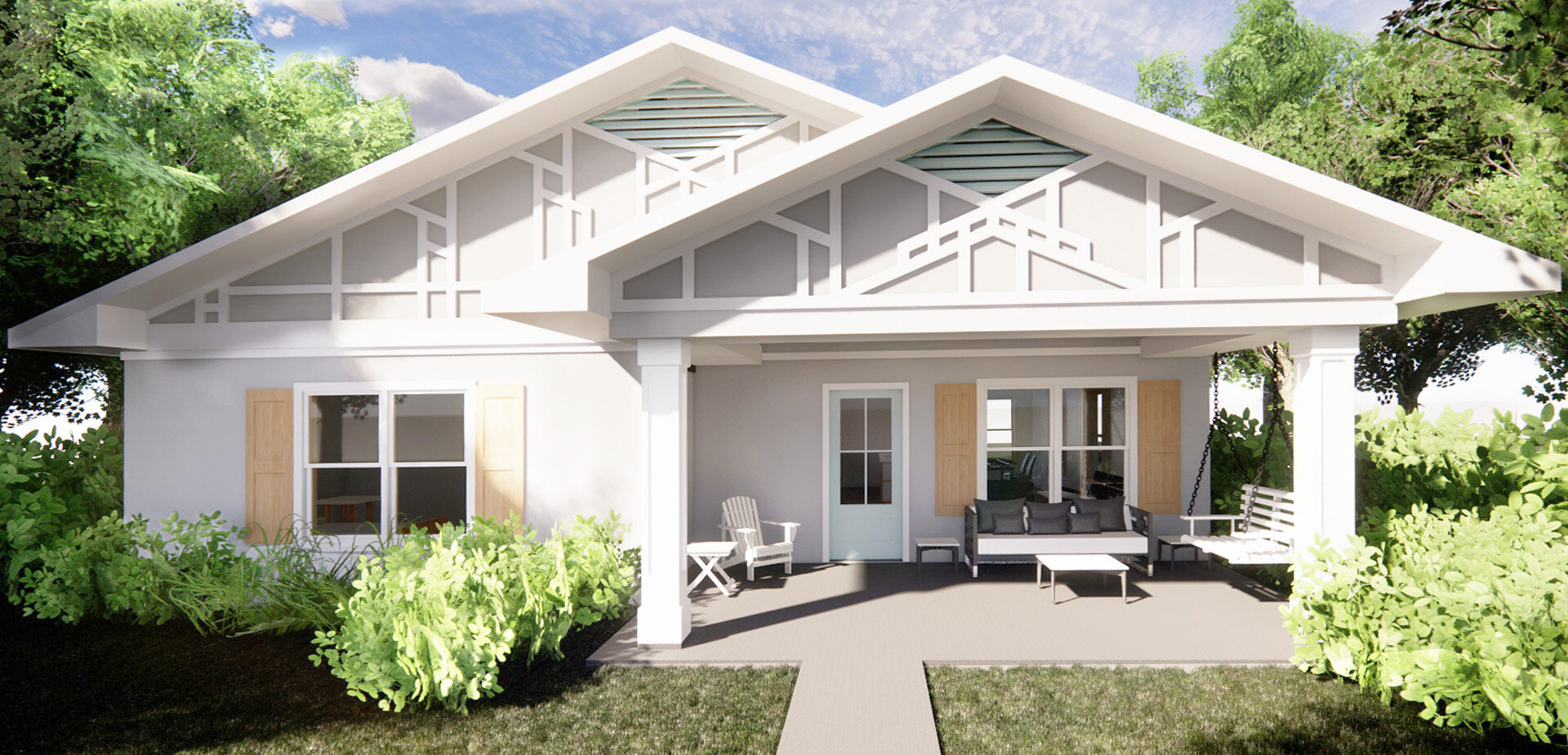
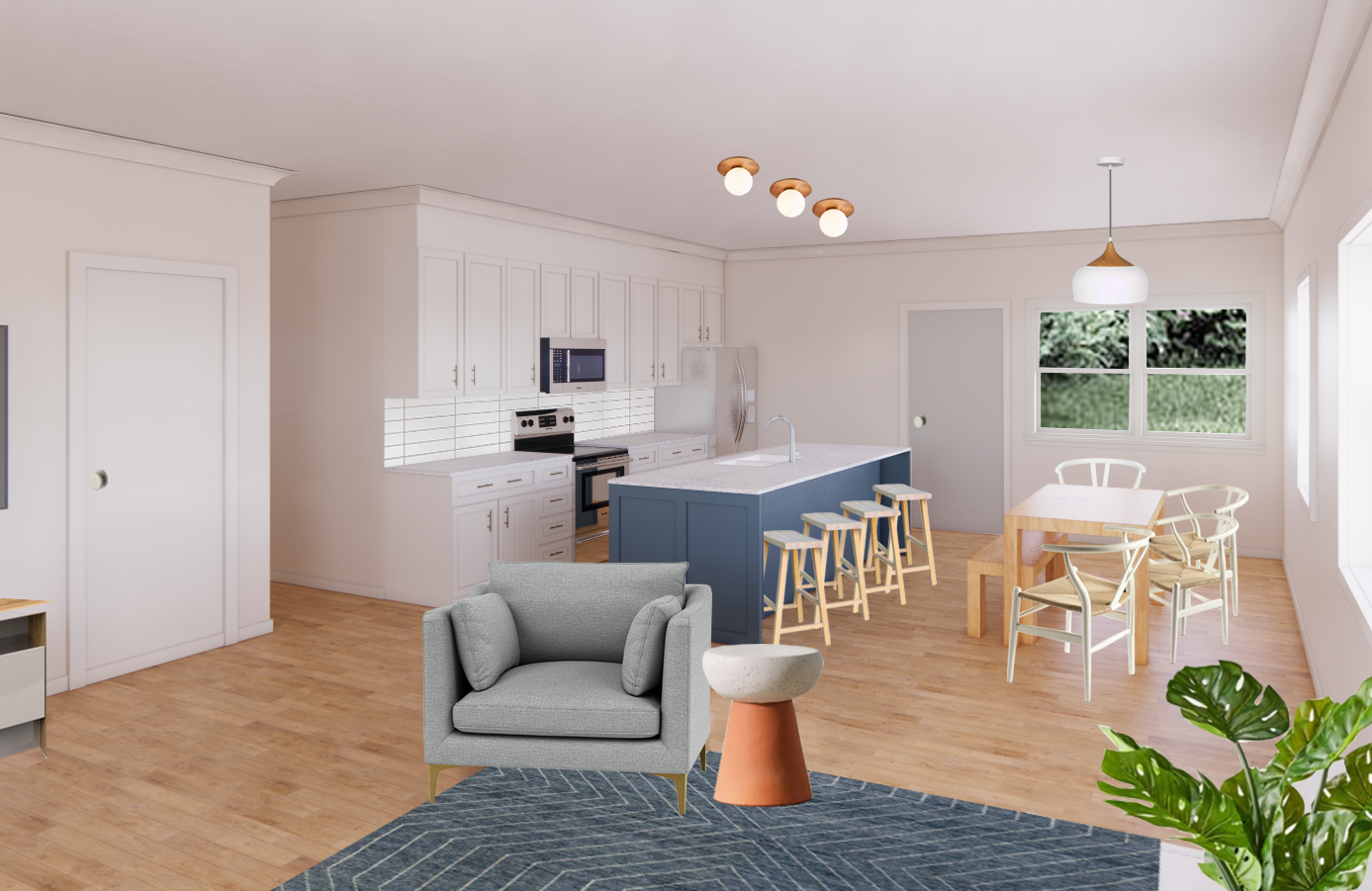
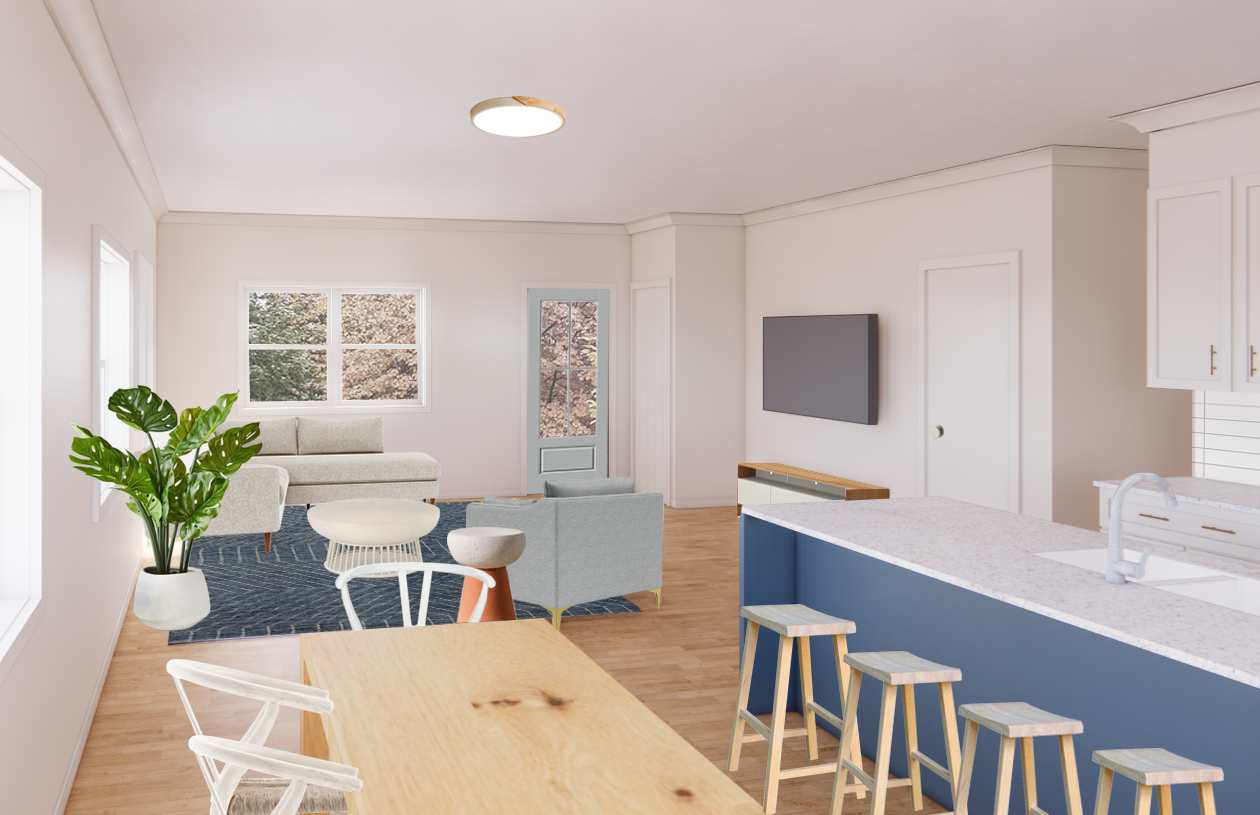
Our design team created interior and exterior 3D renderings, assisted with design selections, and we will be staging after construction is complete. The home will greet the street with a swing-equipped covered front porch, decorative gables and trim accents, with a contemporary coastal design aesthetic brought from the outside in. Check out the link to the live feed of the printing being done now! https://www.facebook.com/events/3951354534990556?ref=newsfeed

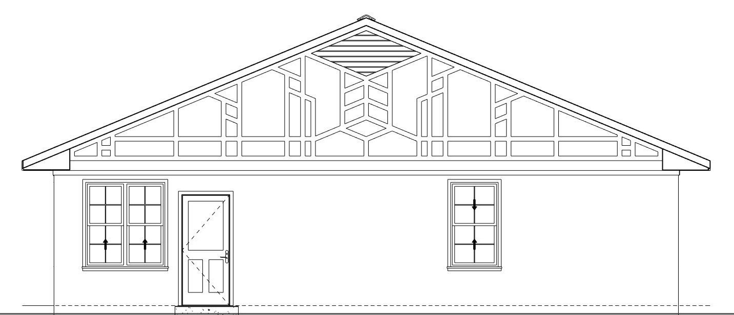
Exterior Plans:

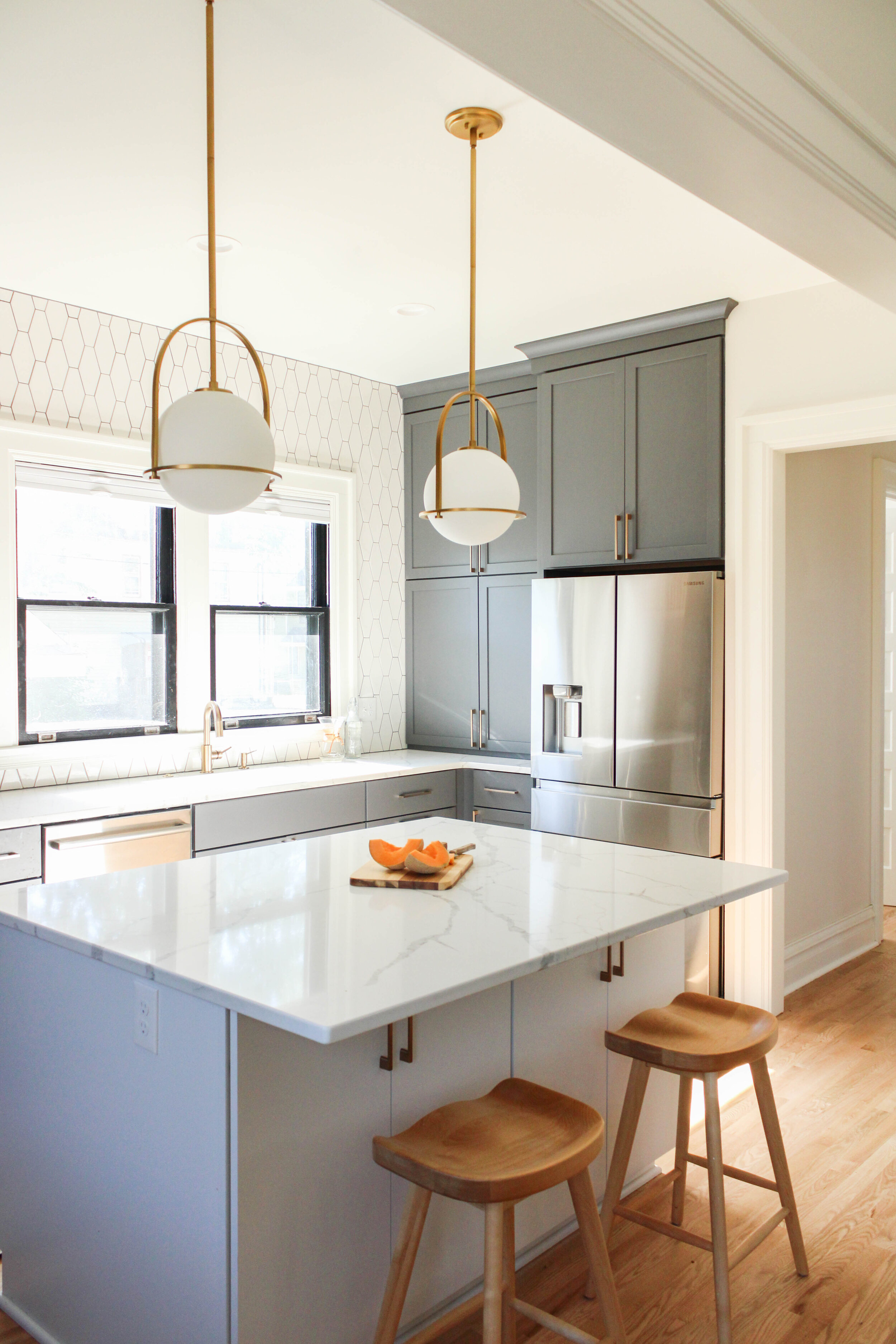
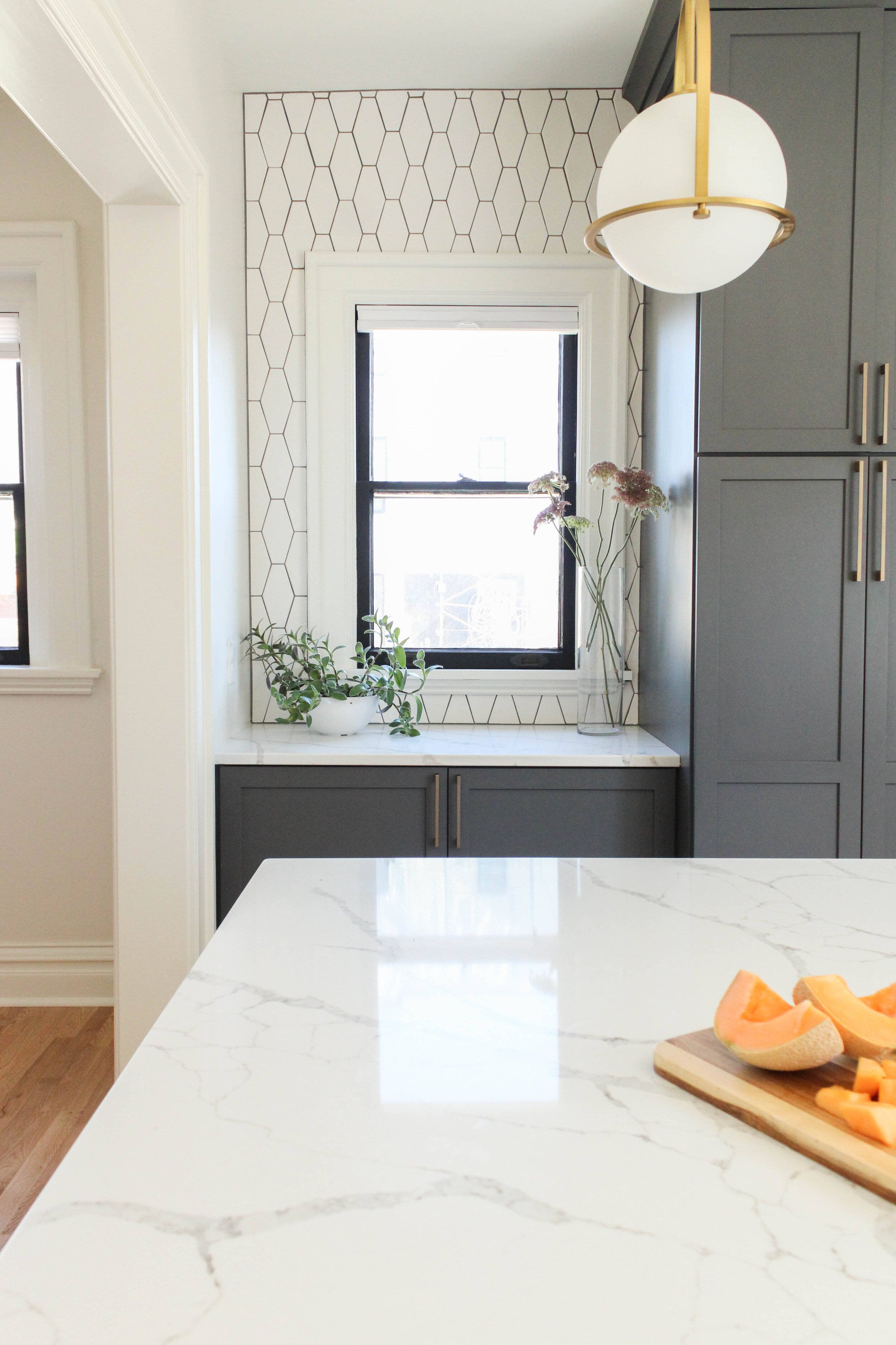
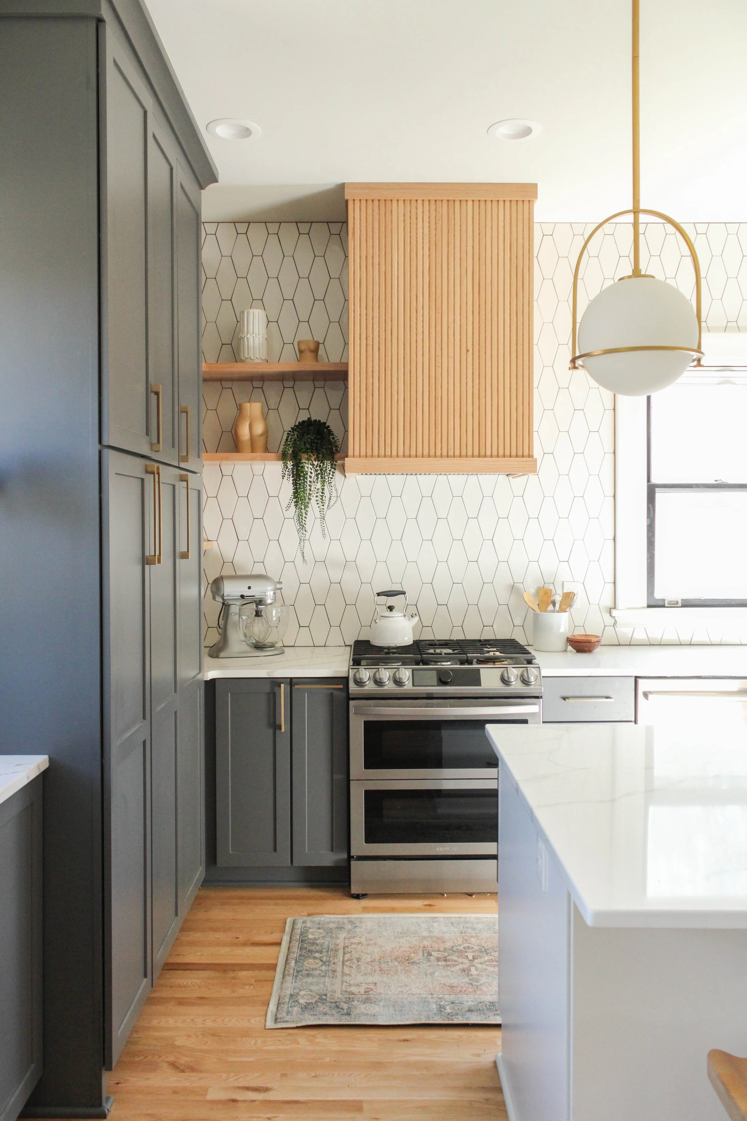
837 19th St. Kitchen Reveal

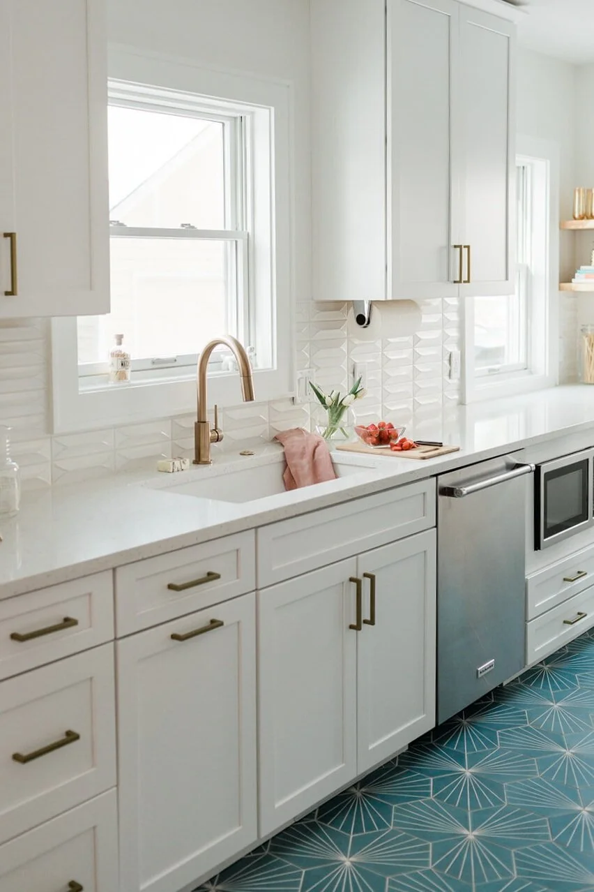
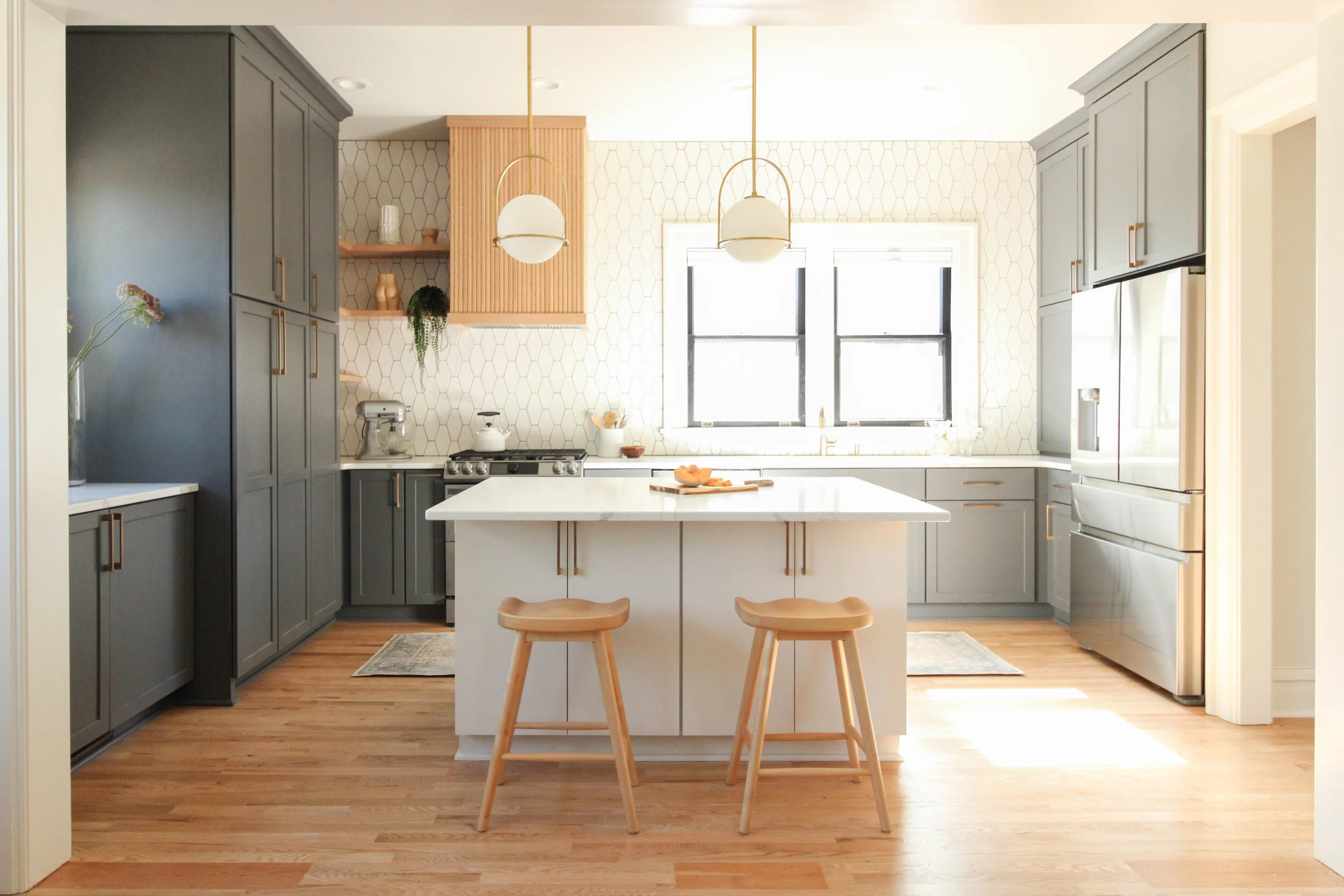
This 1903 American Foursquare, the north triplet, was fully restored to its original layout after being a multi-plex apartment in Drake Neighborhood. We always had the intent to go a little more modern on this one. Our planned to mix stains, metals, patterns and top it off with funky fixtures. The buyers came along in the 2nd phrase of the project and were totally on board with our ideas. We collaborated and came up with a kickass kitchen full of character and beauty. Since we typically use a lot of neutrals in our designs, we really wanted to incorporate warm tones in the design. The dark tones really pop off the fun backsplash, the clear coat hardwood floors provide a lighter base and we wanted to make sure we tied that into the rest of the design. Drumroll please!… the custom hood cover and corner shelves. Instant warmth that added a more organic feel to a what could have been a lackluster kitchen. The fixtures were a perfect combo of modern and traditional. The soft brass finish of the lights, hardware and sink fixture added the perfect frosting to an already, in our opinion, delicious kitchen.

Special thank you to the homeowner for sitting in on the photoshoot and being an amazing client!

-Cabinets by Cabinet Boutique

-Lights YLighting

-Developed by Laneways

-Tile - Home Depot

Homeowner Michelle Yoshimura-Smith.

Homeowner Michelle Yoshimura-Smith.

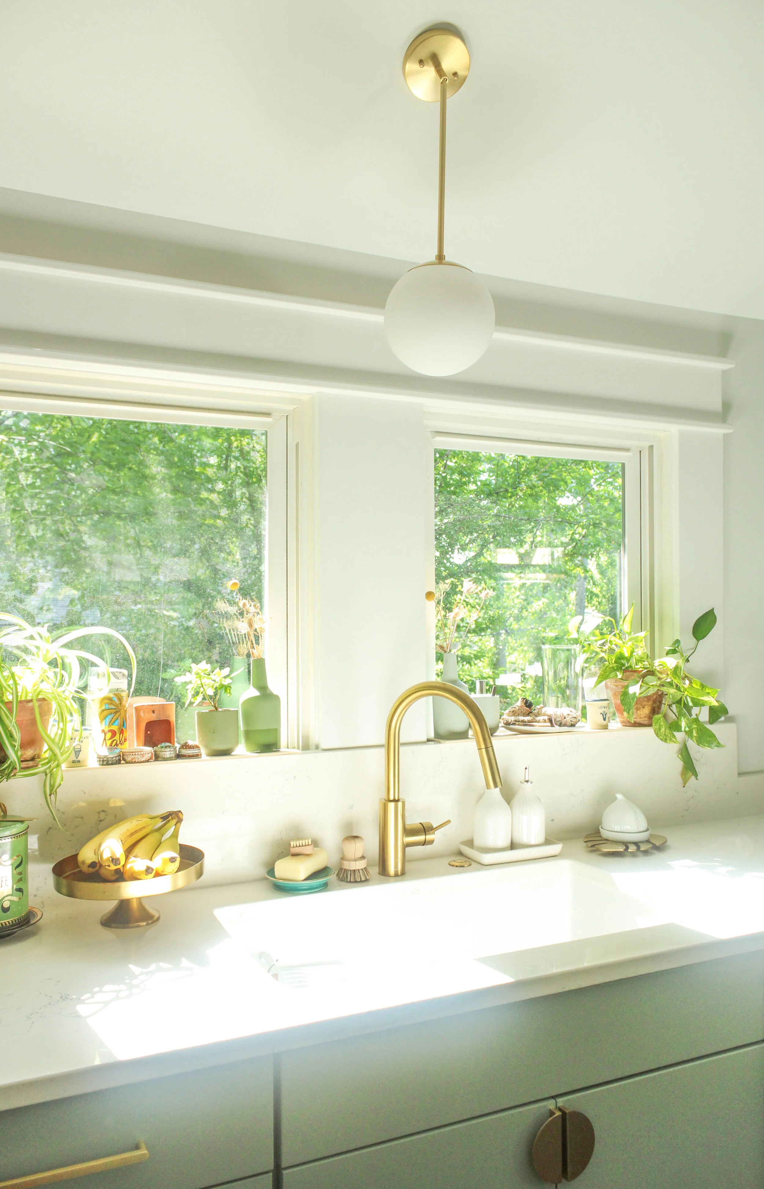
Behind the Design: A Color Inspired Kitchen Remodel

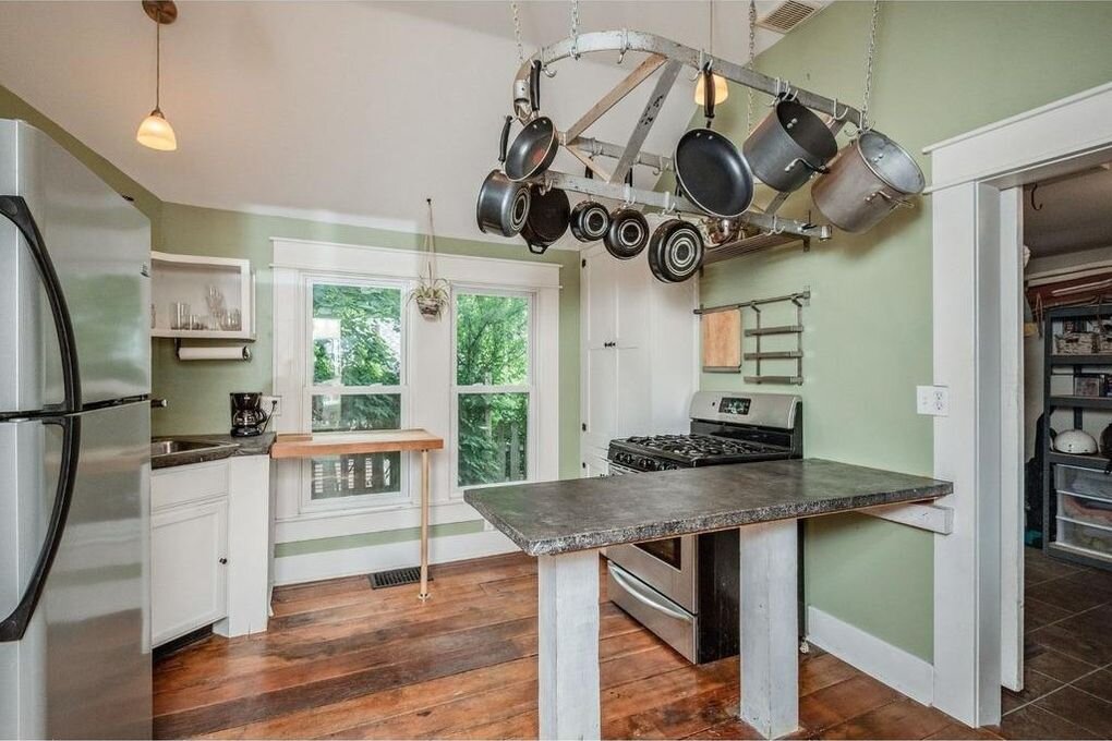
This little home was extra special to the ALT Team because Jess lived in this home about 10 years ago. Her boyfriend at the time had rescued the home from almost being condemned by the city. On a shoestring budget he brought the home back to life with reclaimed barnwood floors (pre-farmhouse trend) lol, railroad ties, concrete counters, etc. When his family outgrew the home, he turned into a rental for a bit then listed it. Tat, a friend of both of us, snagged it up!


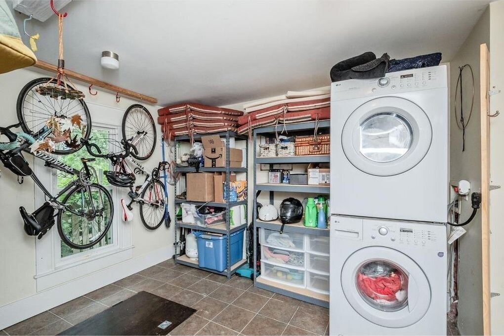
Fast forward to when we got a call to help renovate her kitchen. Jess was stoked to help make the kitchen and back storage room more functional and beautiful for this 993 sqft home.
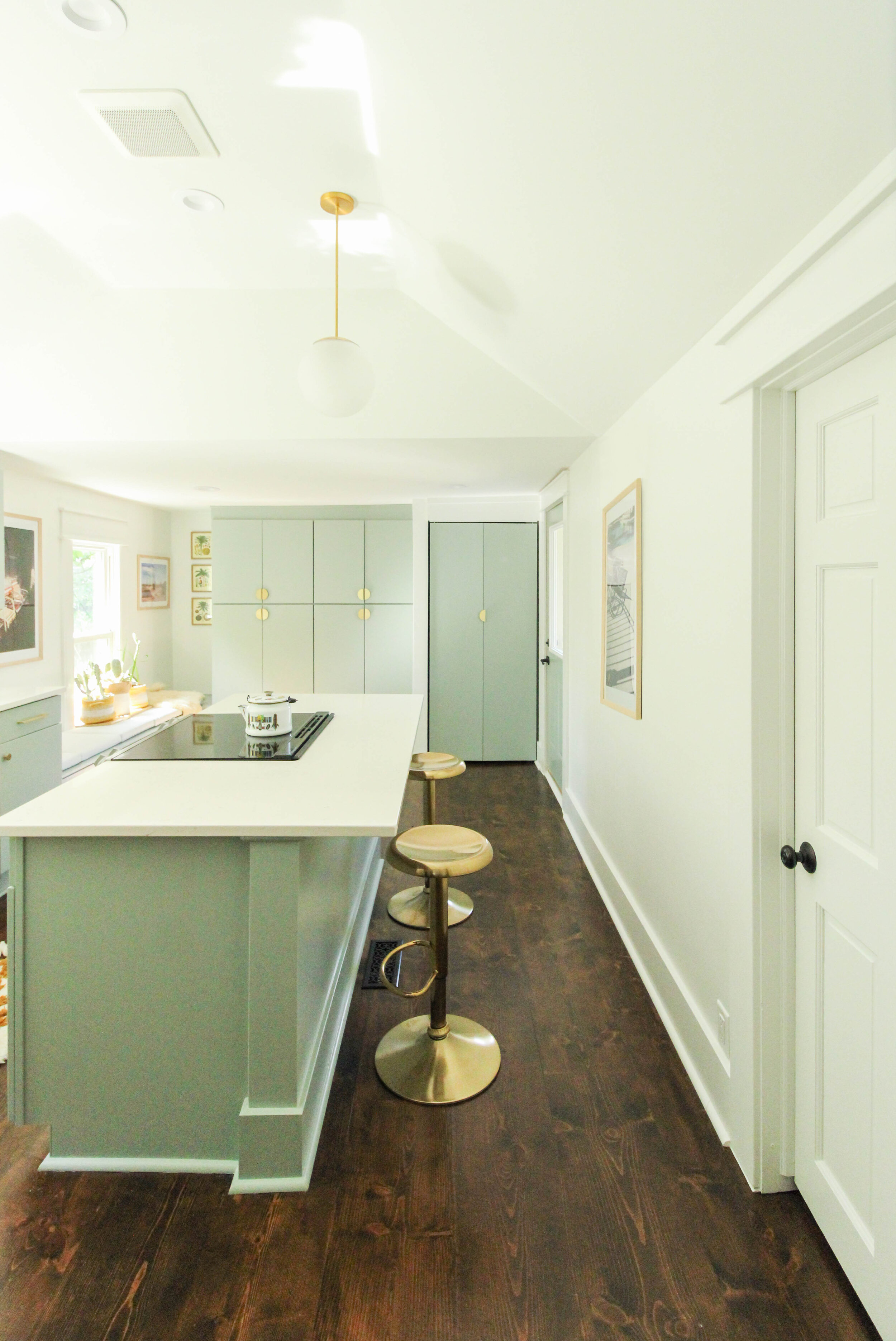
The challenges were as follows: What is an appropriate amount of money to invest into this kitchen? We did not want to outprice the value of her <1k sq ft home. With that being said, we needed to use every square inch of the space to make it feel more like 1,200 sq ft instead of a 1,000 sq ft home. Removing a wall, relocating the sink and stove, adding an island, utilizing the back room with floor to ceiling cabinets and possible dining space was a game changer. Can we say accomplished?!

+ Design for budget and function = work around the basement access in the floor by the built-in bench.

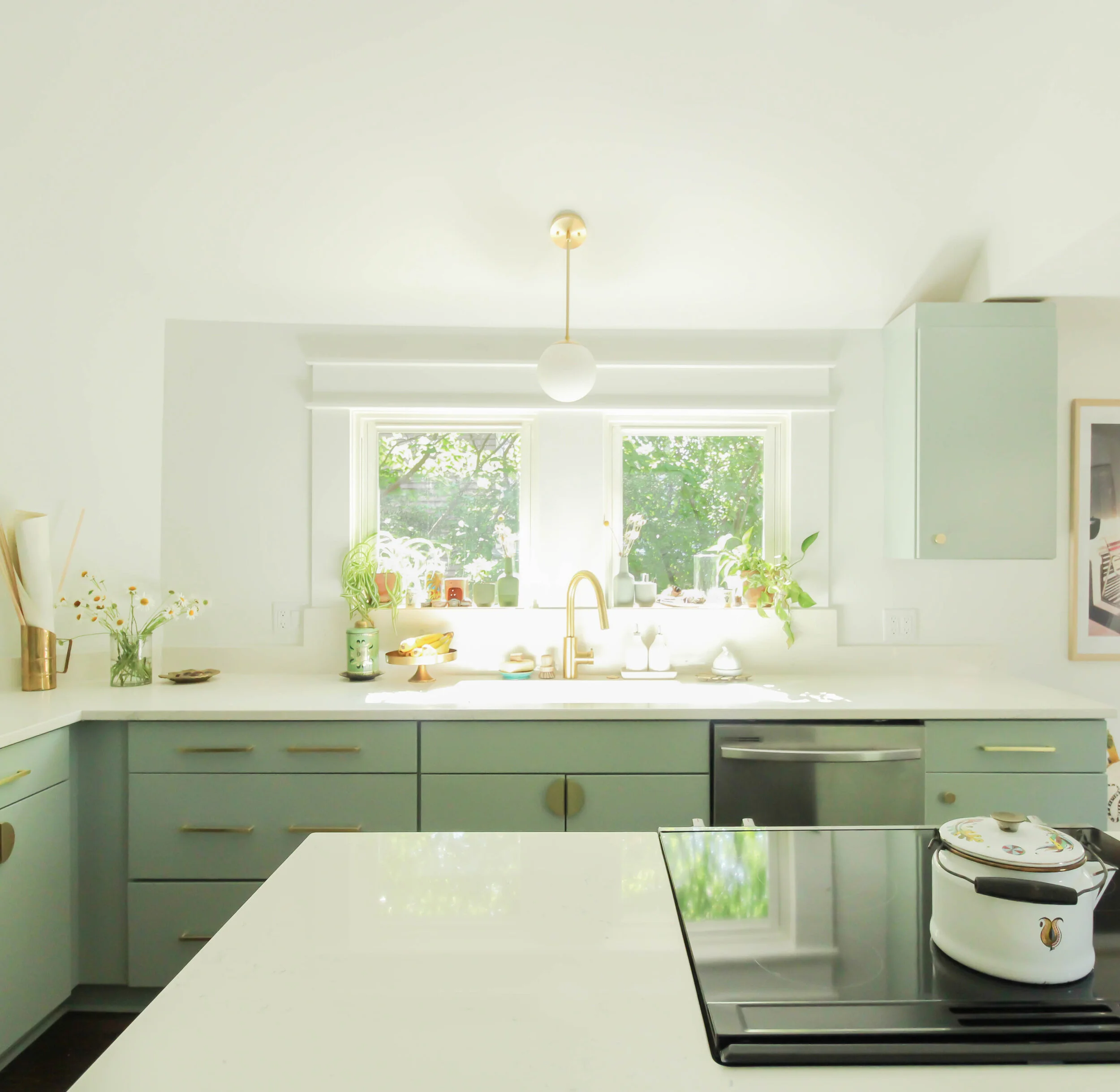
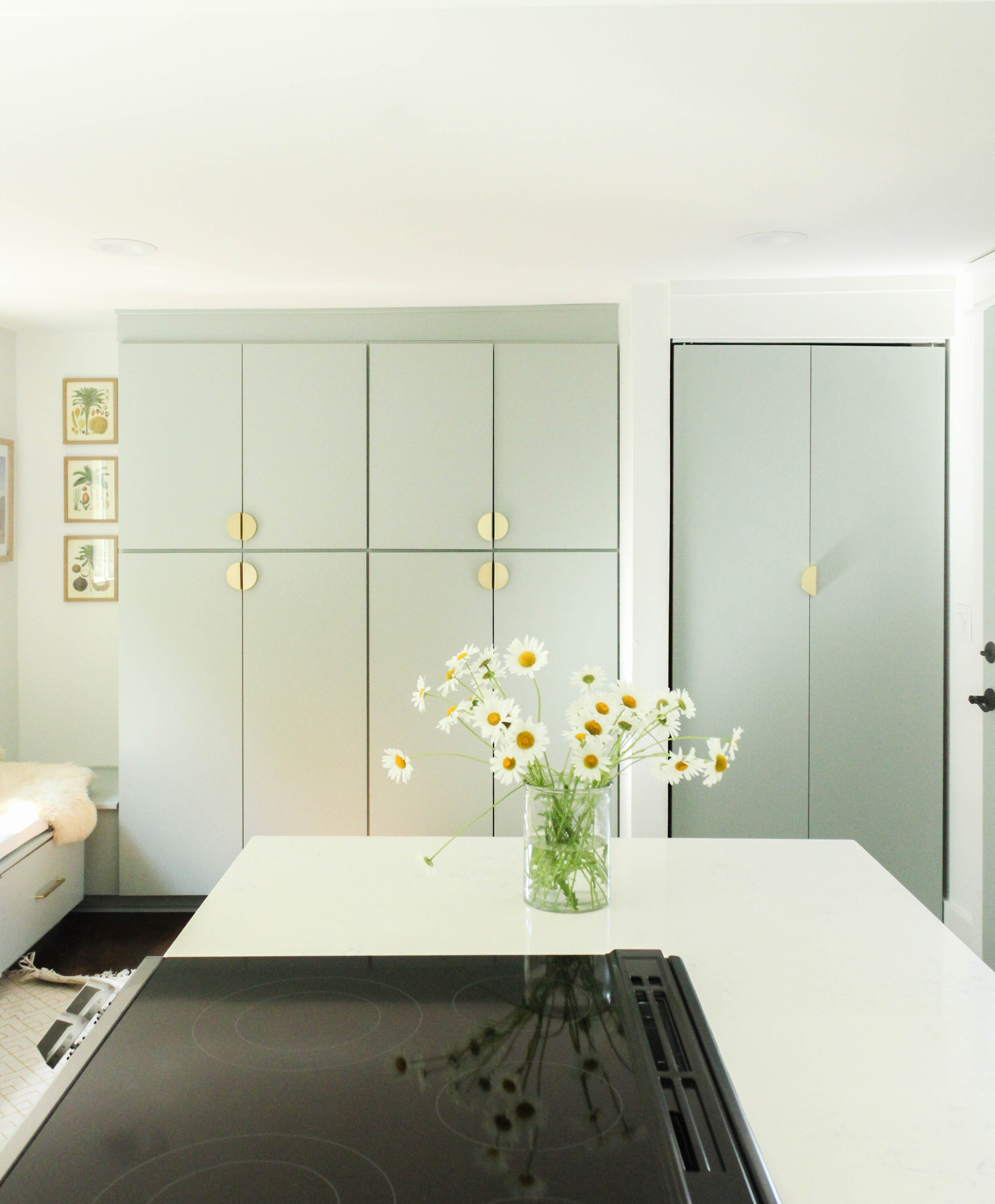
+ Pick the most perfect shade of soft green. Fun story - the color was inspired by Tat's talented graphic designer sister’s pottery. The green color ended up being a perfect match to the cabinets and had a special meaning and place in Tat’s home.

+ Fixing the uneven floors. The height difference between the tile floor in the back room and kitchen floor was over 2". Tat also did not care for the reclaimed wood in the kitchen due to the large spacing in between planks- hard to clean. Removing the wall dividing the kitchen and back room would also require major floor patching. Solution - replace the entire kitchen floor and shore up the back floor so it would even and one type of floor. Winning!

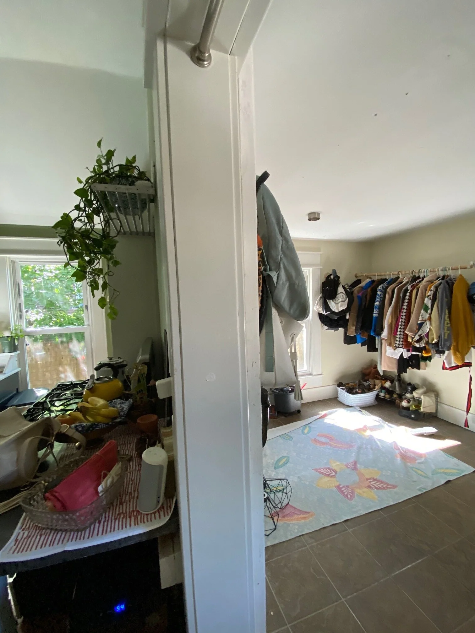
Before

ecc265025938f1340638896cc7c80729l-m14xd-w1020_h770_q80.jpg
(Basement access door on the left).

(Basement access door on the left).

AFTER

Tat’s Sister’s Green Pottery

Tat’s Sister’s Green Pottery

IMG_7938.jpg

Design INSPO

Copy of Green and Brown DIY Collage Interior Design Moodboard Photo Collage-2.png

Thank you for following along this behind the design home journey. We loved being a part of this project!