Behind the Scenes: Simple Living in Black & White

Behind the Scenes: Simple Living in Black & White!

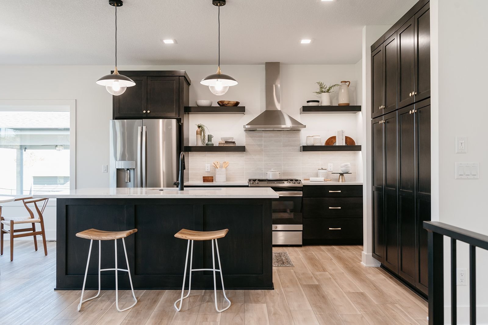
Today we are sharing one of our latest spec homes on Wolcott Circle!

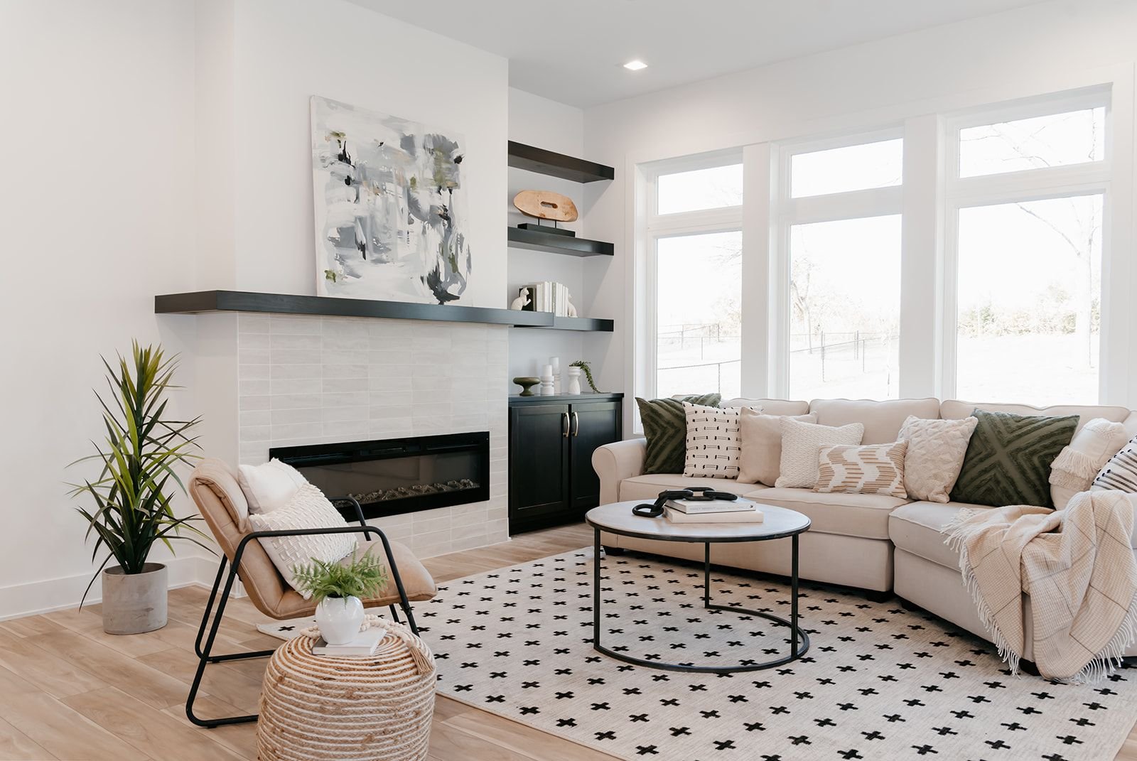
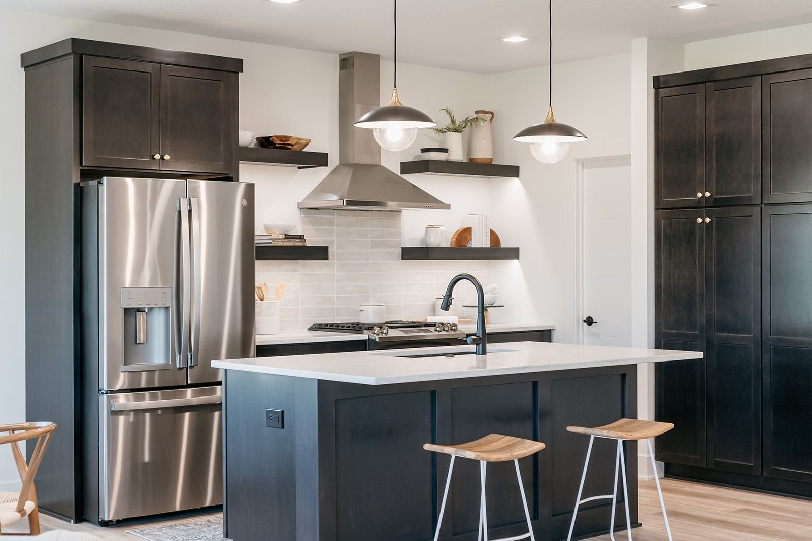
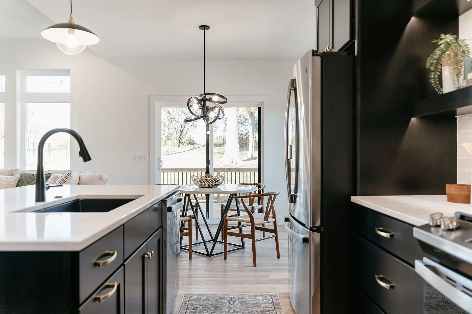
A little about the Wolcott Circle home: We teamed up with Kruse Development Iowa yet again for a new build here in Des Moines. This home shows off elements of a sweet and simple design in black and white. The open concept and neutral colors in this already sold spec home, paired with the beautiful black stain called Dusk, showcase the dramatic design of the built-ins and kitchen cabinets. Check out our photos below for a more in-depth tour of the bold and simple elements within this home!

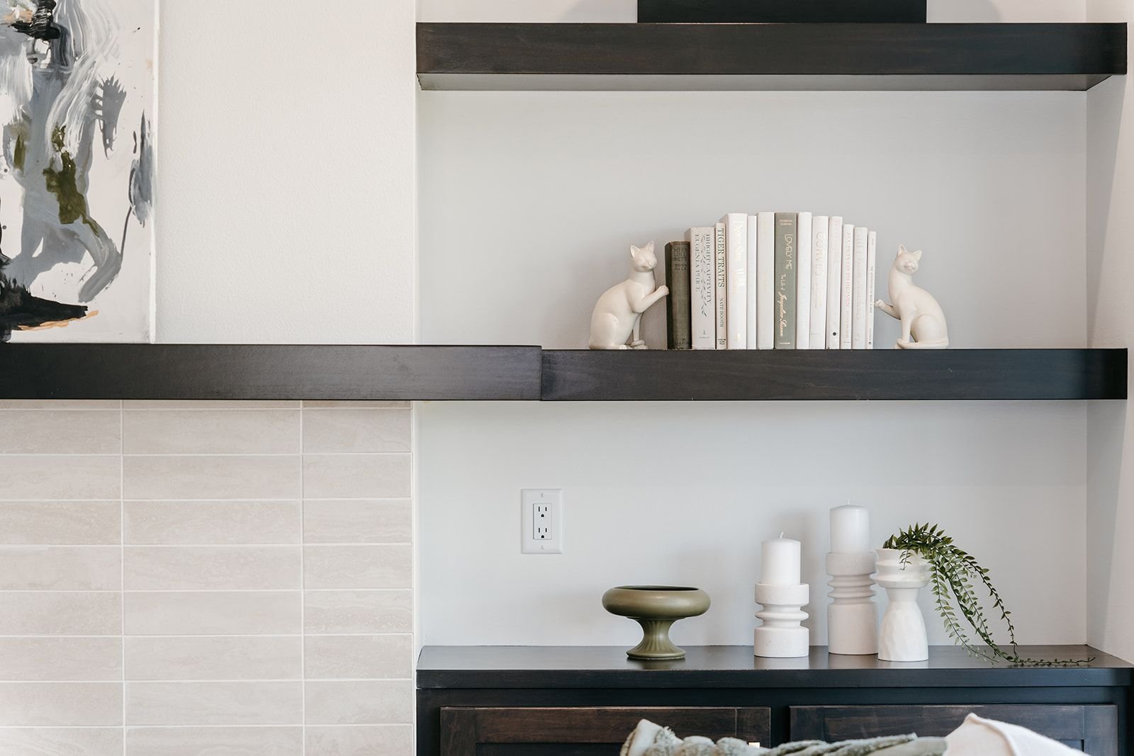
A big part of the fireplace design in this home is the asymmetric layout of the built-ins and open shelving. This adds an interesting contrast with the white stacked tile on the fireplace!

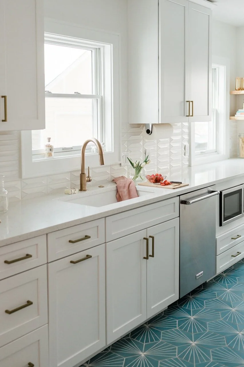
The same tile that was used on the fireplace was used for the kitchen backsplash too create a cohesive design and consistency.

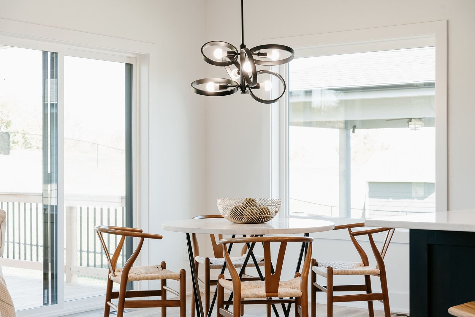
This bold chandelier creates a dramatic statement in the eat-in dining area. We love picking out unique light fixtures to add personality to our designs!

Art Class with ALT Design: Wall Art How-To

IMG_9508.JPG

Class is in session! We're here with the do's and don't of displaying artwork.

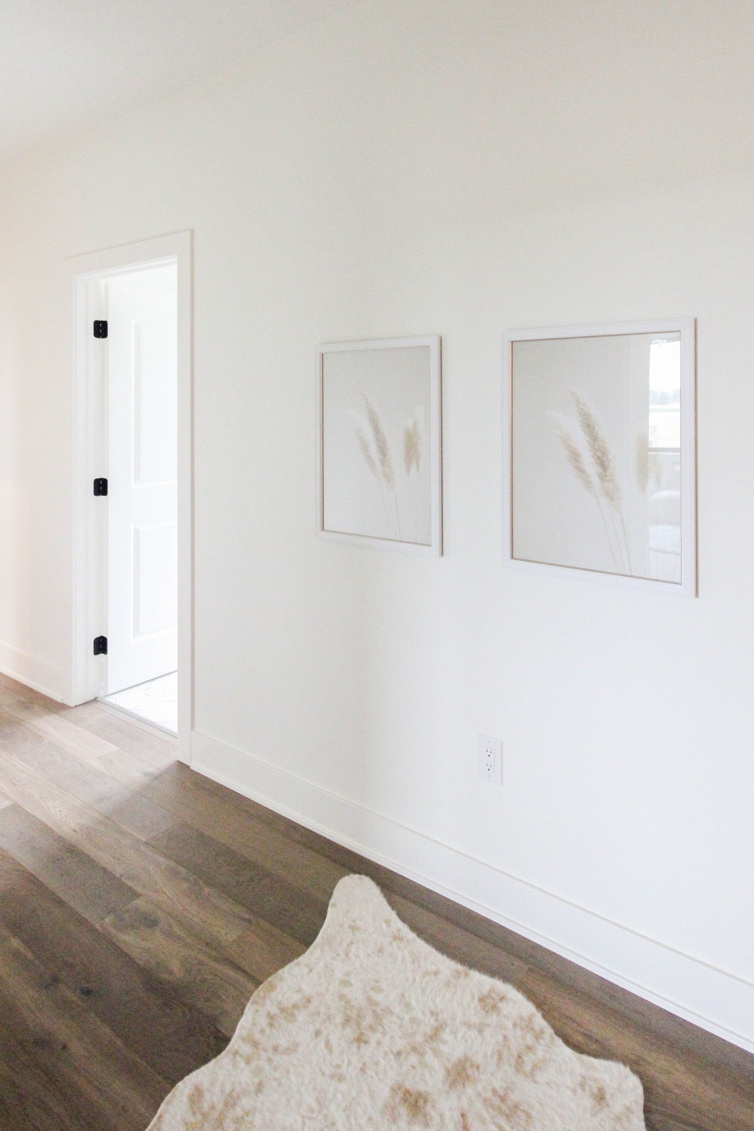
- Size matters! We see too many times artwork that is too small or too big for the wall it is hung on. A large wall deserves a large piece, or a grouping of multiple same-sized pieces to fill the wall space. Tip- If the wall space above and below the art measures larger than the art itself, it is too small.

-Eyeball it! A great rule of thumb when hanging art is to hang pieces at or around eye level. This not only balances the wall space but creates the most appropriate view of the art. This is of course just a general rule for the average height person of 5'-6' tall. :)

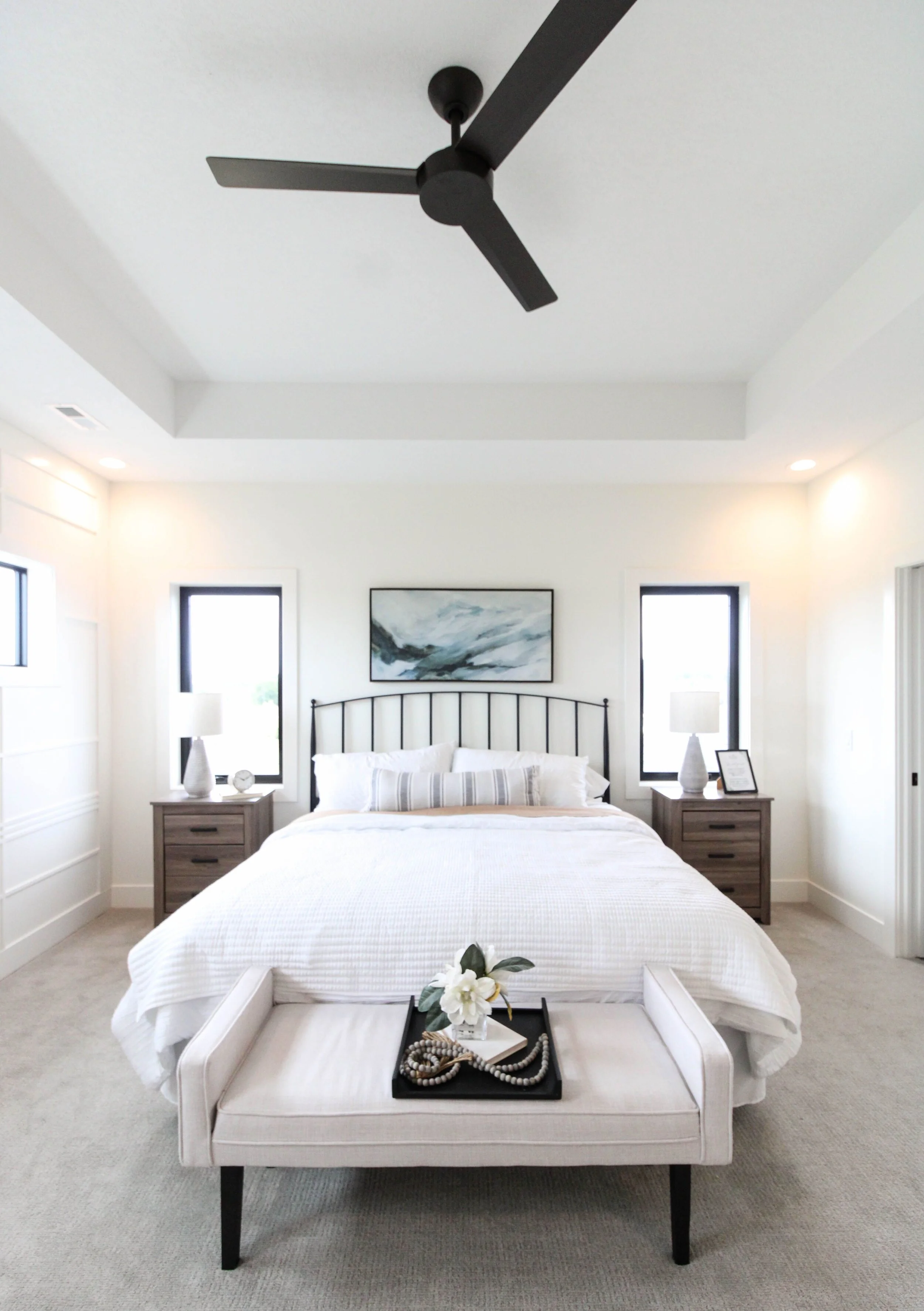
-Window Art- When placing art in between or on either side of a window- we suggest using the window size as your guide. Never hang higher than the top of the window. And always hang the art with equal distance away from adjacent windows or doors.

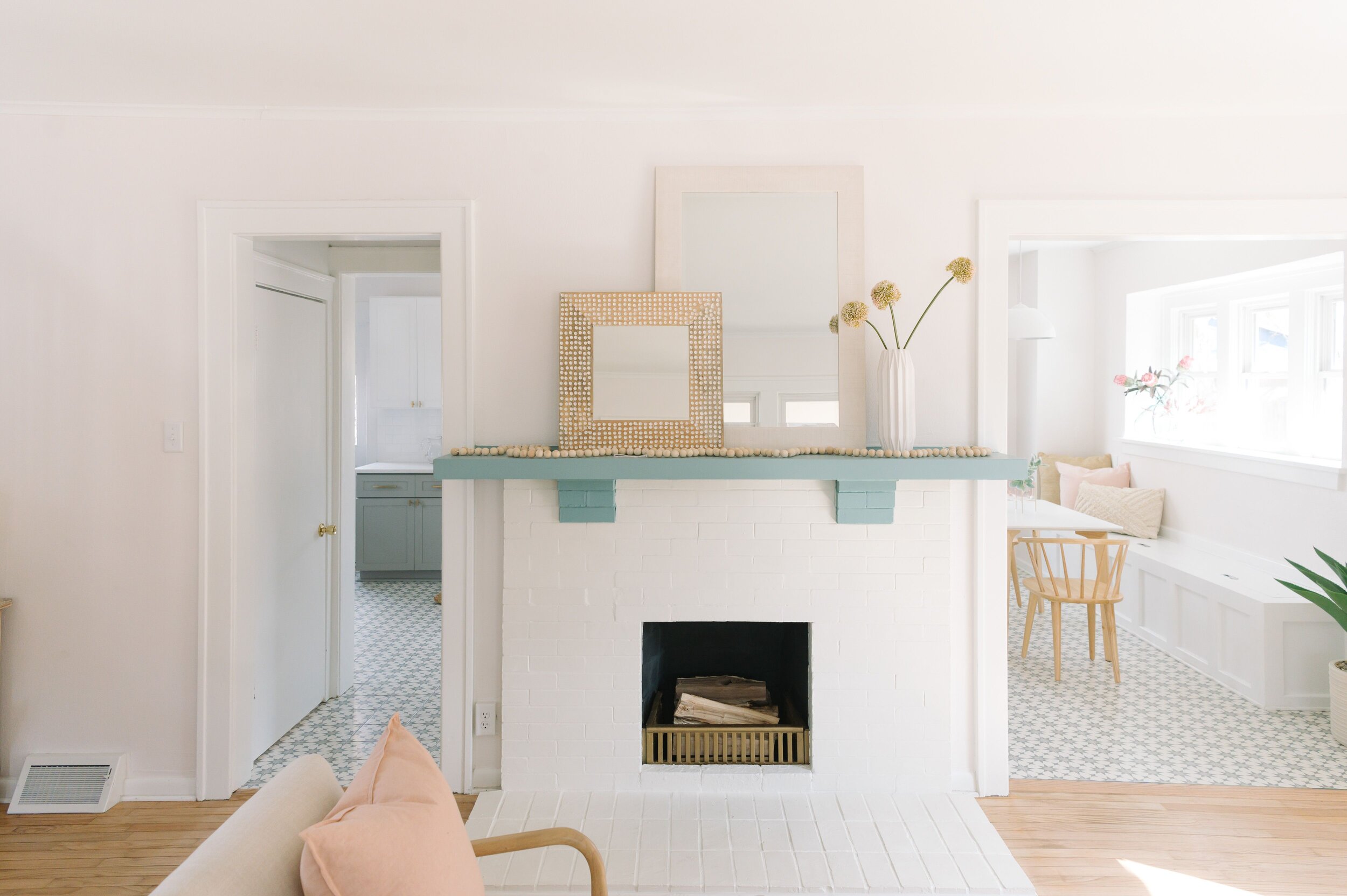
-Fireplaces are our favorite places to display artwork. A trick we like to use over fireplaces is layering multiple pieces of art, or pairing one with a large mirror.

JjUtsAbA.jpeg

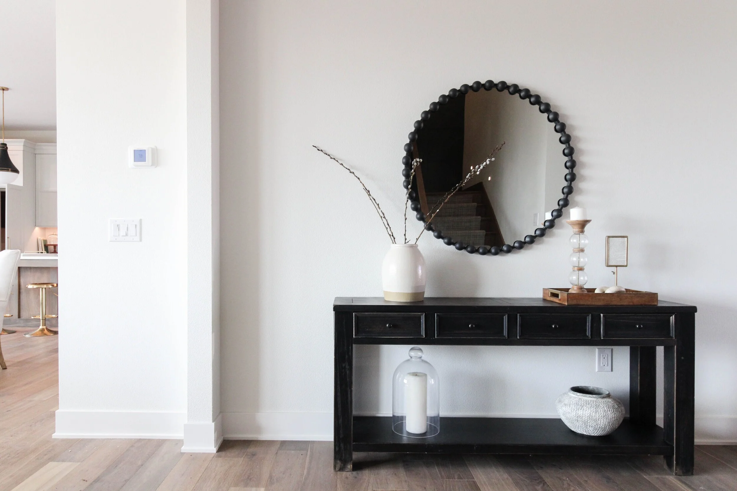
-Mirrors as artwork are always a classy way to fill up a blank wall. We love mirrors over console tables, over the fireplace, at the end of a hallway. Hang your mirrors with the same rules as you would hang a piece of artwork.


-Our final Pro Tip- Monkey Tail Hangers are the best invention ever! Easy to install! No tools needed! No stud needed! ;)

IMG_0277.JPG

Stay tuned for more design guides soon!

Woodland Part IV: Lighting Selections

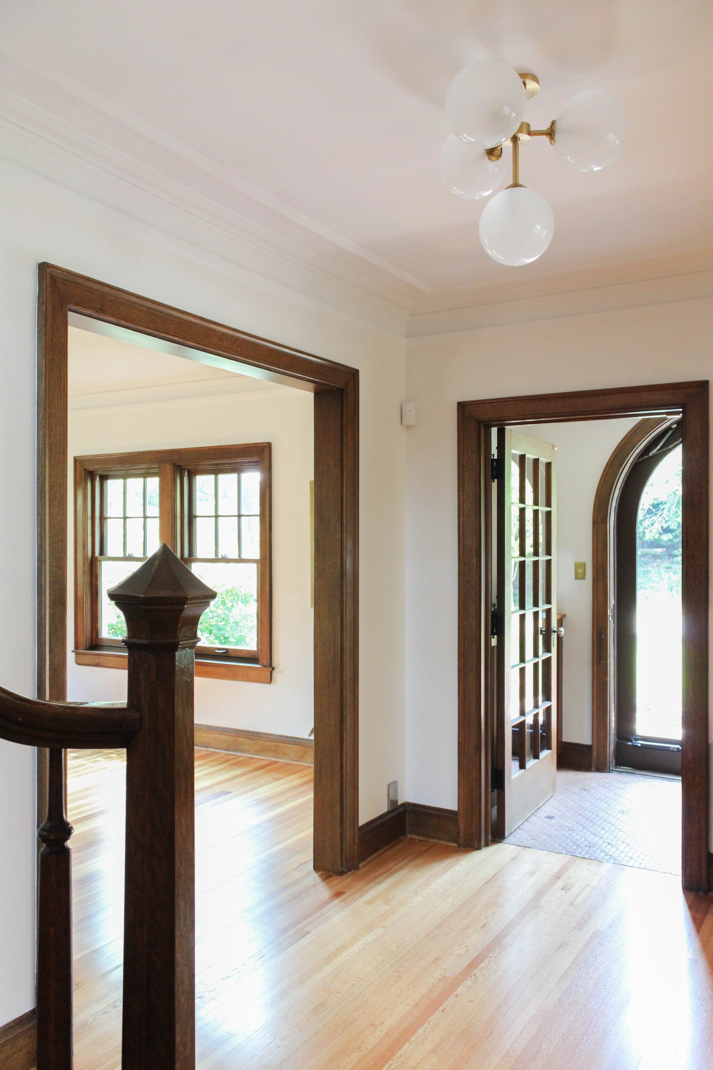
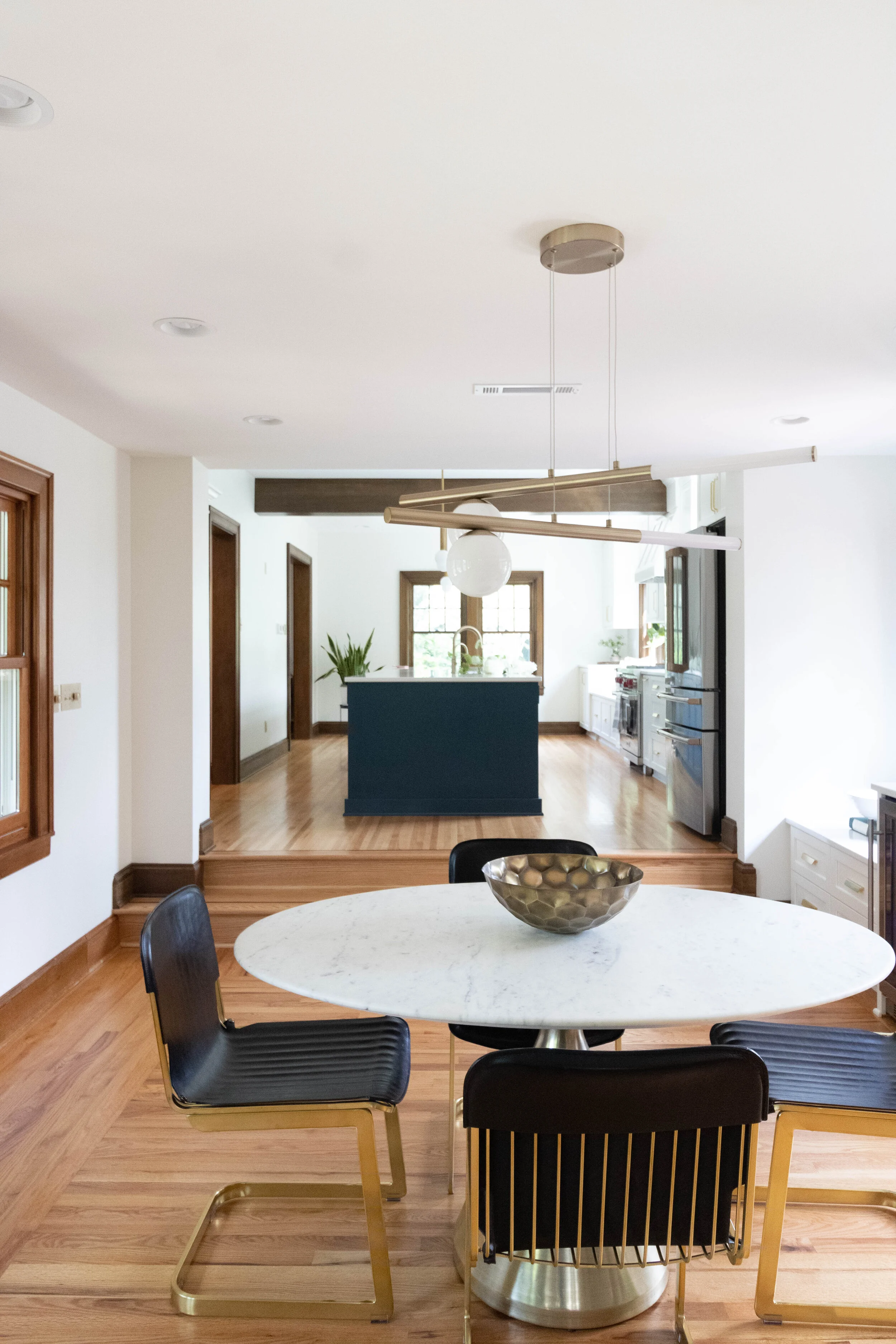
We love lighting here at ALT. It can instantly transform and update a space. We consider it an accessory just like jewelry. It's the topping, the icing, the final detail that can really make the space stand out from others. Consistency is key. If we do frosted glass - we keep that consistent throughout the space. We do this with shapes as well. When we mix finishes, we do it based on other materials present in the home.

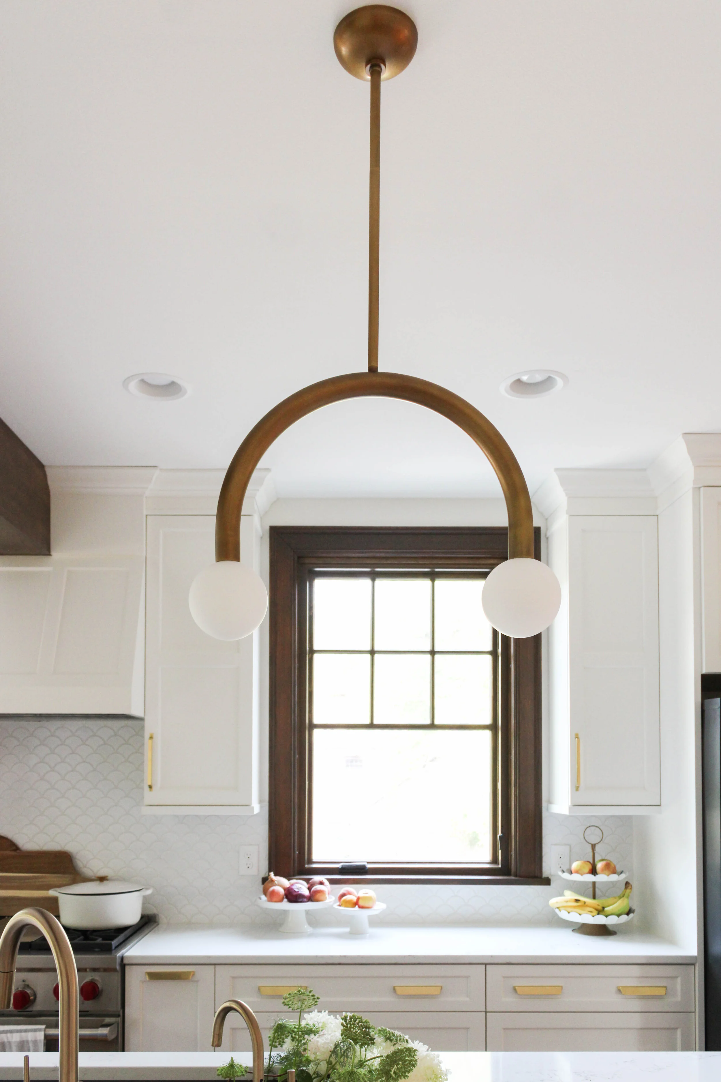
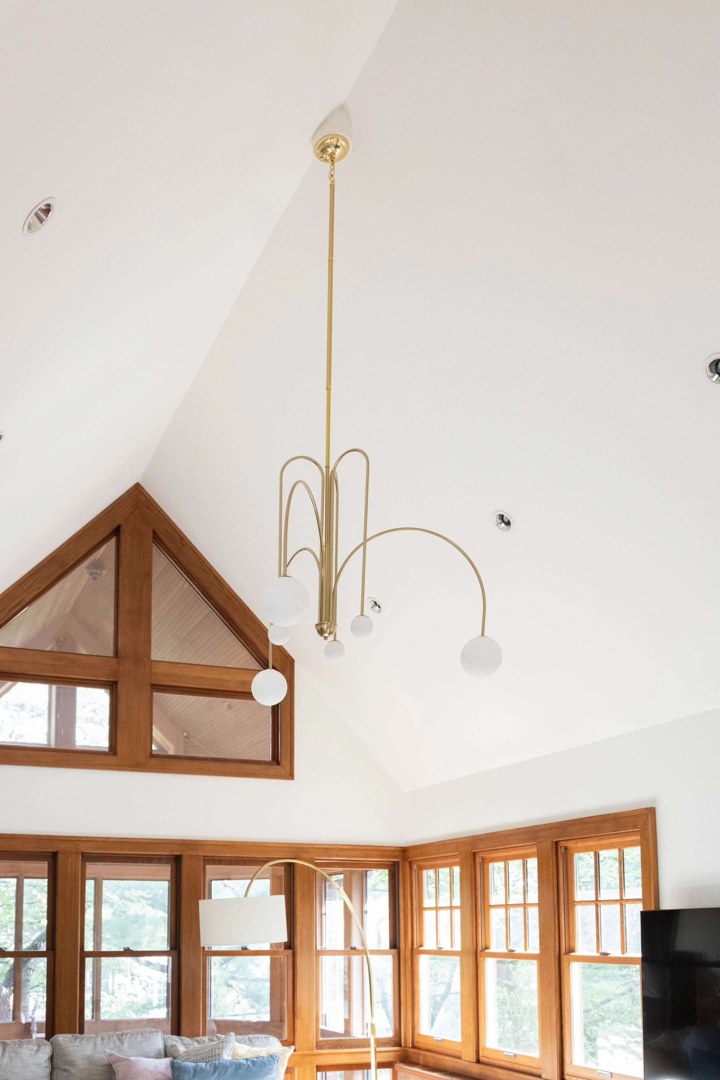
Believe it or not, the island light was not our first choice even though it turned out for the best. The first selection turned out to be a ruse because the rod turned out to be non-adjustable . At first we were totally bummed but then along came the Happy Lights- (like the total cutest ). The Family Room light (noticed similar curves and frosted globes) also presented a challenge. The pitch in the ceiling was very high so it was challenging to find a rod long enough to be able to drop low enough to see from the newly opened kitchen. Fortunately, we were able to hire a woman who was able to rebuild the light to the length needed. Lucky us!

Anyway, TLDR right?! Hot tips - gold, curves, frosted, shapes.

IMG_9337.JPG
IMG_9177.JPG
IMG_9283-Edit.JPG