Woodland Ave Part III: Living Room

Woodland Transformation: Part III

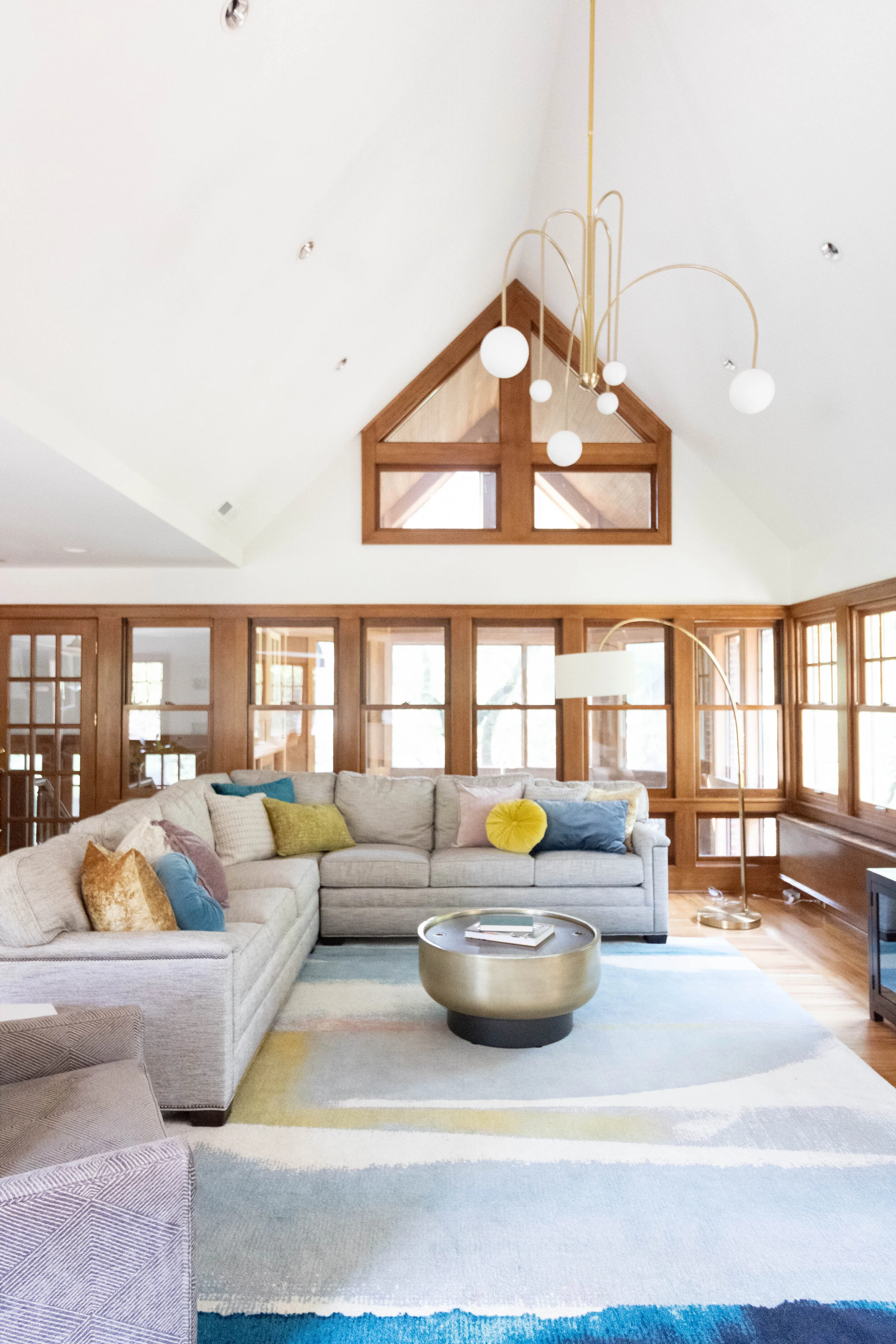
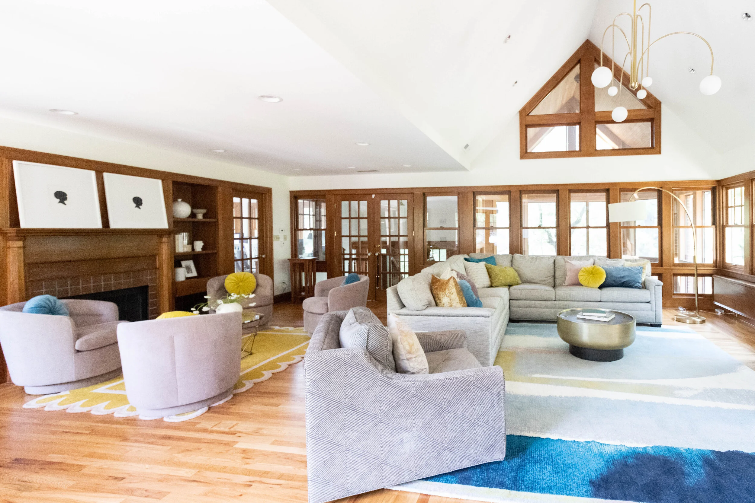
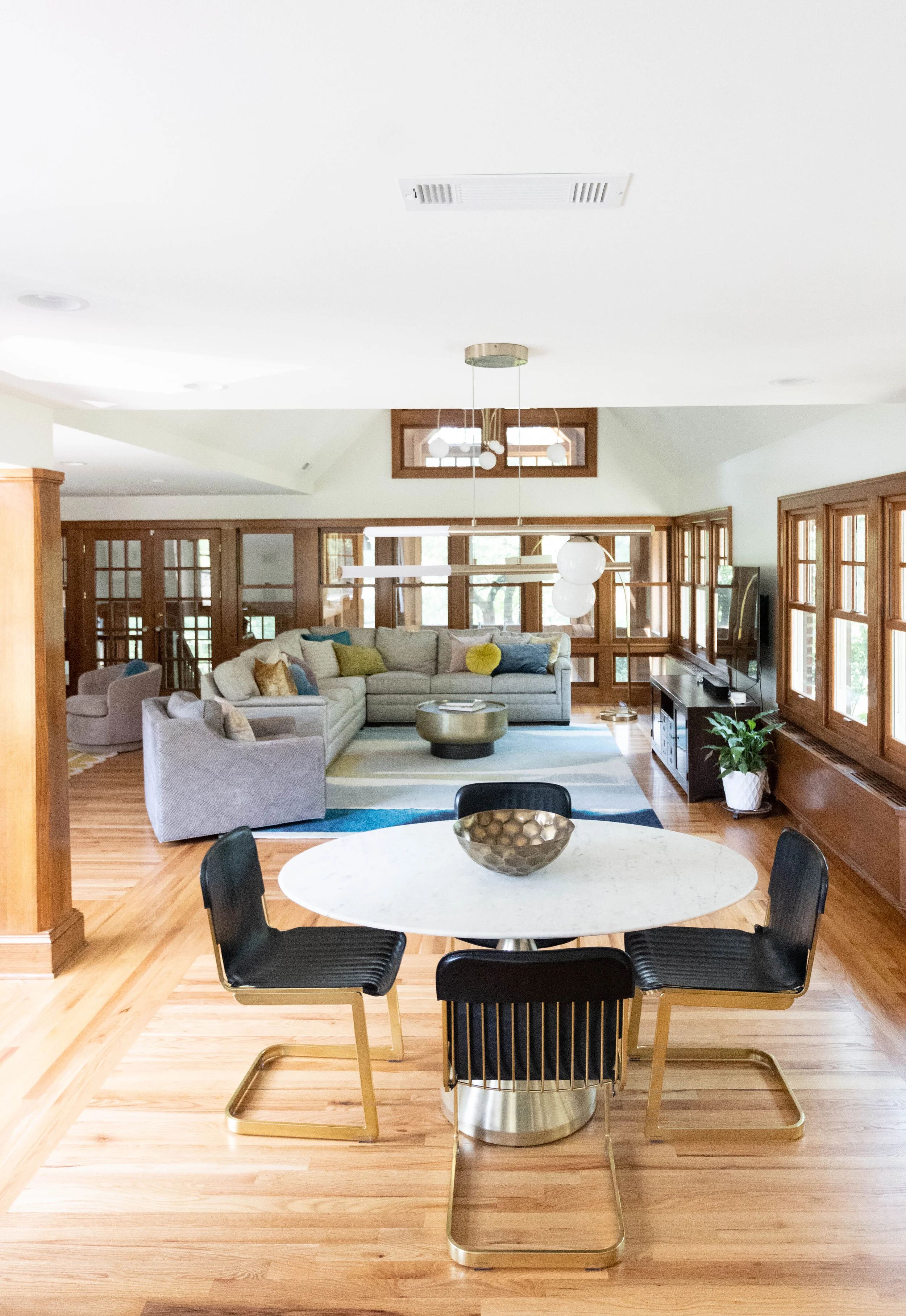
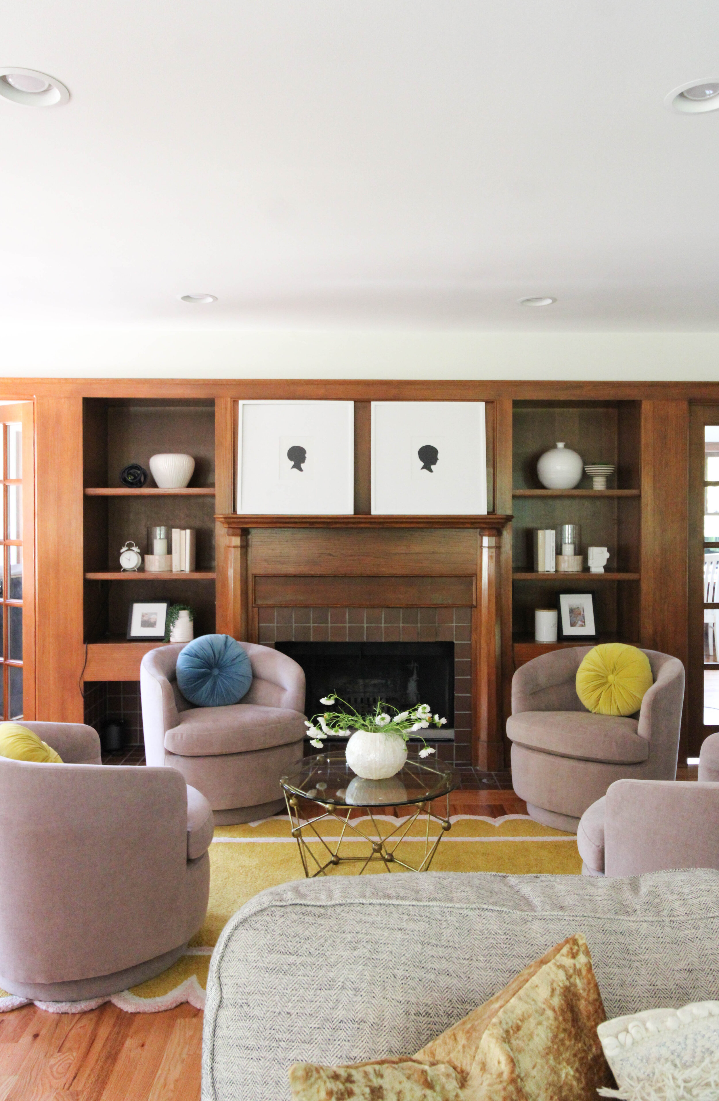
While the front living room and sunroom were our immediate priorities, we wanted to make sure that whatever we did we was sprinkled in the back of the home as well. Their family room is massive. Before it was blocked off by a kitchen wall but with the remodel it was going to be all open. With that being said, the kitchen island color and lighting needed to flow right into this beautiful room. We also wanted to carry in the pink and gold tones from the front room.

We worked around Shawna’s current sectional and chair and swapped out the rugs, coffee tables and pillows. We replaced the dining room table and chairs and swapped out the lighting. Backstory on giant 48” light - we wanted something kickass in the Great Room ceiling pitch. The light was a dream come true but could only drop 4’. We needed to be closer to 7’ so we had it custom rebuilt to accommodate the 7ft drop needed to be visible from kitchen. Easy peezy, right?!

This Great Room was the original showpiece in this home and we wanted it to keep it that way even though the kitchen, ya know, might be a close second now

Scroll to see the before and after pictures.

IMG_9168.JPG
IMG_9175.JPG
237284451_2909410565981885_3044858761043490953_n.jpg

Woodland Ave Part II: Front Room + Sunroom

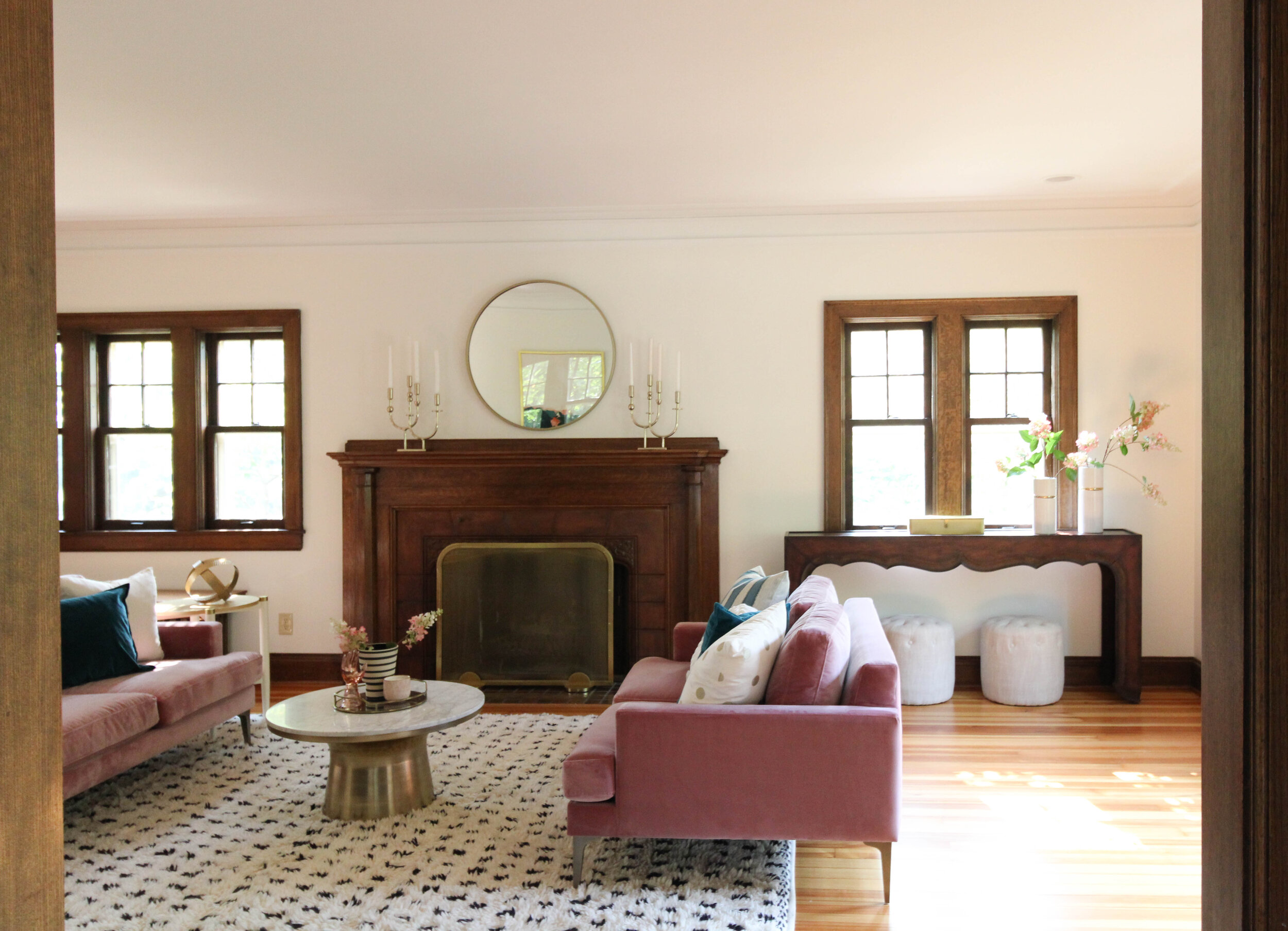
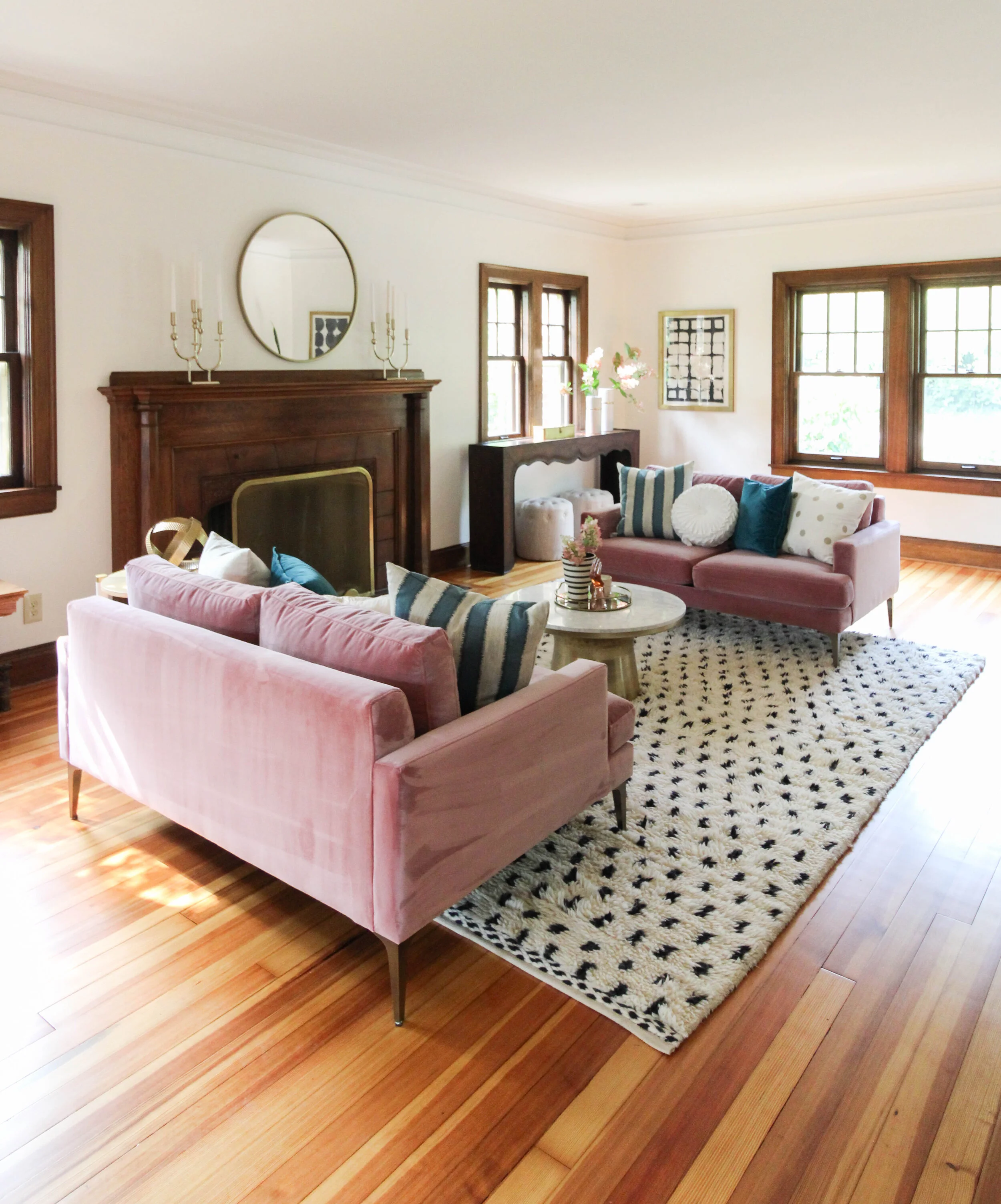
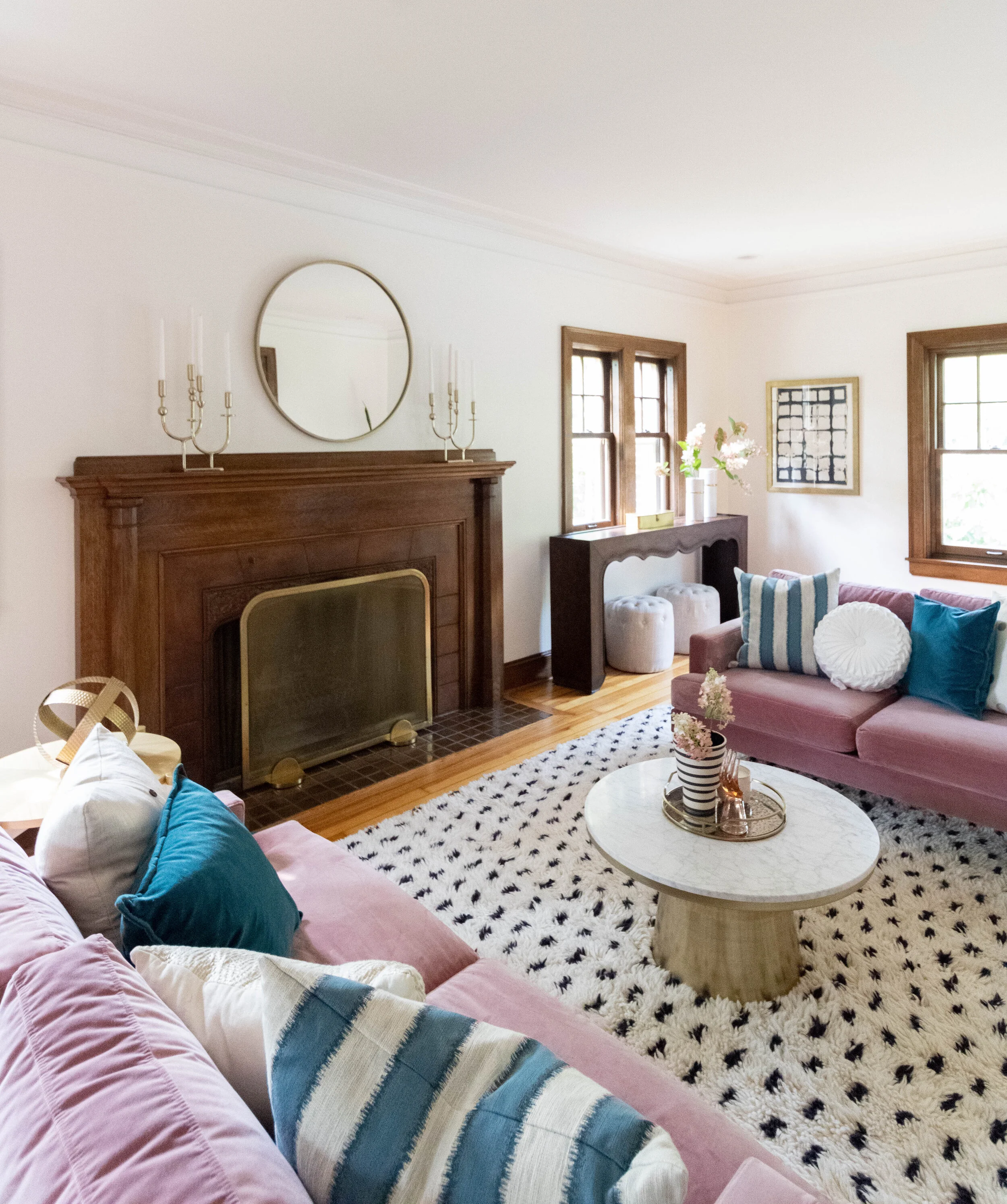
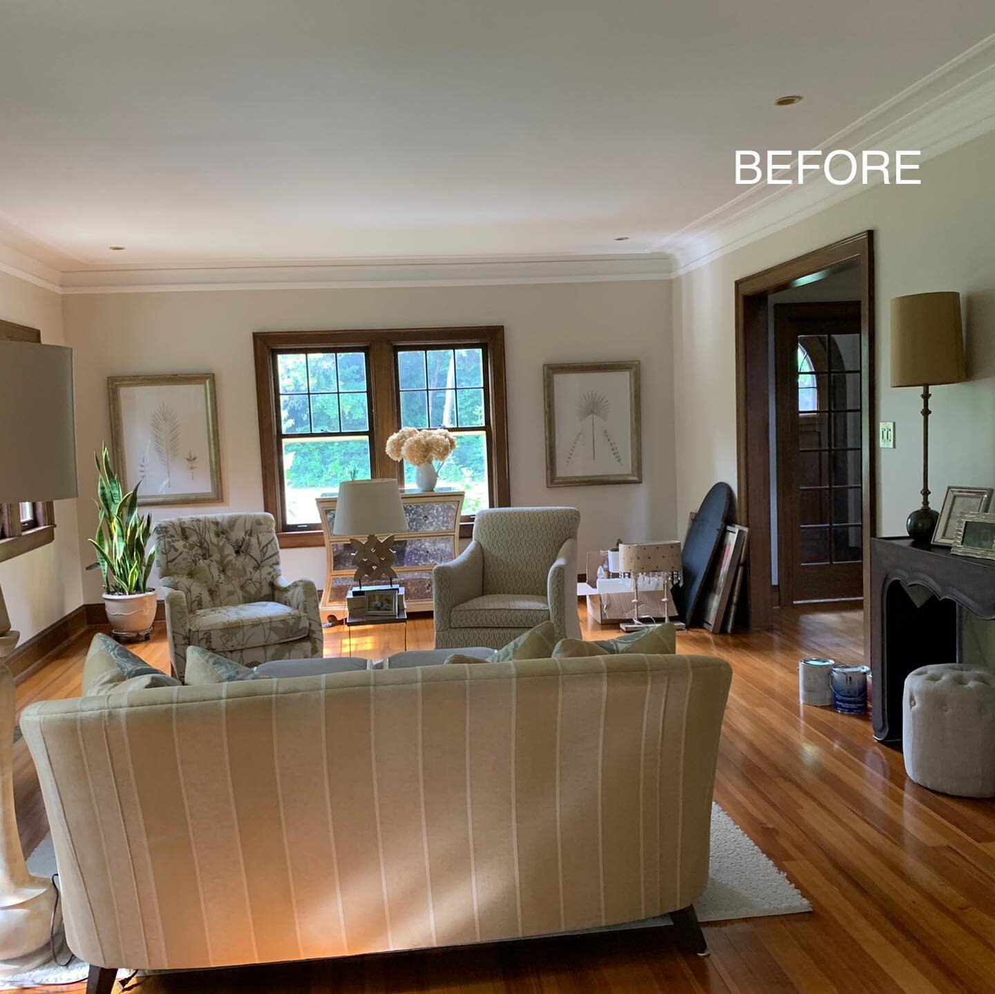
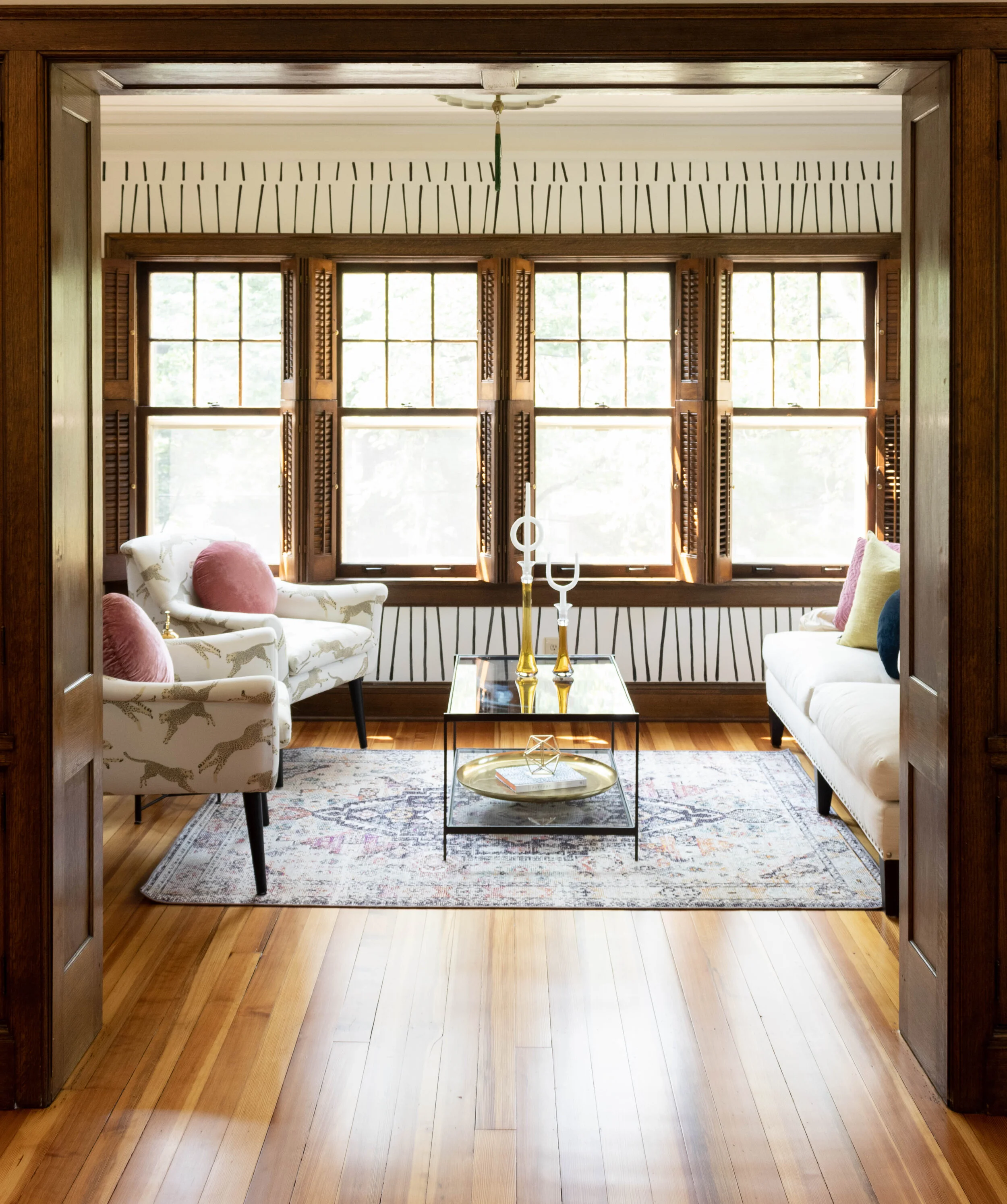
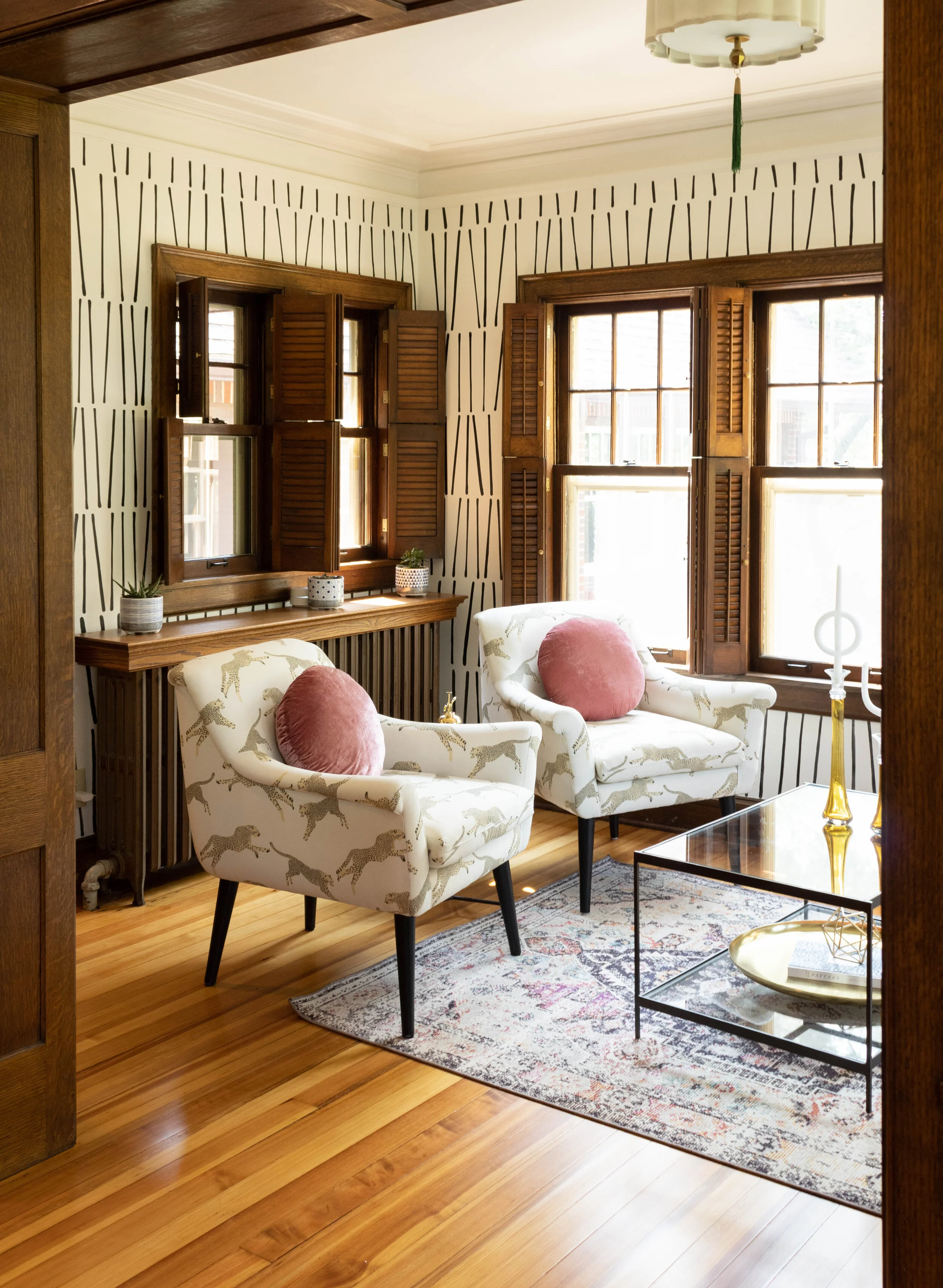
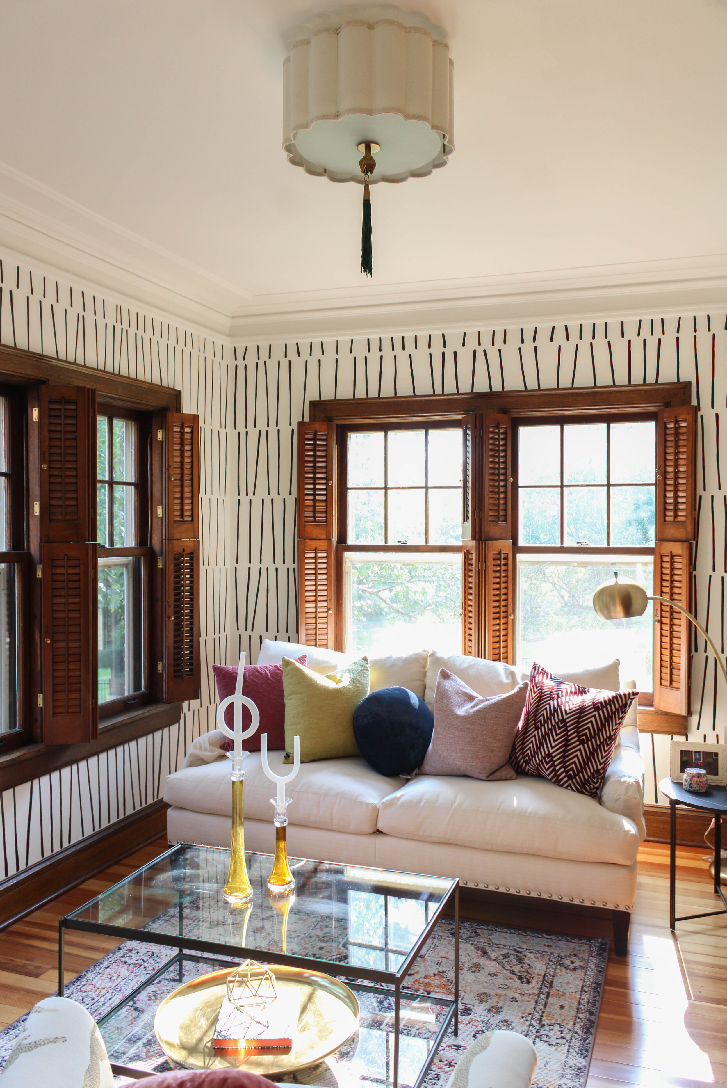
Welcome back to Part ll of our Woodland Ave Transformation! We are picking back up in the front room + sunroom and showing you the before and after pictures of this magnificent home. If you missed our last post, here is a quick recap. ALT was initially hired to help Shawna update her furnishings but she was also in touch with K&V Homes about a potential remodel of her kitchen. You’ll see why in a minute. Our first impressions -

Magnificent Tudor home full of character - loads of stained trim, windows and rooms. Tons of room. Decor underwhelming. We would classify Shawna as a hip mom. She was wearing a rock and roll tshirt , but during the tour of her home we felt as if the furnishings did not pair with the person she was- hence why we were there Shawna wanted more personality, color, & pattern. Yay! The current furniture was so formal in most of her rooms she felt she couldn’t even chill out. Ring! Ring! ALT Design to the rescue.

IMG_9193-Edit.JPG
IMG_9423.JPG
Woodland Before 2.jpg

Thank you for taking the tour of this project! Stay tuned for part lll.

Woodland Ave Part I: Kitchen Transformation

We first met Shawna on March 13th, 2020. It was actually Friday the 13th and exactly 4 days before Covid shut the world down. Dr. Fauci could only predict what would happen next

ALT was initially hired to help Shawna update her furnishings but she was also in touch with K&V Homes about a potential remodel of her kitchen. You’ll see why in a minute. Our first impressions -
Magnificent Tudor home full of character - loads of stained trim, windows and rooms. Tons of room. Decor underwhelming. We would classify Shawna as a hip mom. She was wearing a rock and roll tshirt , but during the tour of her home we felt as if the furnishings did not pair with the person she was- hence why we were there ;) Shawna wanted more personality, color, & pattern. Yay! The current furniture was so formal in most of her rooms she felt she couldn’t even chill out. Ring! Ring! ALT Design to the rescue.

While we were busy ordering and installing new goodies for Shawna, her and her husband decided to move forward with their kitchen remodel starting the Fall of 2020. They asked us to be a part of it and help make sure their new vision for the home also made an appearance in the kitchen. Their current kitchen size was not the correct proportion for the size of the home. It was SMALL. Tiny oven, tiny dishwasher, no prep space, etc. And no lie- Shawna actually cooks a lot so it was quite impressive that she was working food magic in this dark cave.

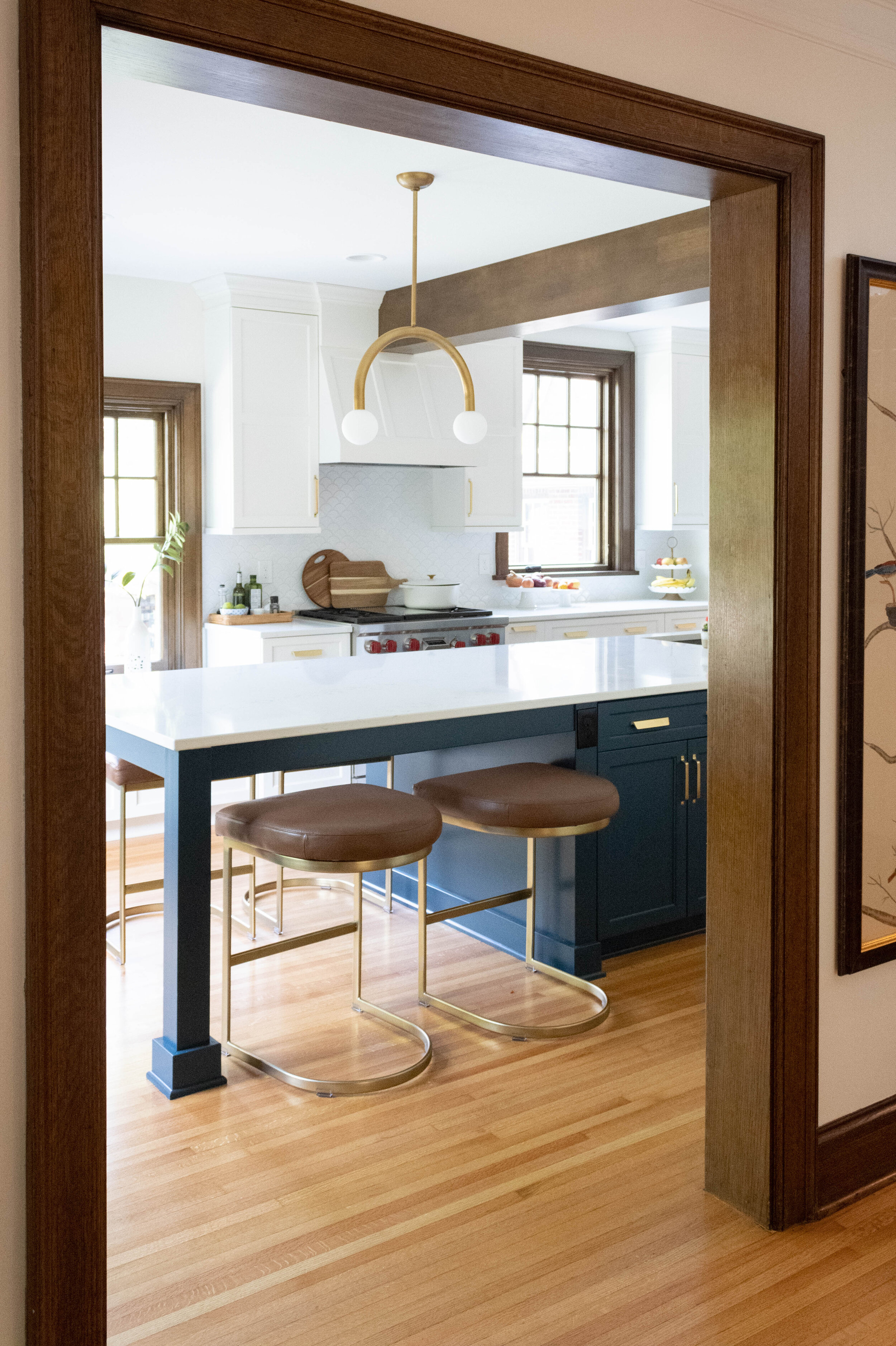
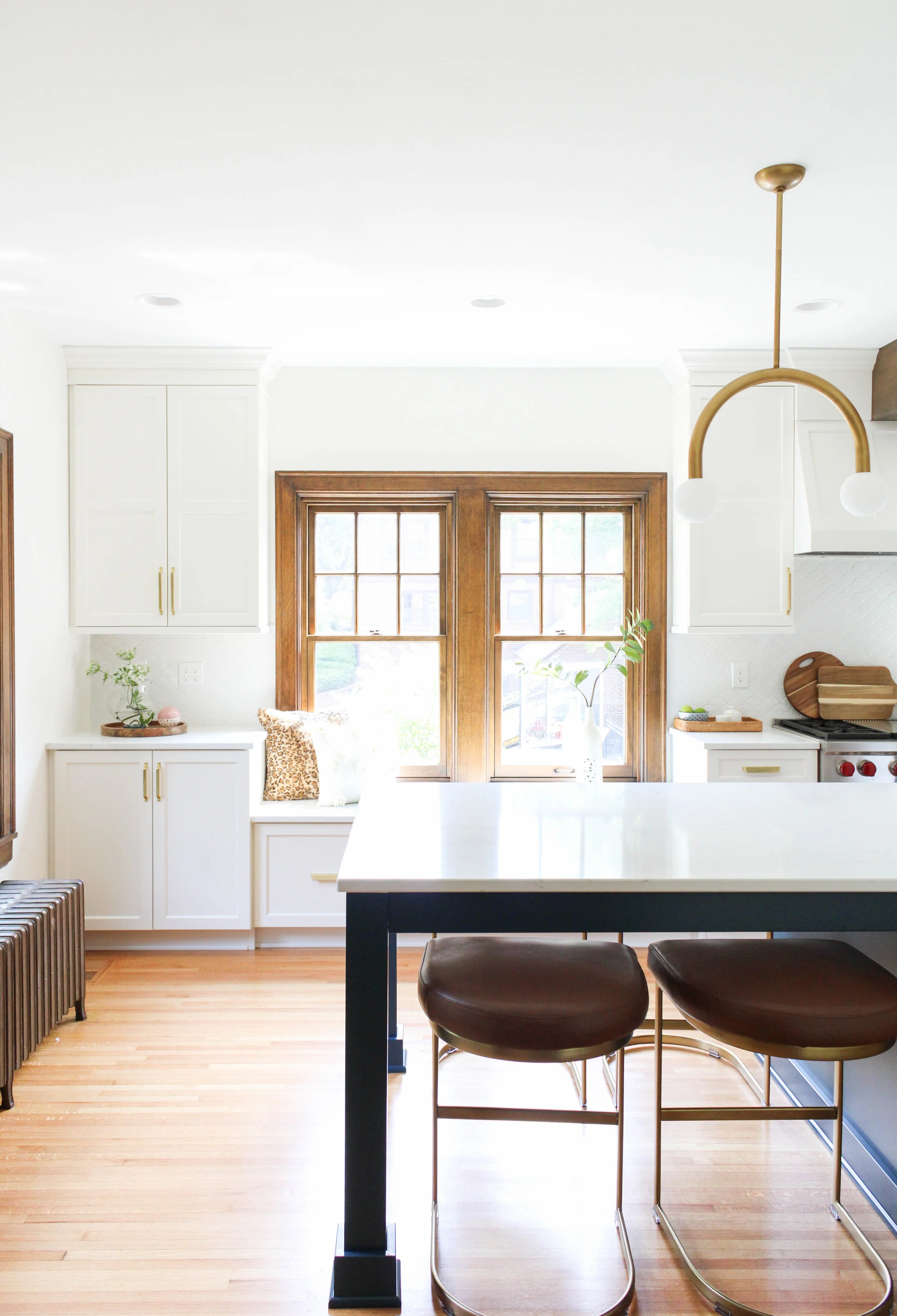
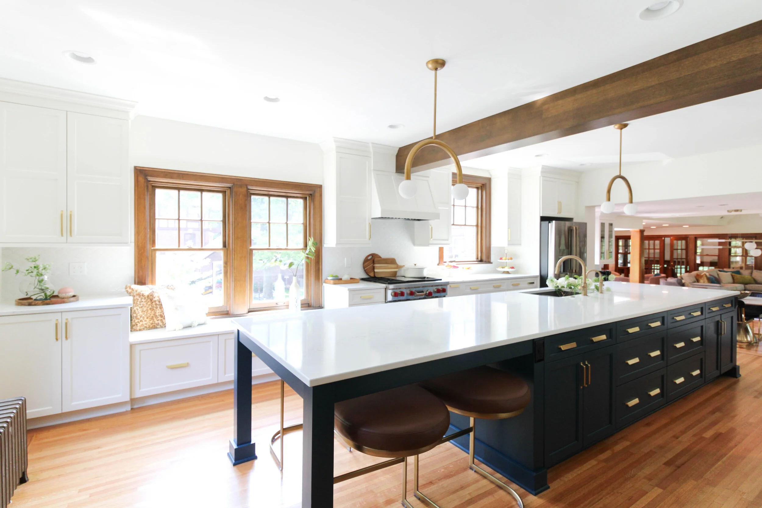
First things first- walls have got to go. Giant 15.5’ island to fill the once dining room and kitchen? Yes please! Two-tone painted custom cabinets- Bold. Beautiful gold, classic hardware- Add to cart. Unexpected, playful lighting- Nailed it. Loads of drawer space- They got it.

This facelift was a total game changer for this family and you will see why scrolling through before and afters. They doubled their kitchen size which created a more open concept to the new dining and family room. Every detail was considered during this remodel. For example should the header in the kitchen be painted white or stained to match woodwork. Neither was the right or wrong answer but in the end we felt it was important to keep the integrity of the home and go stained so we could tie in old with the new.
What a journey! This Covid Kitchen had its highs and lows (6 months lead time on cabinet pulls) but in the end looking back it was worth every extra minute we had to wait for it. So honored to be a part of this incredible transformation. Scroll down to see the before and after!

3.png
IMG_9171.JPG