Before & After: Hull Avenue

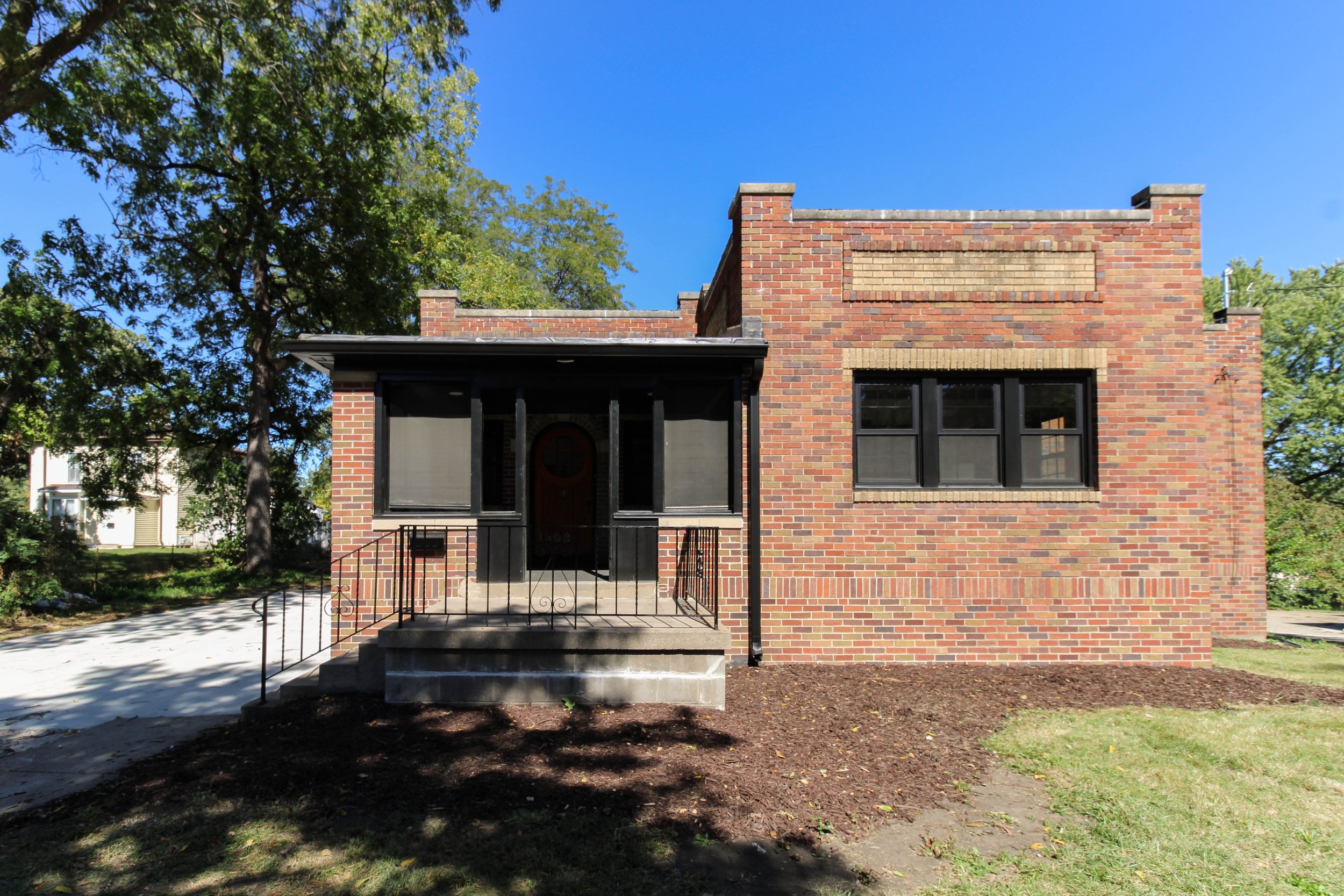
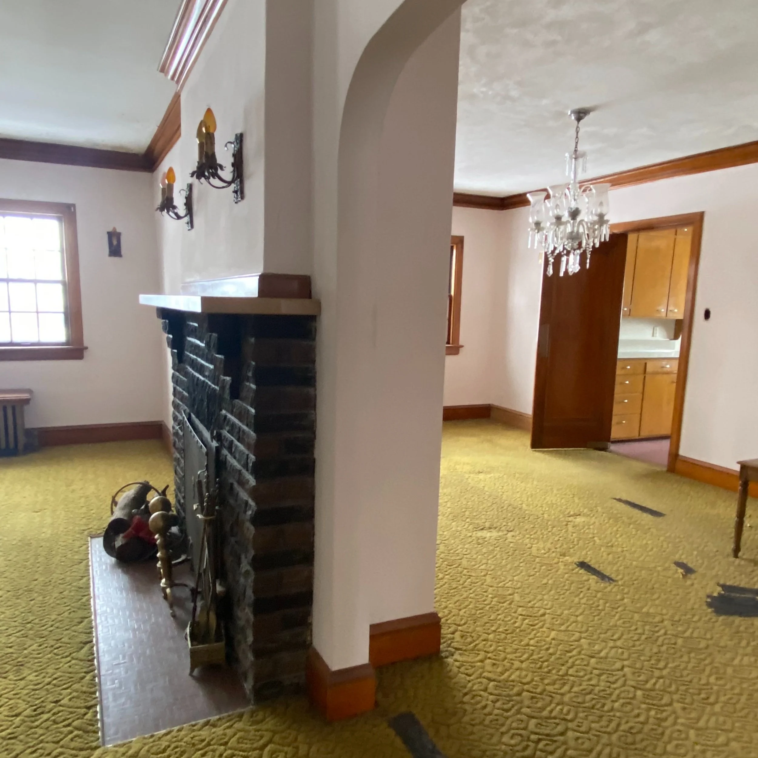
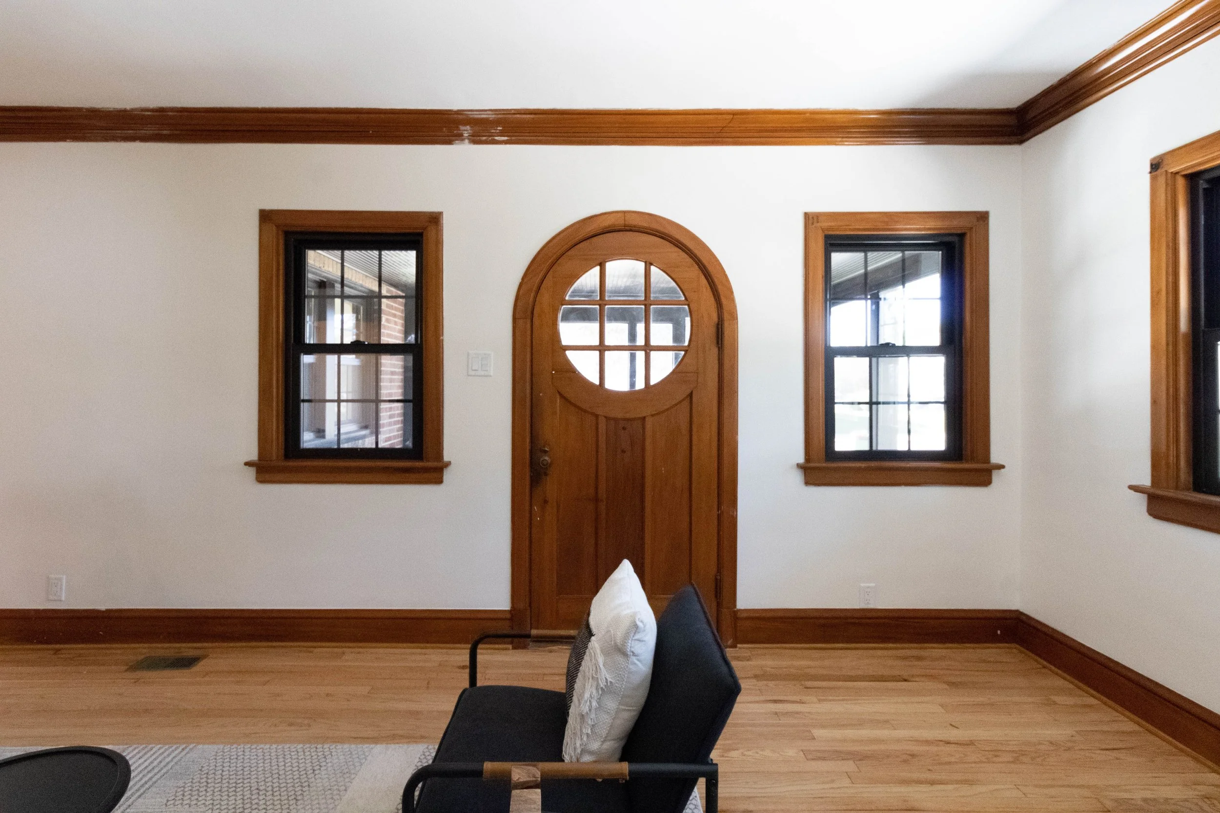
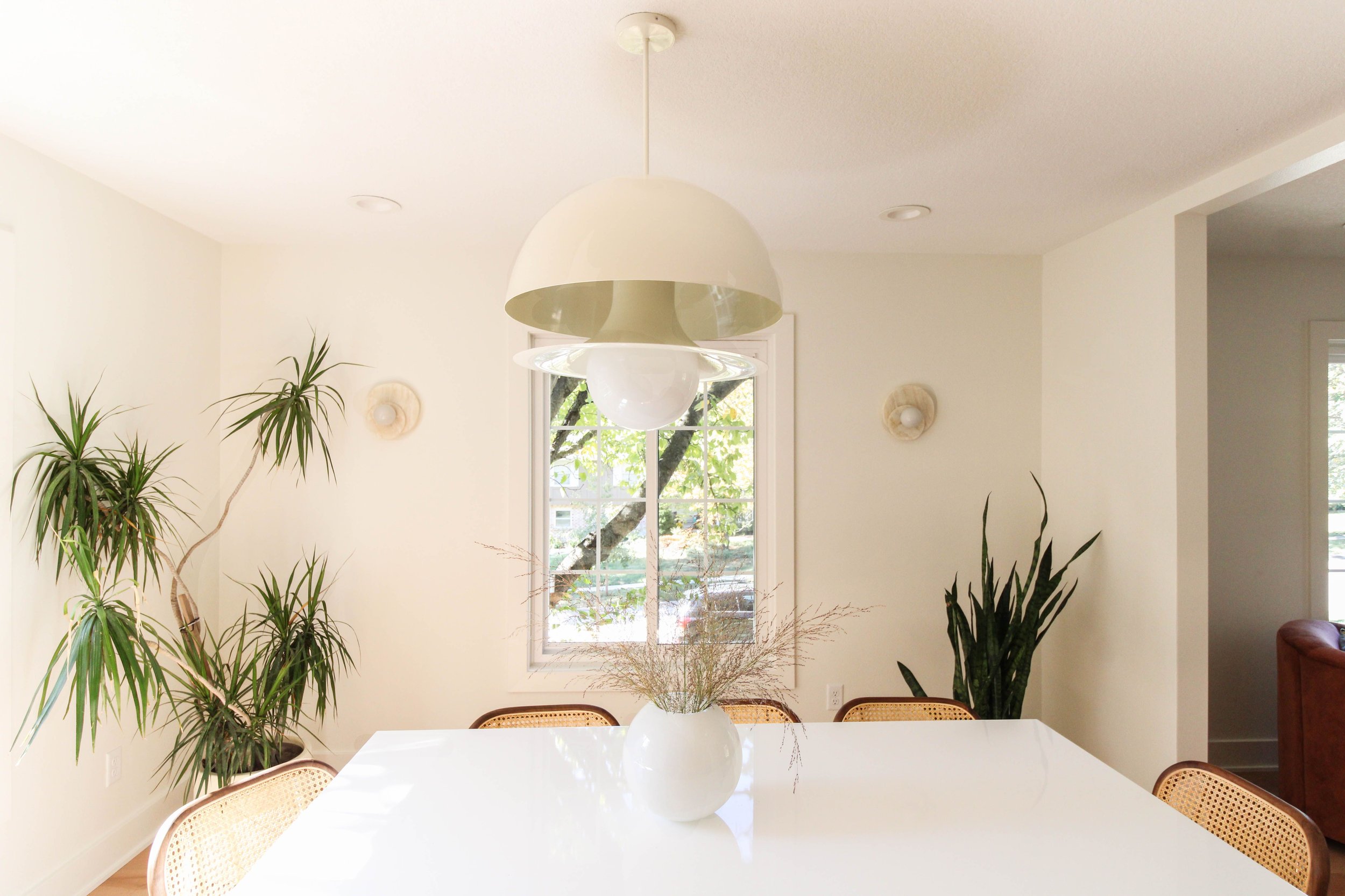
We instantly fell head over heels with 1508 Hull Ave when we first walked through with our realtor friend, Eric Quiner, last winter. This unique home was built in 1926 and is directly across from Grandview University. We knew right away that the house had great bones and ever charming original architecture under it’s current dirty and dated finishes.

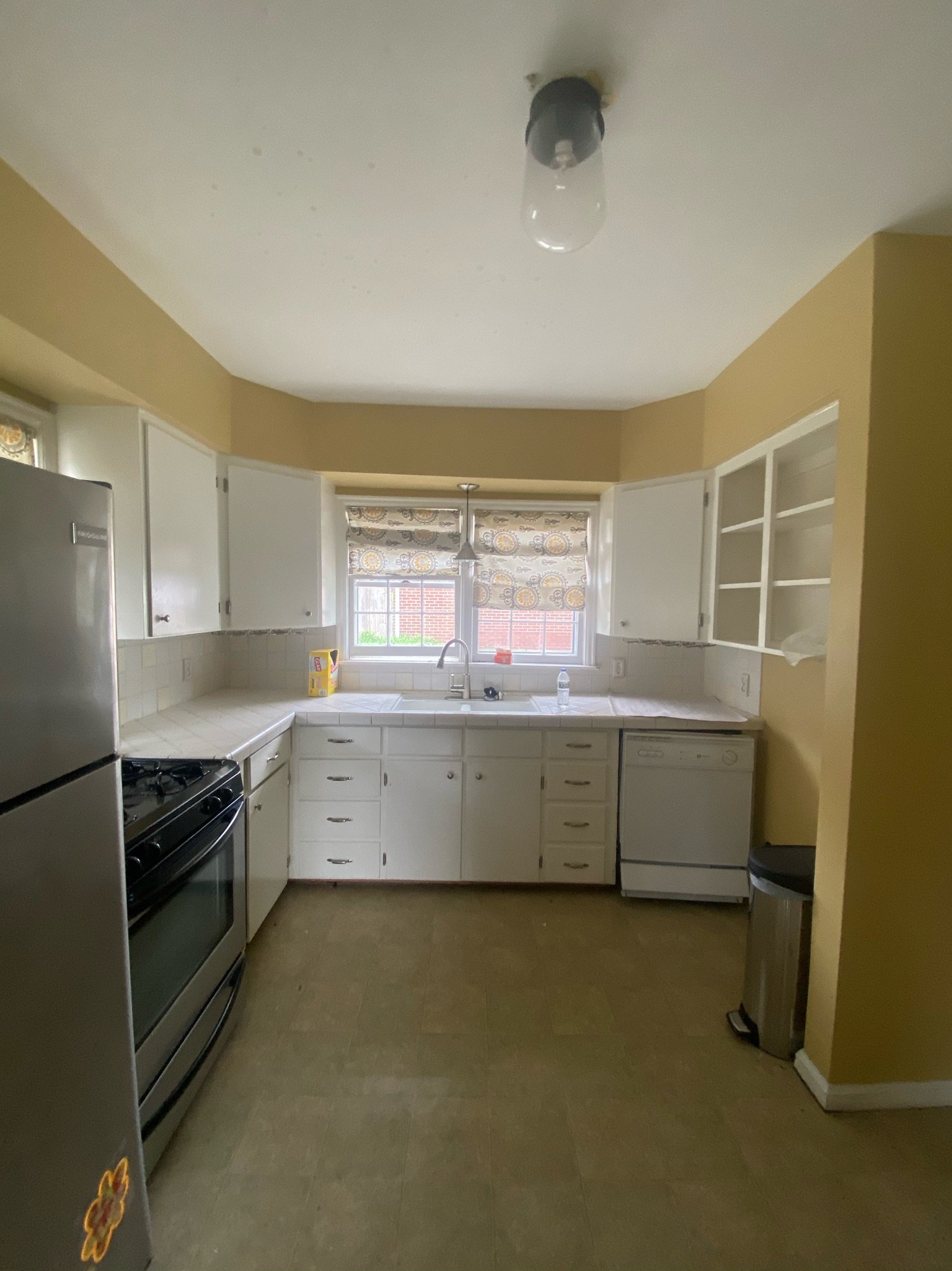
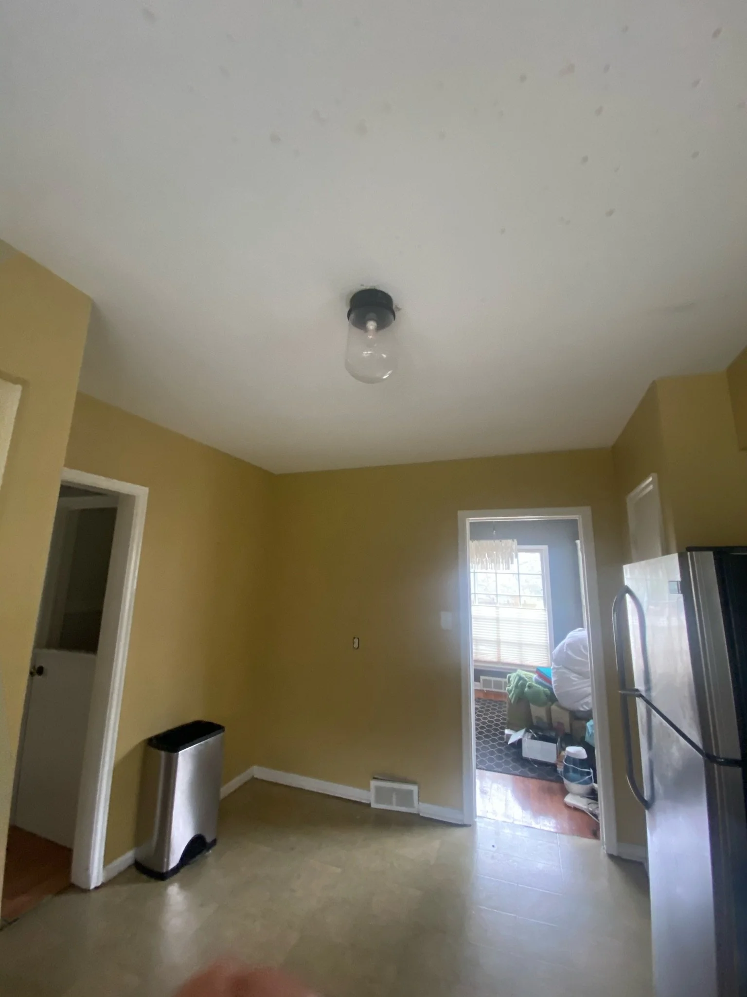
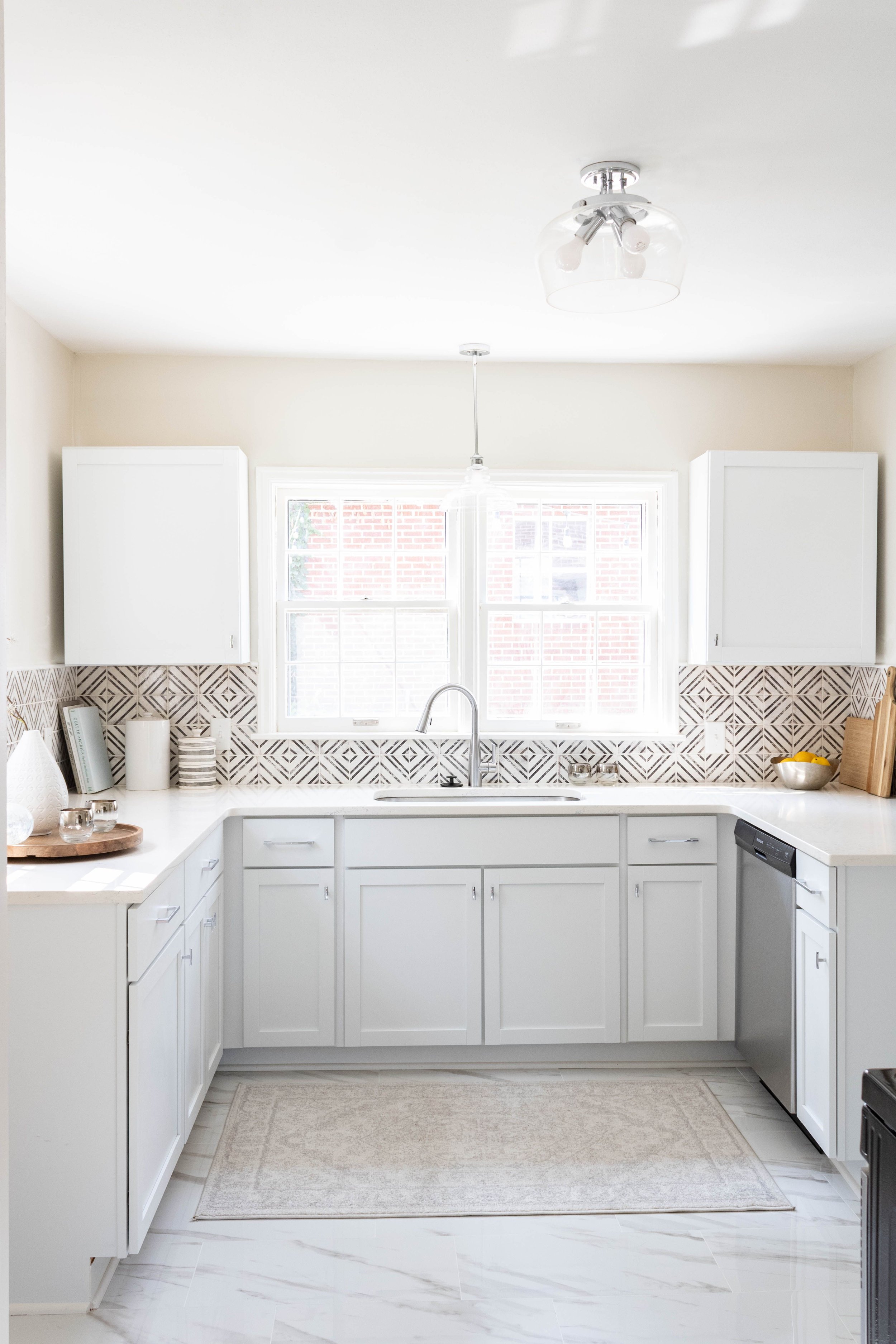
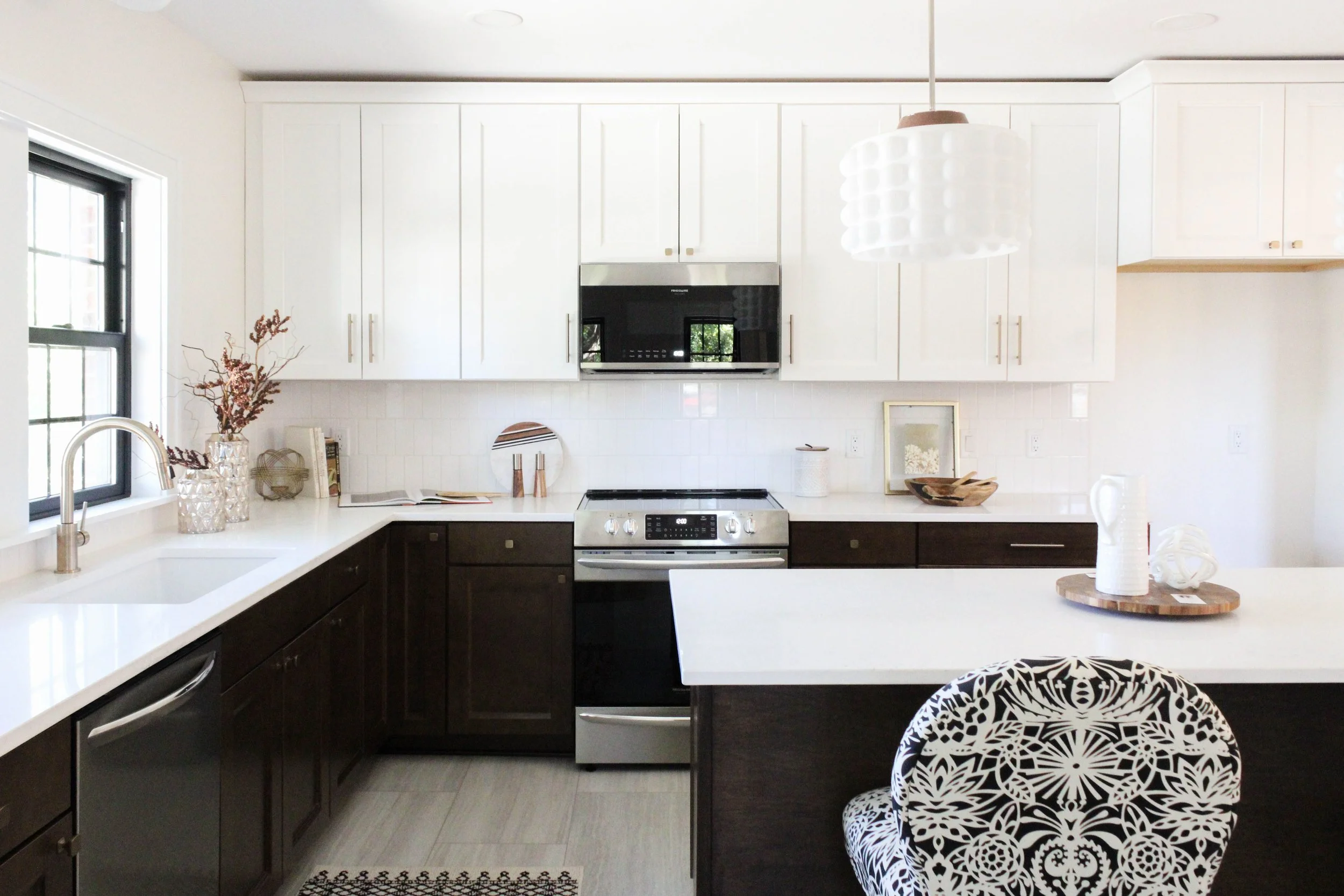
We reconfigured the kitchen - deleting a wall and remapping the tragic flow of the entire house. We were able to add a drop zone and coffee bar. Refinished hardwood floors, trim, casings, and all new windows were replaced in a style keeping the home’s original character in mind.

Kitchen Before:

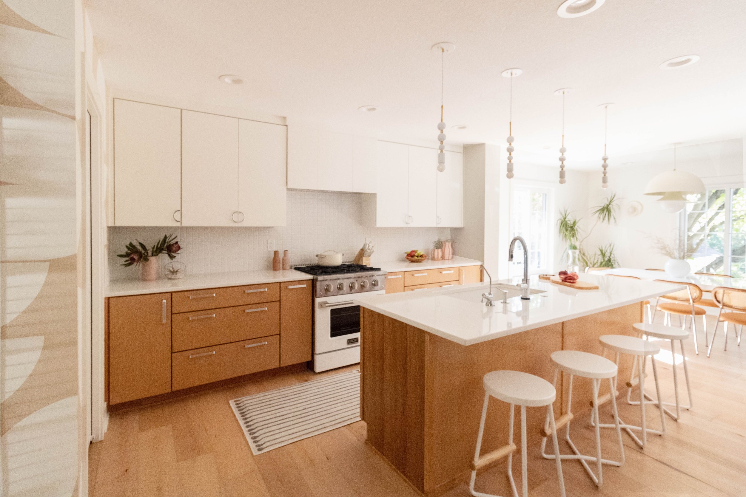
Kitchen After:

Lighting is a huge love of ours, so when we came across those bubbly milk glass island pendants we had to design the whole house around them.

Living Room Before:

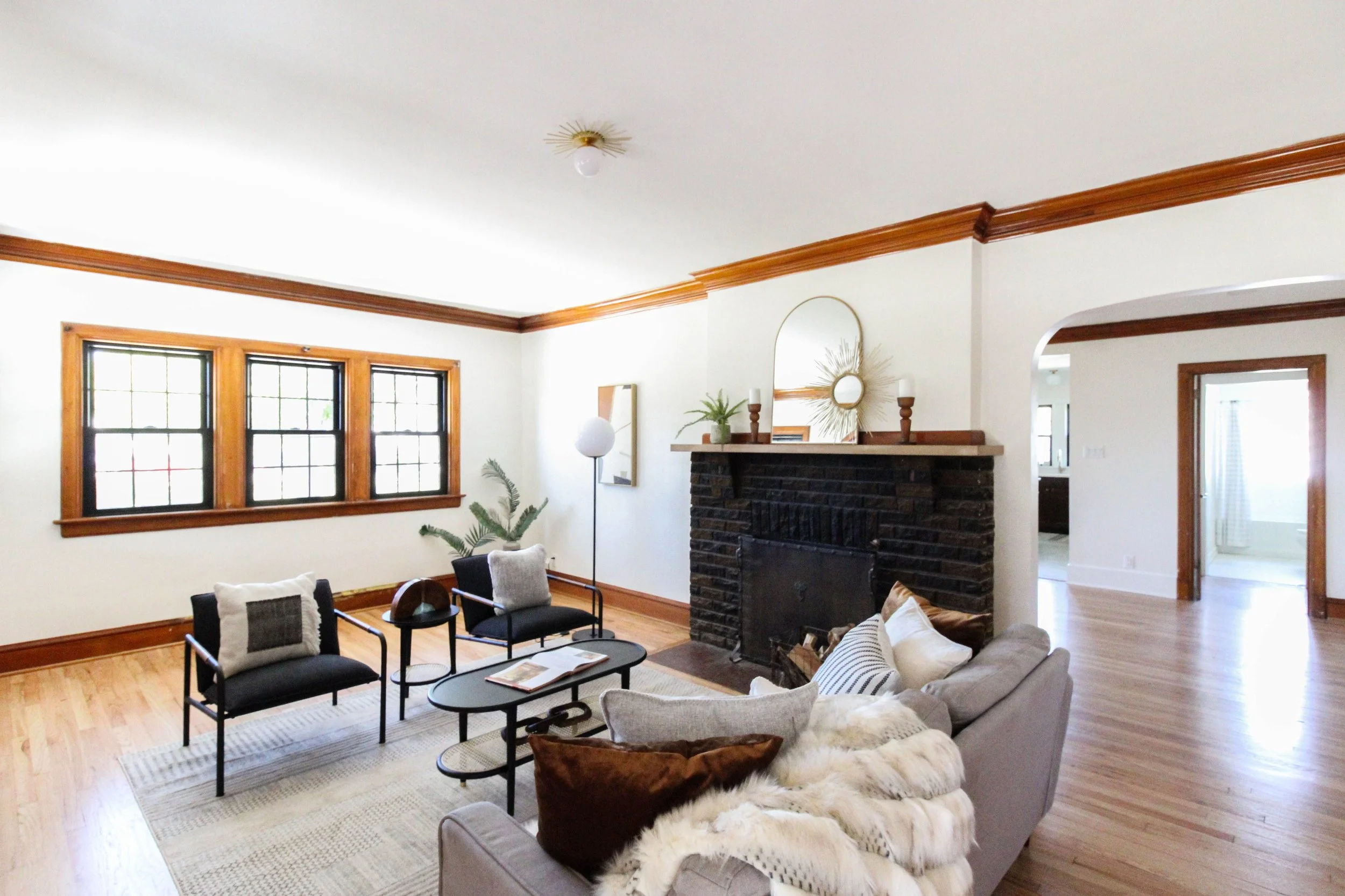
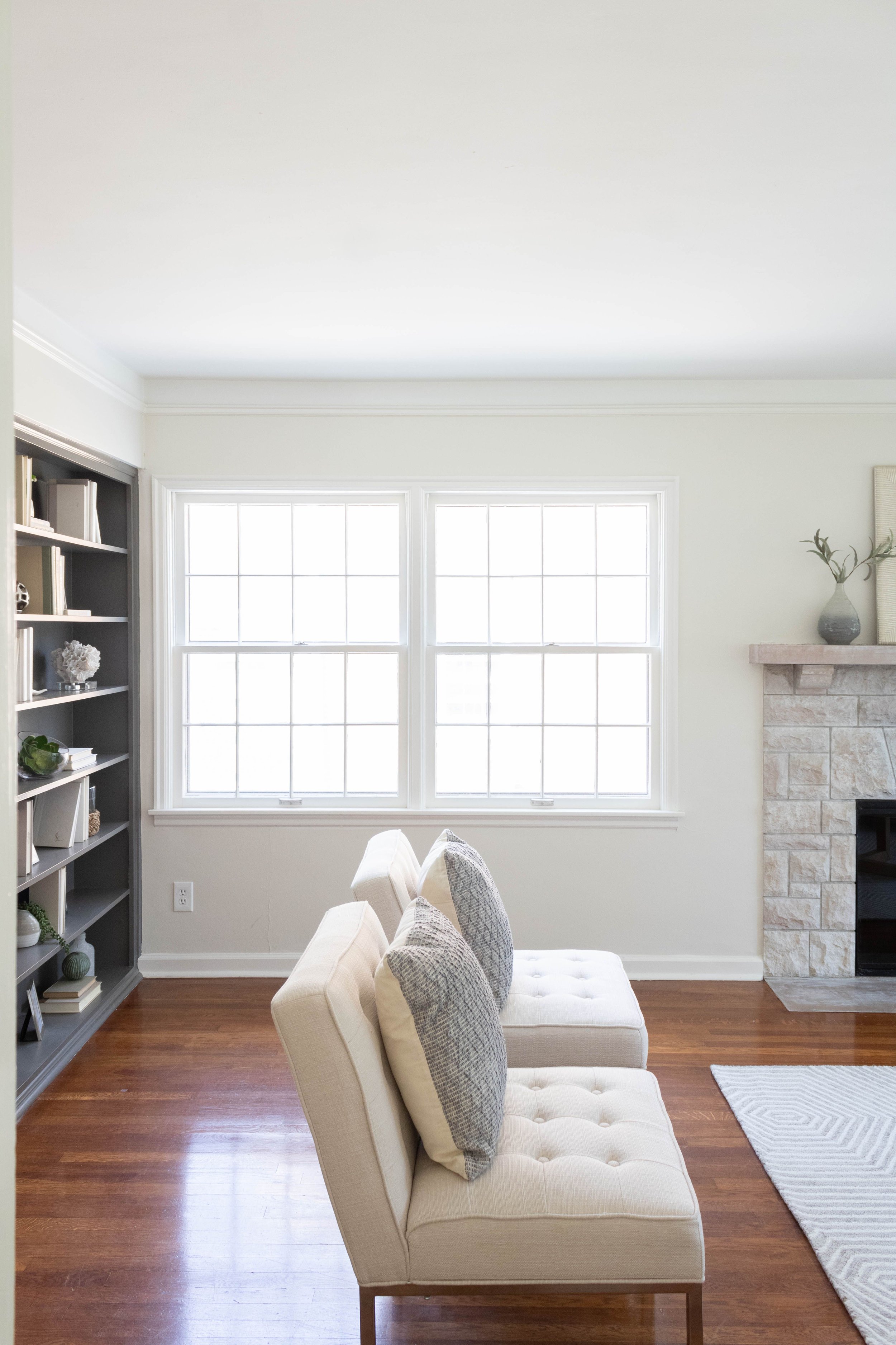
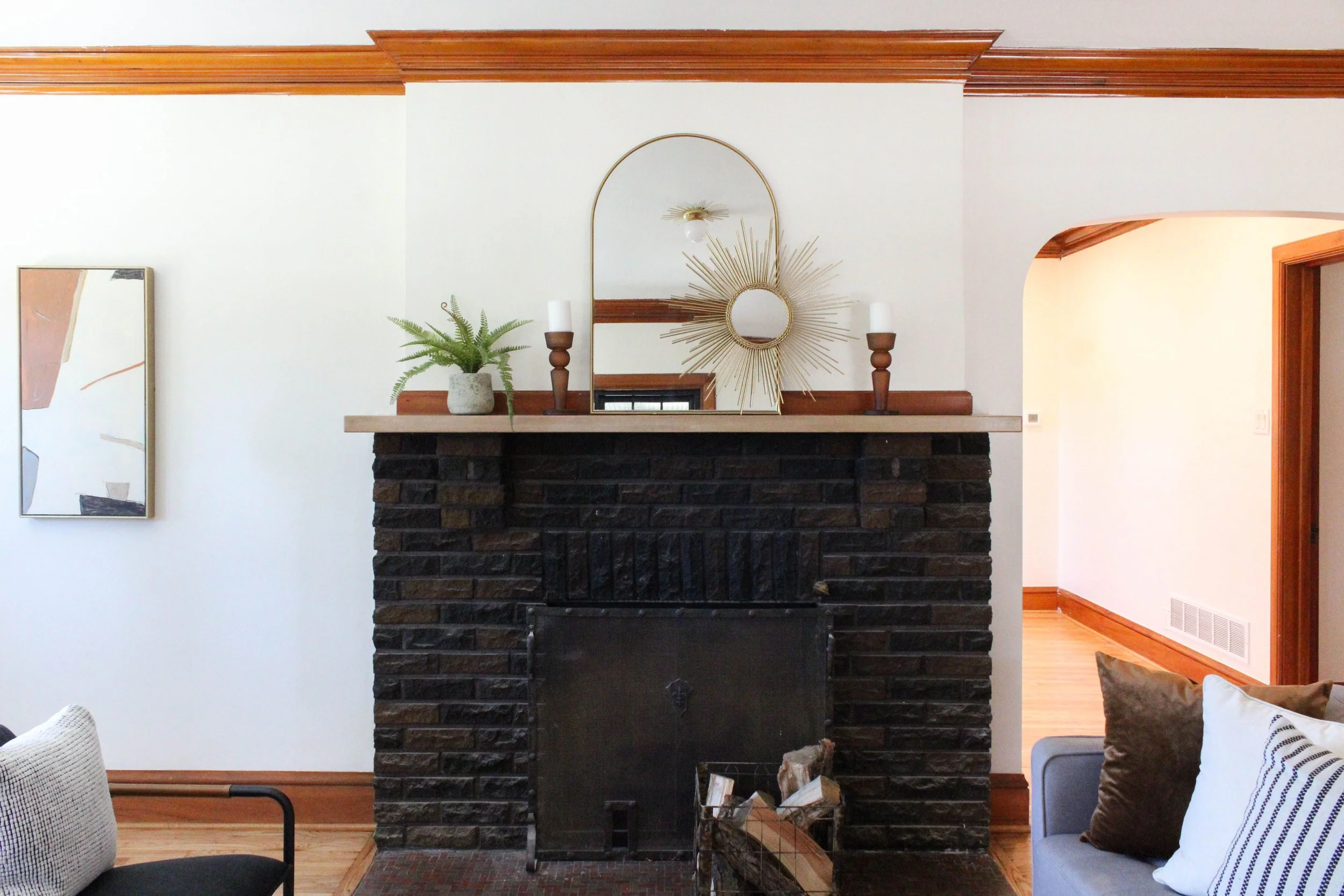
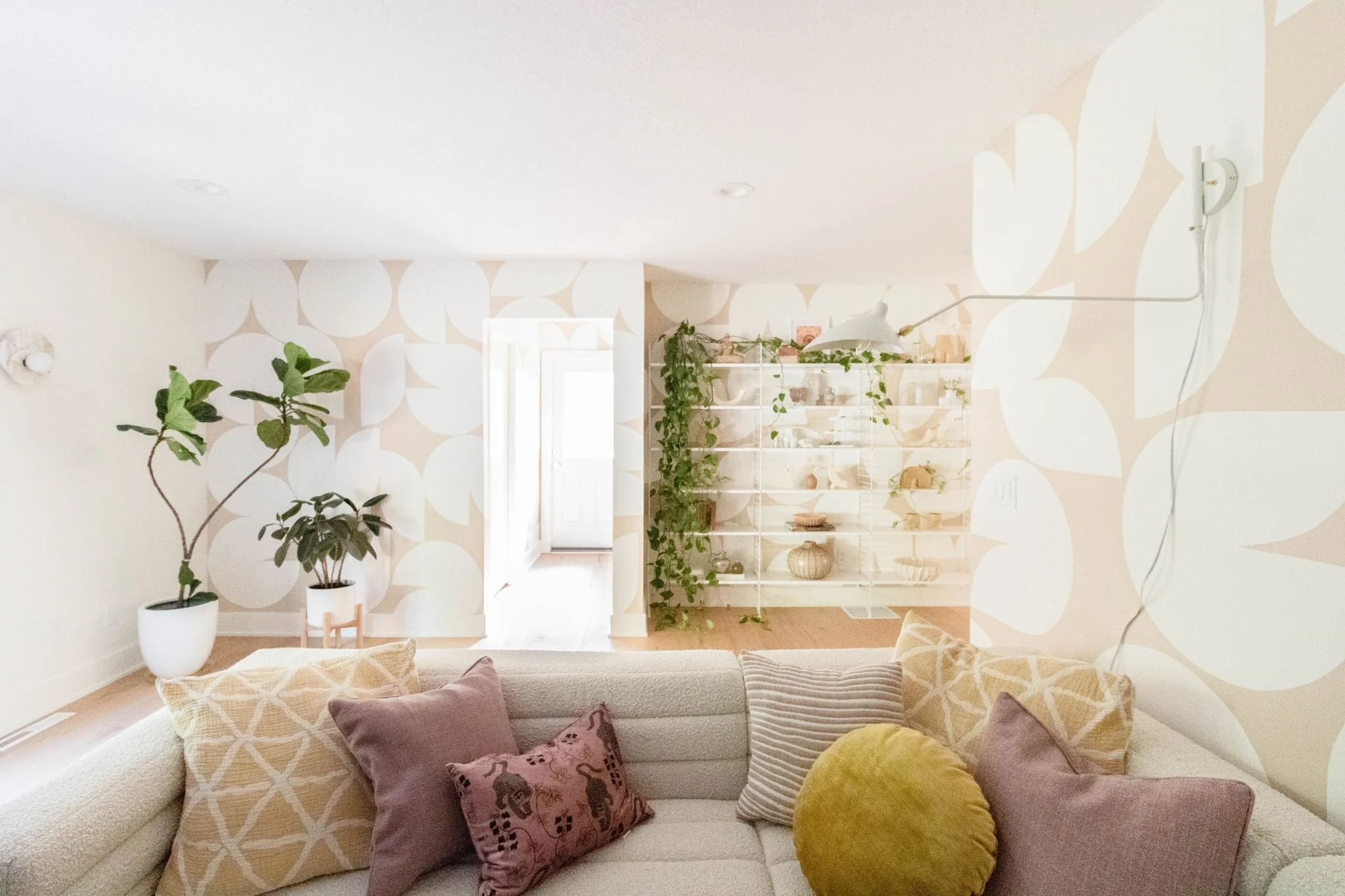
Living Room After:

Our goal with any historic renovation is to give the home a new, modern life but always-always keep the original character in mind and bring it back to life. We are so pleased with Hull Avenue’s new look and know that it’s new owners feel the same - it went under contract hours after the listing was posted.

Before & After: Ingersoll Flip

Happy Friday! Today we wanted to share with you the amazing before and after pictures of our Ingersoll Ave Flip. This home definitely needed a little TLC, which is exactly what we gave it. Fresh paint, new lighting, fun tile, and ta-da! You have a fresh and unique design in a home that otherwise might have been dull and drab.

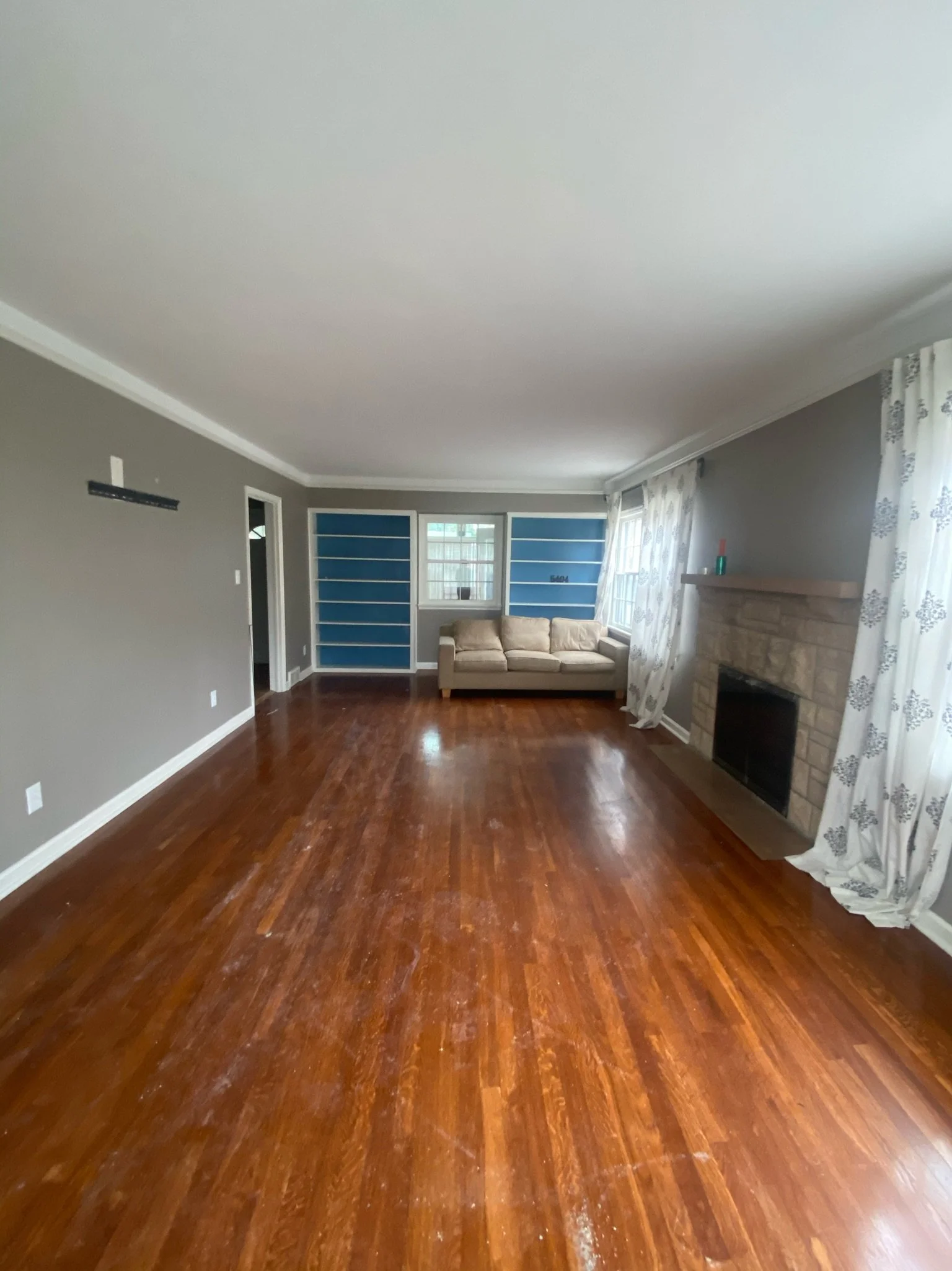
For this flip, we partnered with our friends at Capital City Investors to update and refresh what was already a home with “good bones”. Contrasting colors and textures brought a fun vibe to a typical home with some not-so-great paint choices. Say bye-bye to the crazy blue and yellow walls, and HELLO to a fresh and modern updated space!


Living Room Before


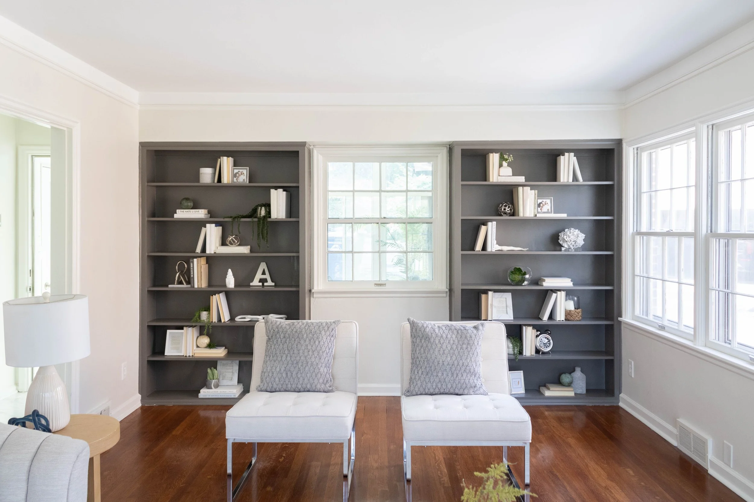
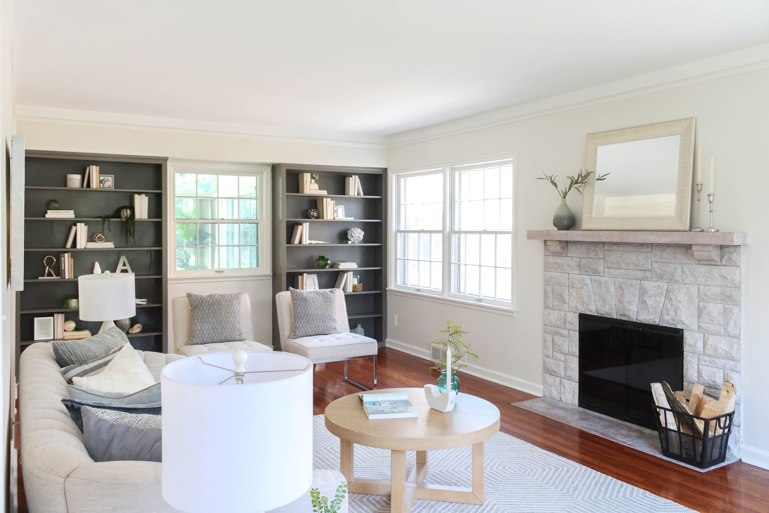
By whitewashing the fireplace, adding a stained mantel, and painting the built-ins SW Gauntlet Gray 7019, the space becomes clean and modern, but also welcoming and cozy.


Living Room After:


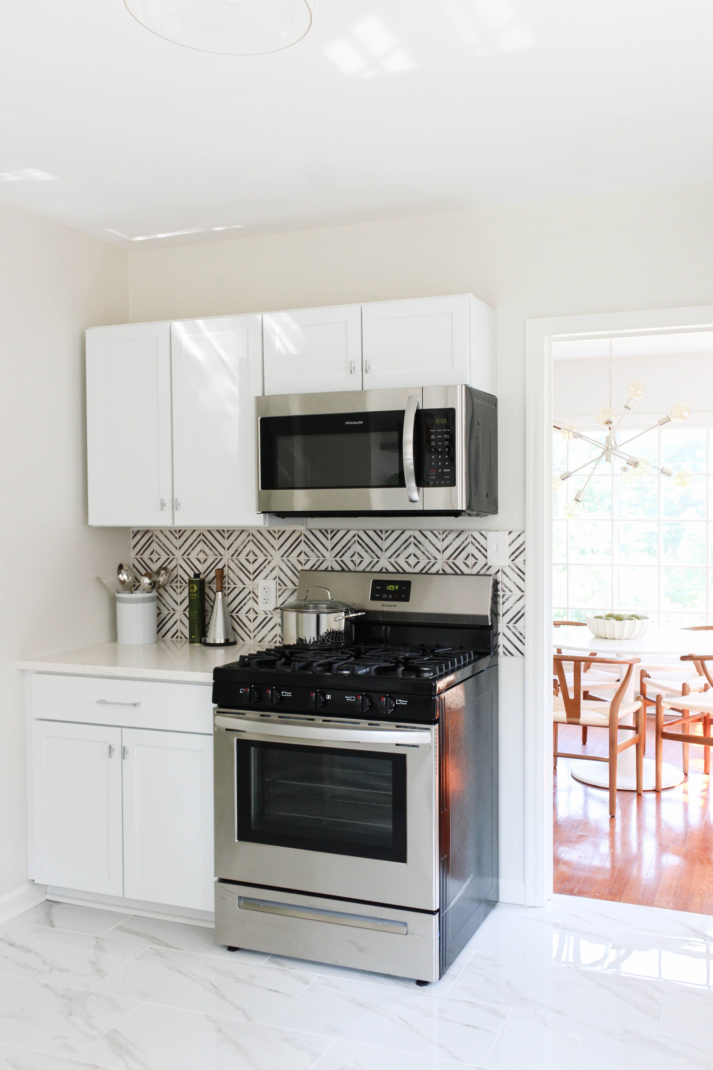
Kitchen Before:


Along with new finishes, a more functional layout breathes life and possibility into a small but mighty kitchen! By moving the oven to the dining room wall and adding more cabinets, there is already a great increase in storage space.


Kitchen After:


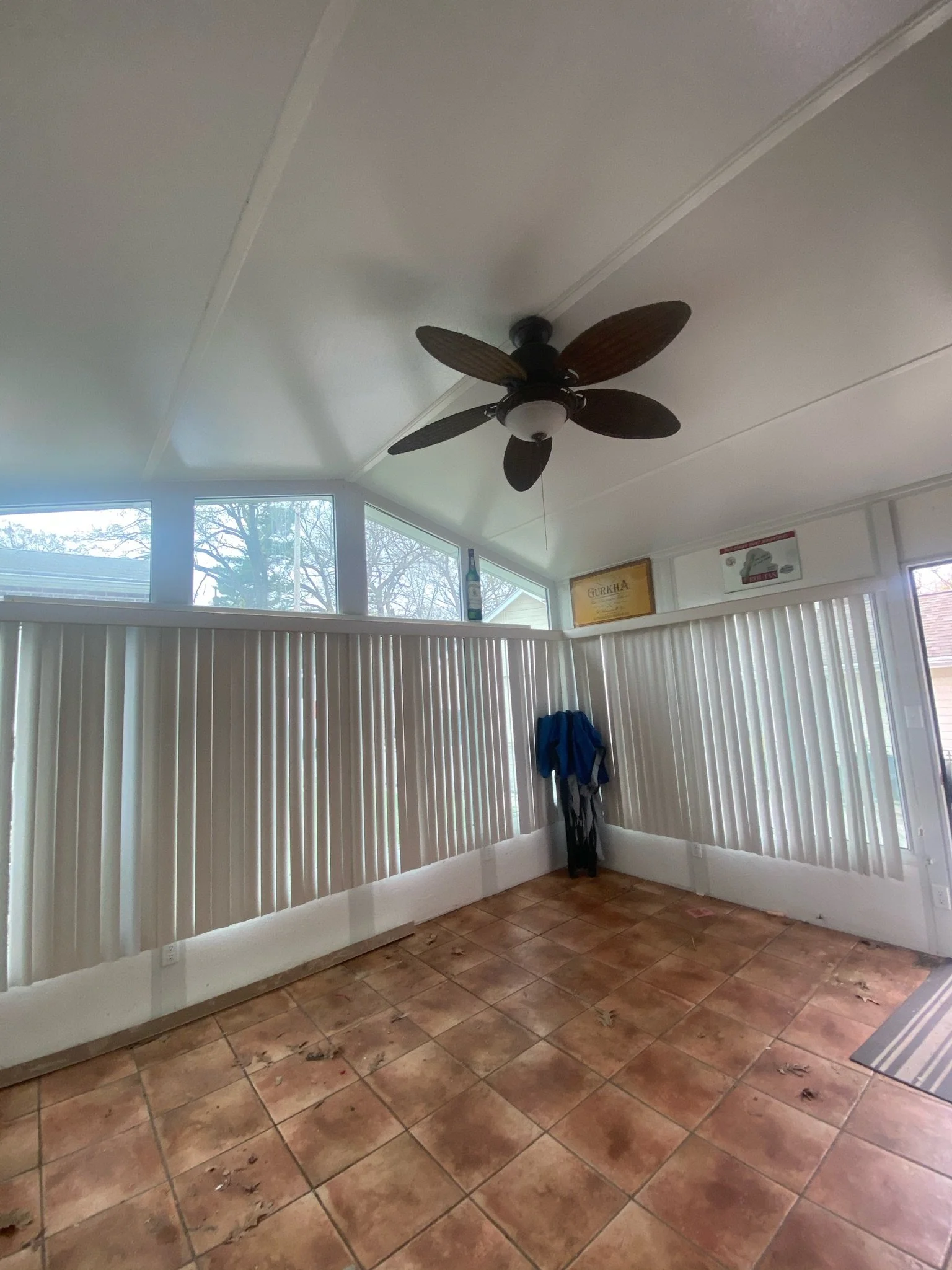
Sunroom Before:

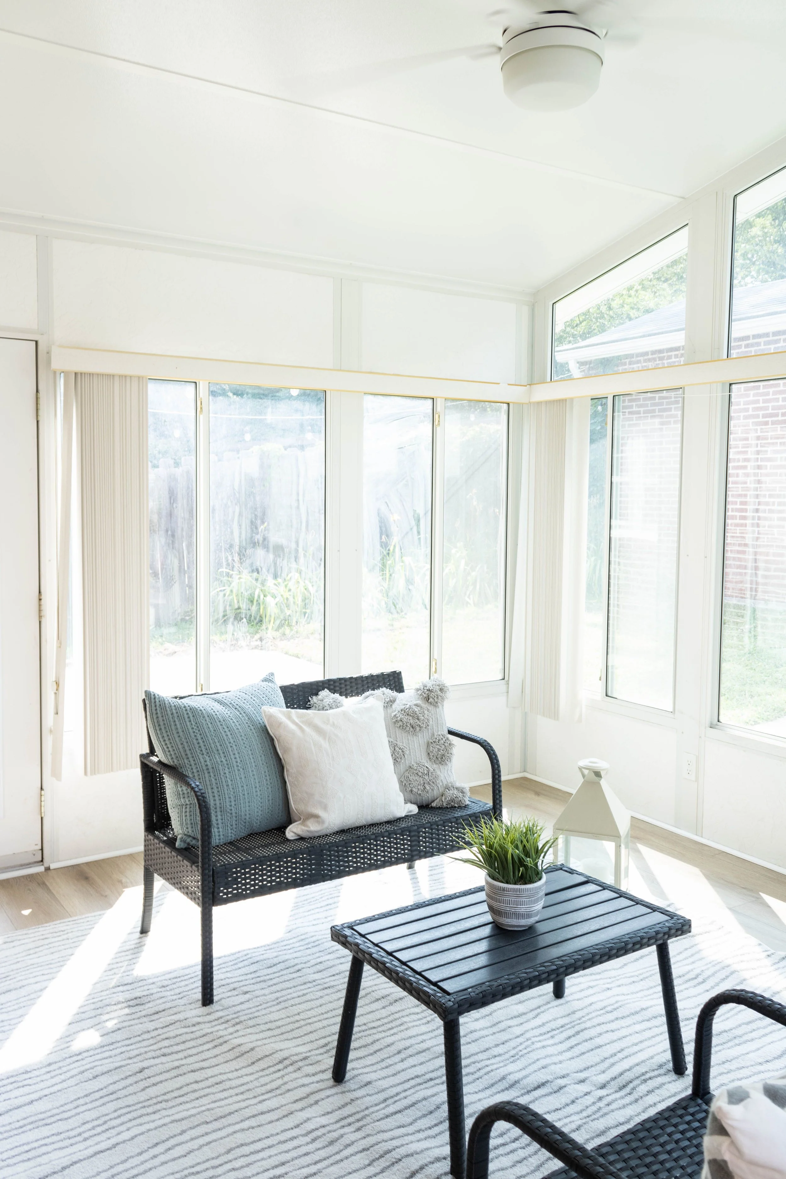
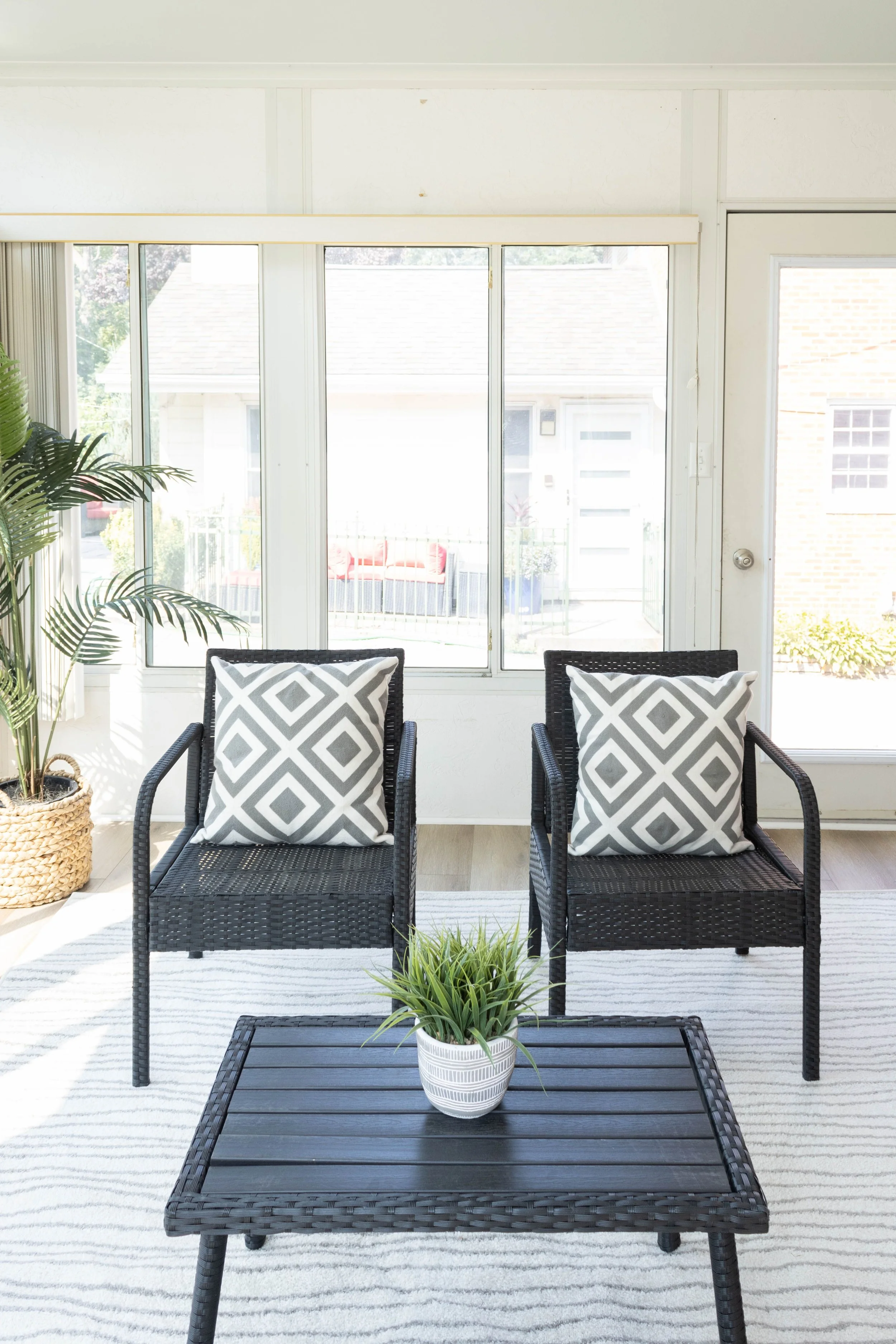
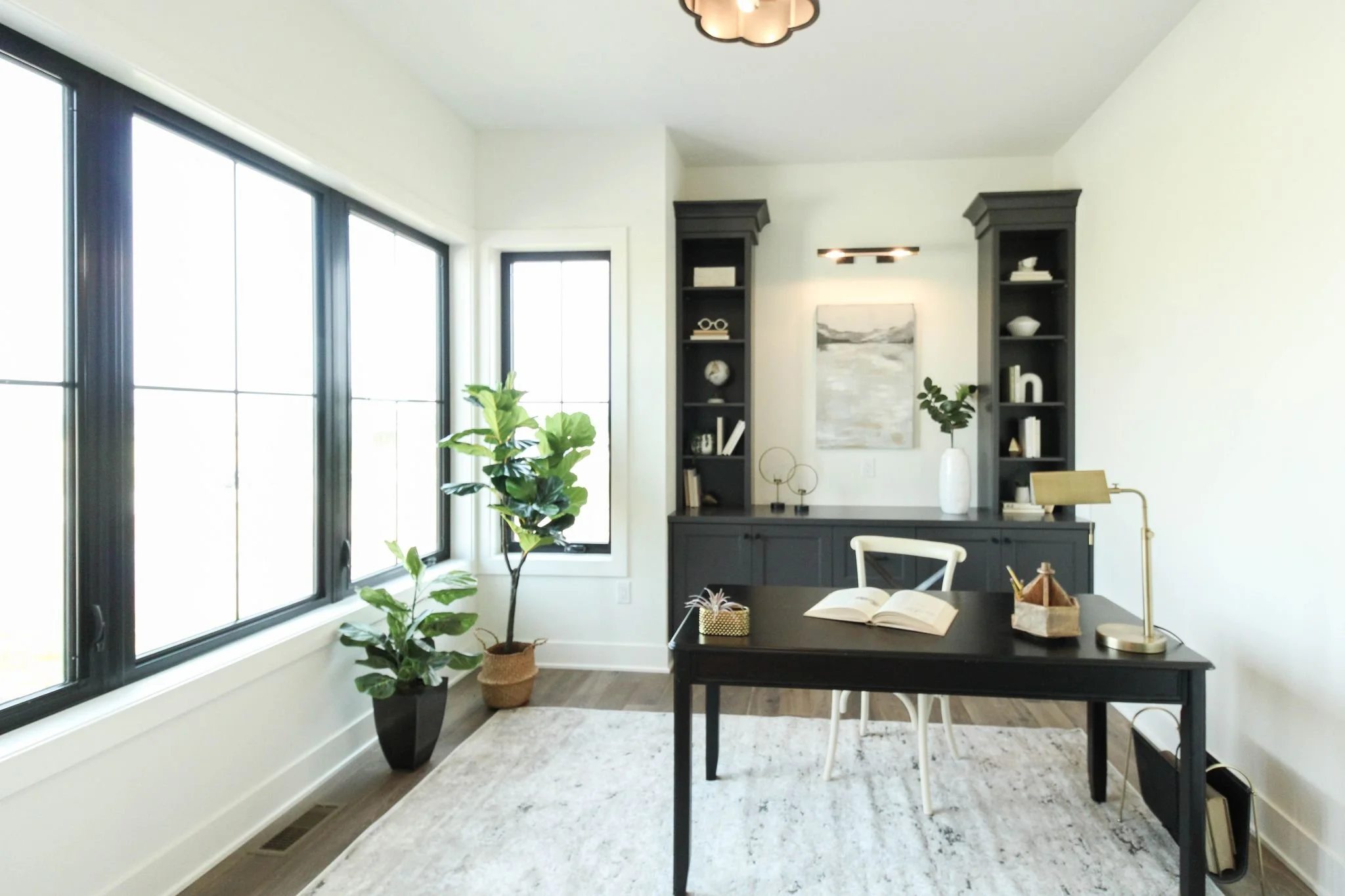
Simple updates such as flooring, paint, and lighting created a light and airy sunroom space perfect for an afternoon oasis.


Sunroom After:

ALT Design Studio: Best of 2021

Best Kitchen Remodel: Woodland Ave

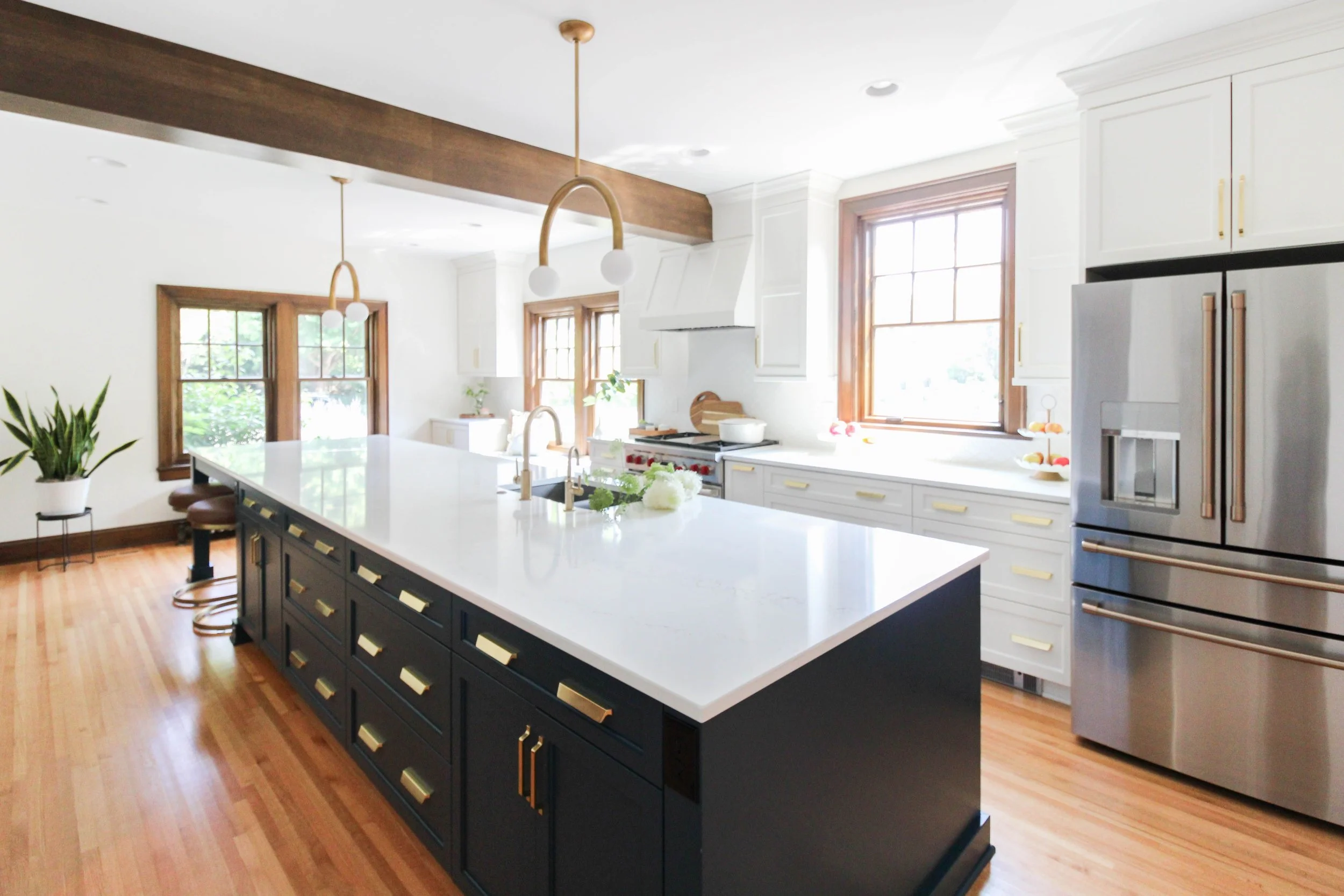
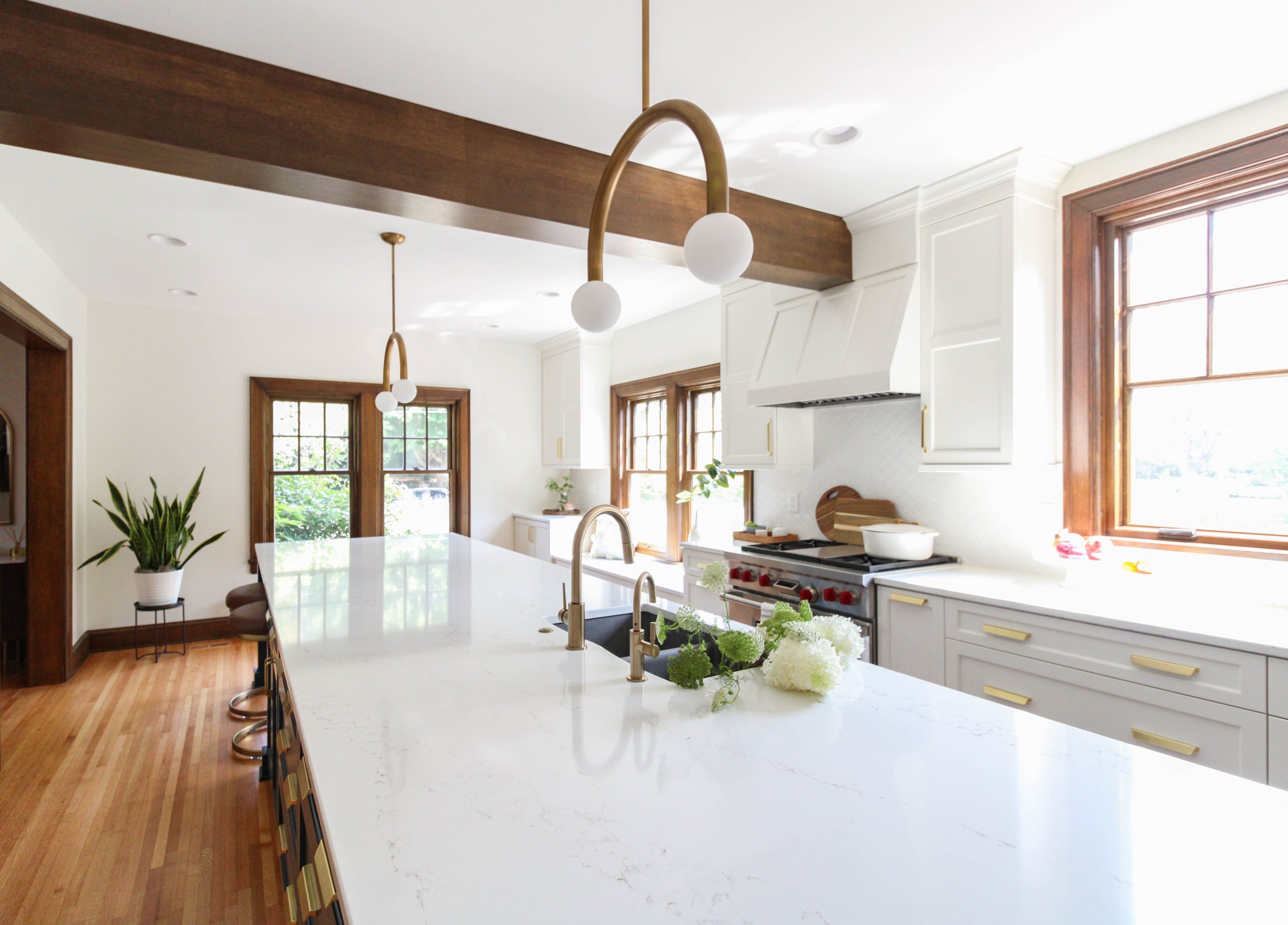
This magnificent Tudor home full of character, with loads of stained trim, windows, and rooms, needed the help of the ALT Design Team. It was underwhelming, the rooms were small and choppy, and the kitchen was teeny tiny. Our client Shawna, was a hip mom with a sense of style, but a home that didn’t necessarily fit her personality. All it needed was a little design magic and it became the best kitchen transformation of 2021!

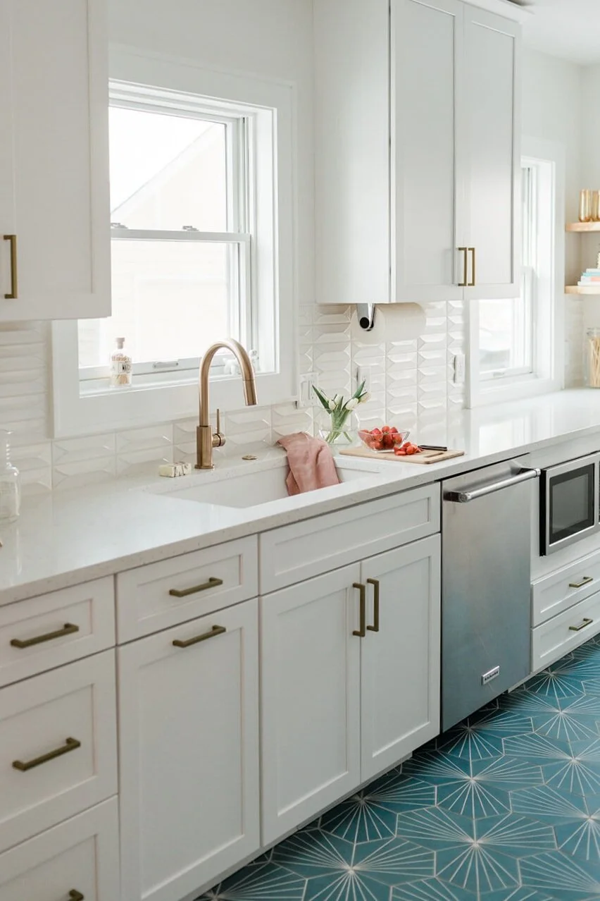
First things first: get rid of unnecessary walls. Check. Bring in a giant 15’5” island with two-tone custom-painted cabinets. Check. Add accents of gold hardware and beautiful lighting. Check.

Nailed it!


Best Bathroom Reno: 833 19th

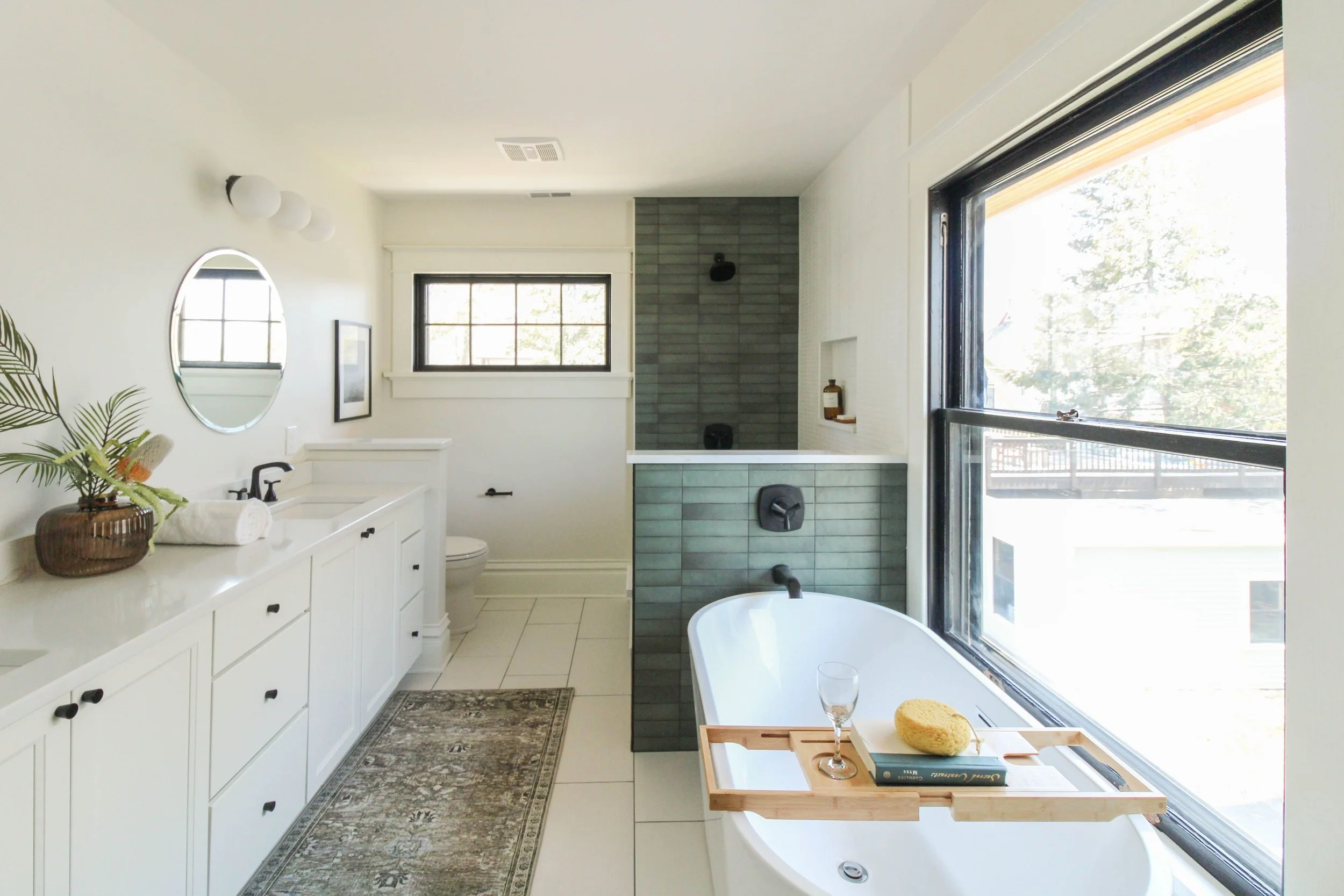
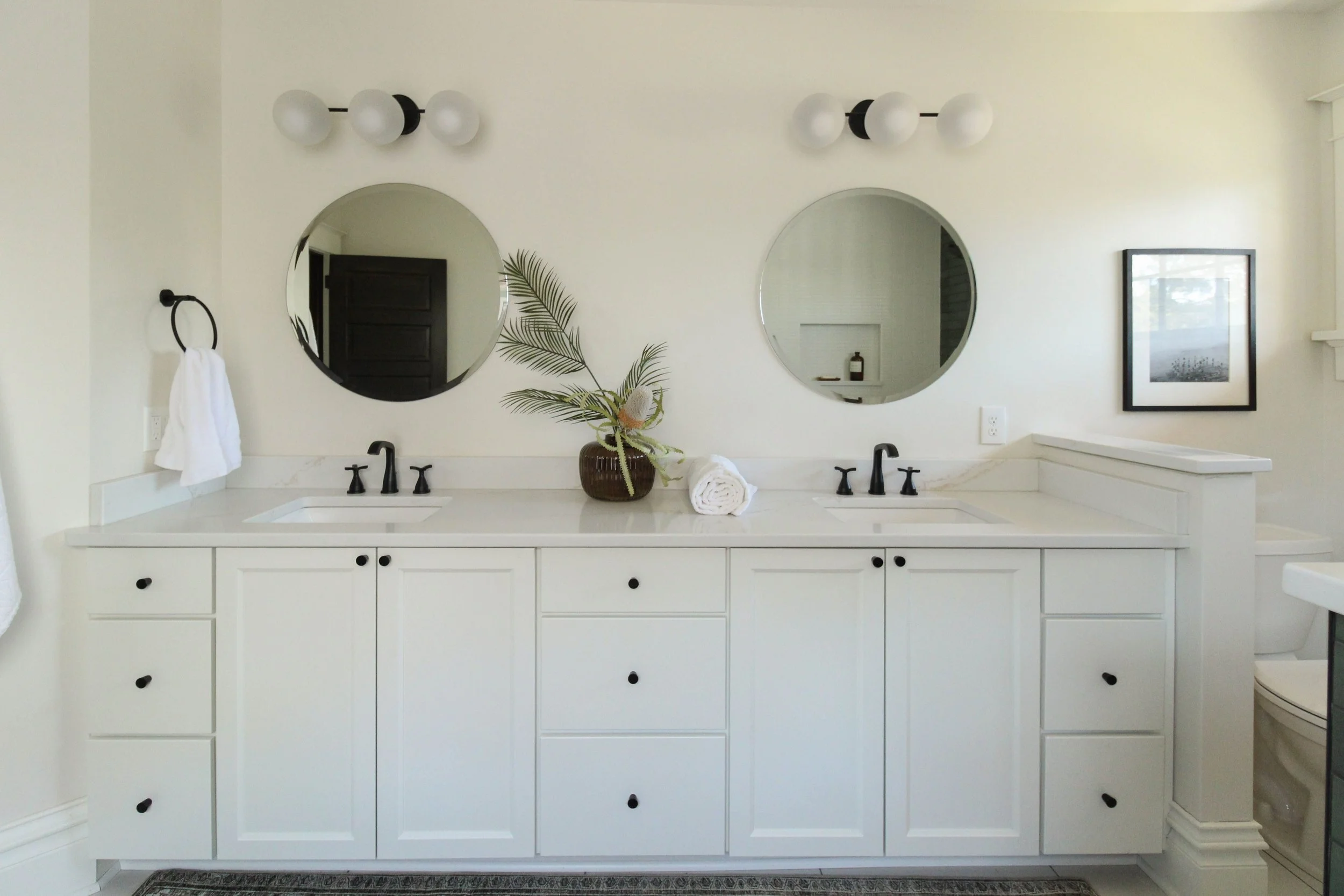
Built in 1905 by Philetus P. and his wife Delilah I. Dawson, 833 19th St. is one of our Sherman Hill Triplets (formally located at 2821 Battleboro Ave. in the Drake neighborhood). This Colonial Revival American Foursquare has been fully restored to it’s original glory thanks to Laneways Development.

Keeping the traditional character of a Craftsman, we salvaged and restored trim and wall treatment in the home. Floors were restored where possible with the addition of a new red oak with clear coat. Within the house, you will see a continuous and intentional mix of white, black and green and golds throughout the home. The more modern clean lights help bring a different style perspective with the woodwork and historic elements.


Best Home Flip: Hull Ave

We instantly fell head over heels with 1508 Hull Ave when we first walked through with our realtor friend, Eric Quiner. This unique home was built in 1926 and is directly across the street from Grandview University. We knew right away that this house had great bones and ever charming original architecture under it’s current dirty and dated finishes. (I mean hello, check out that beautiful arched door!)

The biggest decision for updates started with reconfiguring the kitchen - deleting a wall and remapping the tragic flow of the entire house. We were able to add a drop zone and a coffee bar. The Hardwood floors were refinished, as well as the trim, casings, and all new windows were added in a style that kept the home’s original character.

Our goal with any historic renovation is to give the home a new, modern life but always - always keep the original character in mind and bring it back to life. We are so pleased with Hull Avenue’s new look and know that it’s new owners feel the same - it went under contract within hours after listing!

Misson: Accomplished.


Best Spec Home: 1913 Timberview

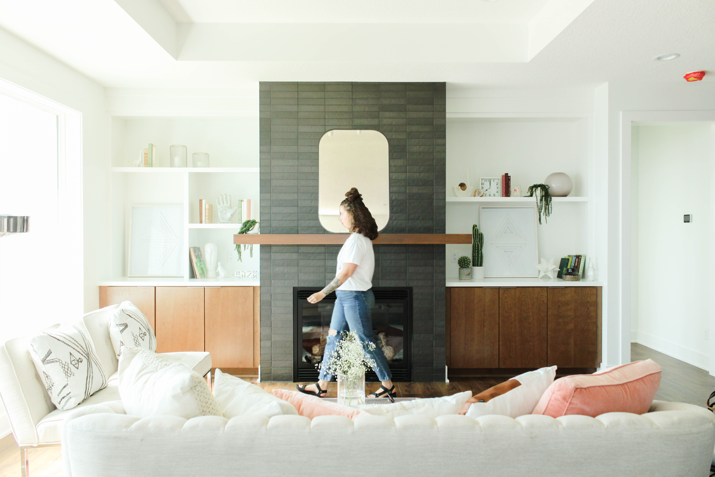
This home is a Mid-Mod inspired beauty with all the charm in the world!

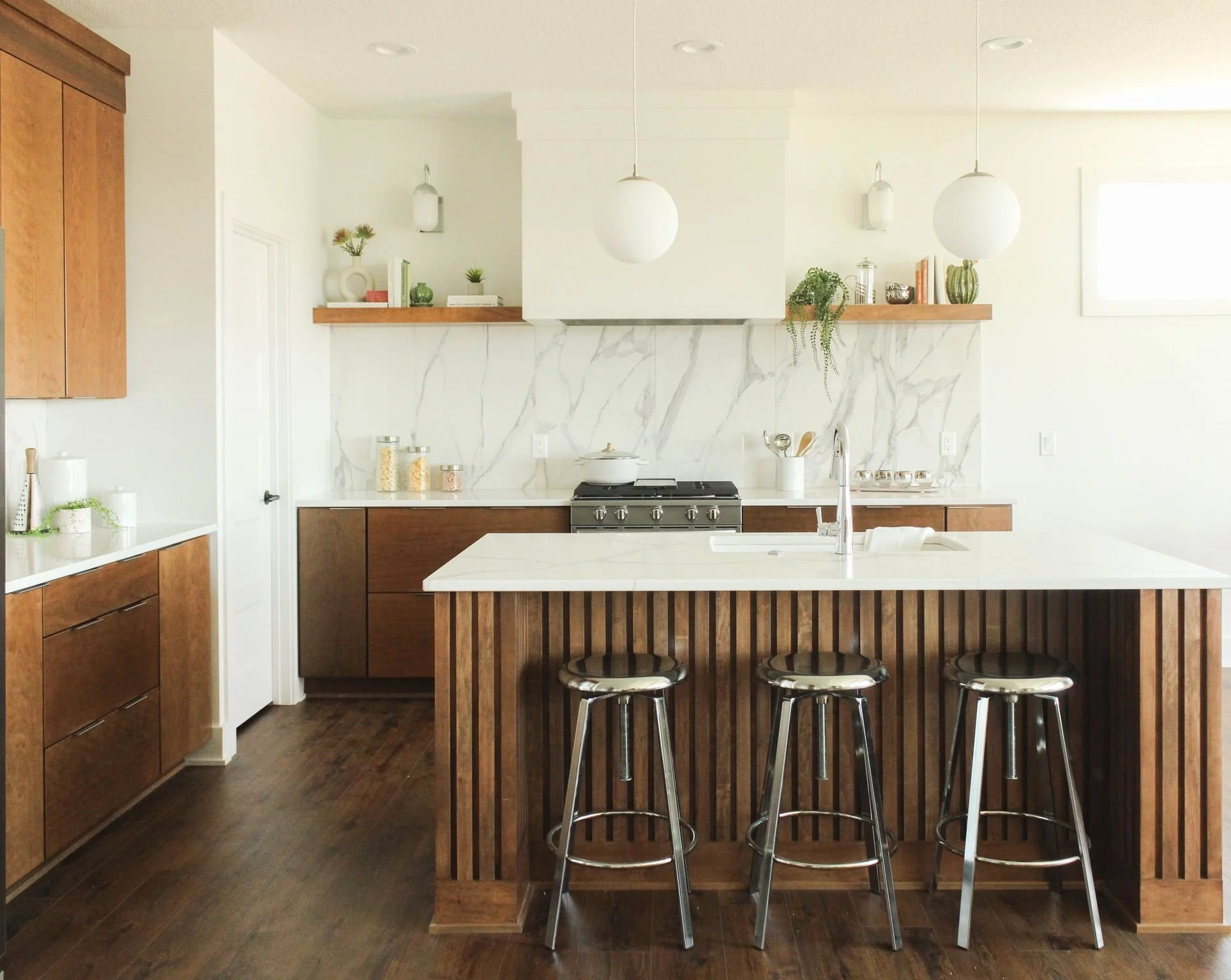
We love creating spaces that raise the bar and inspire us as designers. 1913 Timberview is one of those projects that makes us fall in love with what we do all over again. While it nods to the mid-century modern design style, we also incorporated timeless elements for an approachable and livable aesthetic.

The kitchen cabinets are cherry with an Autumn stain slab door and a coordinating cherry wood kitchen island. We also carried this same look toward the open wood living room railing and fireplace built-ins. We love that the lighting throughout the home creates the most perfect focal moment to keep things fresh with a touch of mid-mod.
Finally, we brought this space to life with lightly layered textiles, playful accents, and laid-back materials.

Our favorite spec home of 2021. <3


Best Stage: Jerry’s Homes (2021 Home Show)

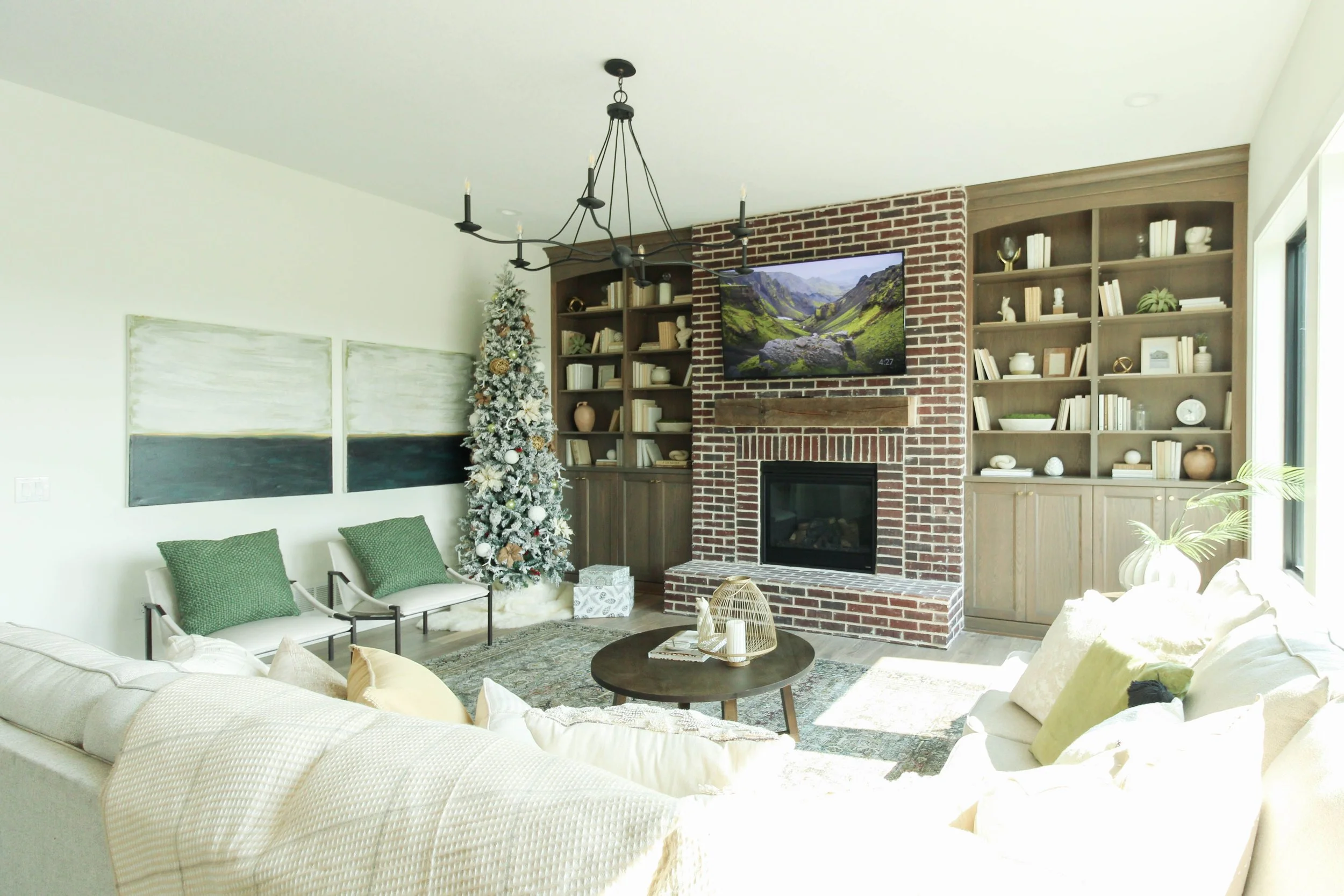
The 2021 Home Show included a collaboration of the ALT team and Jerry’s Homes. This modern traditional home was fun to stage because we took the liberty on bringing in traditional antique decor, but still maintained a cozy modern design.

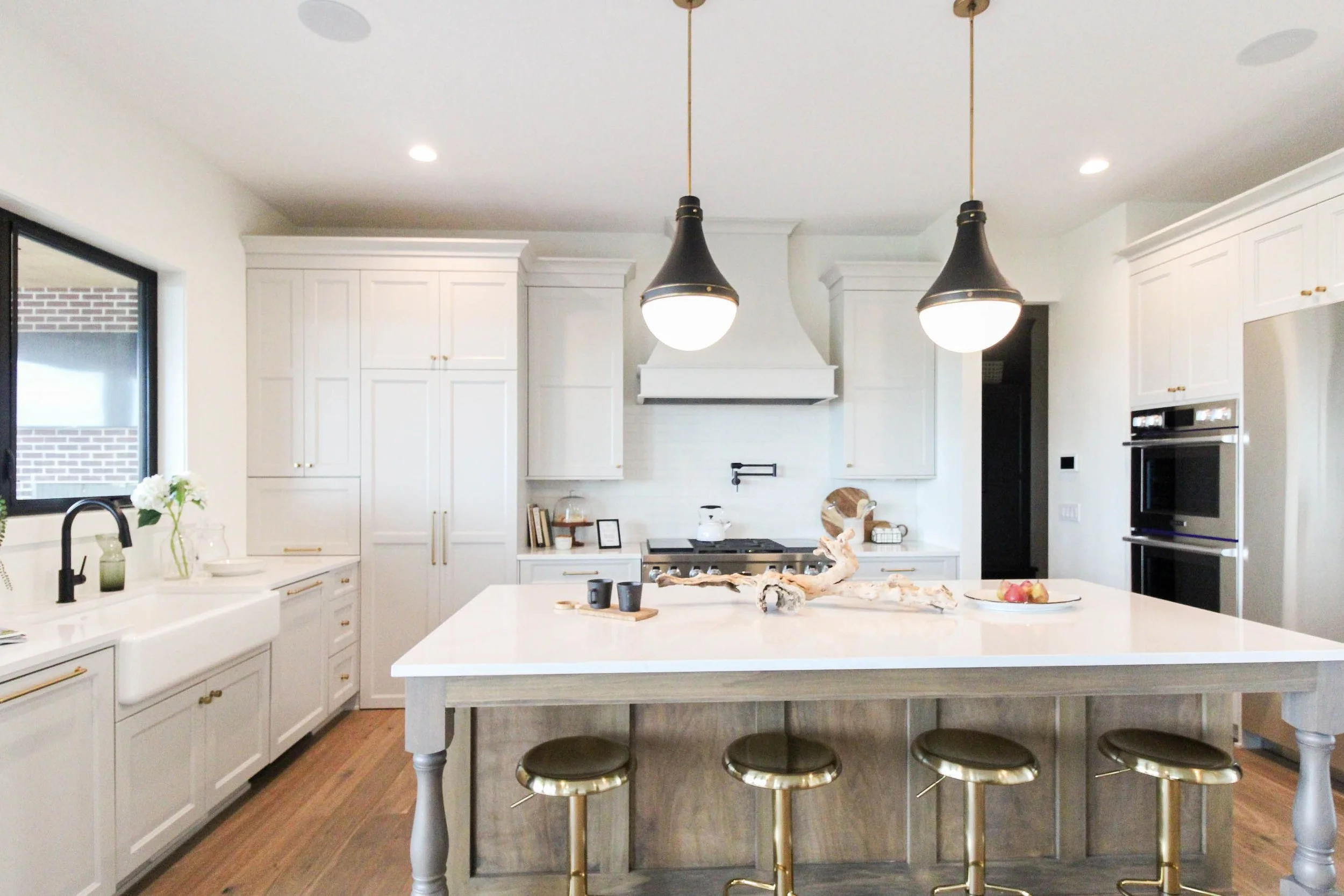
Co-designing this beautiful kitchen with Jerry’s Homes resulted in off-white cabinetry with a gorgeous stained island. The hints of black and gold accents add contrast and interest while keeping it airy and fressshhhhhhh.

Hands down the biggest and best stage of 2021.


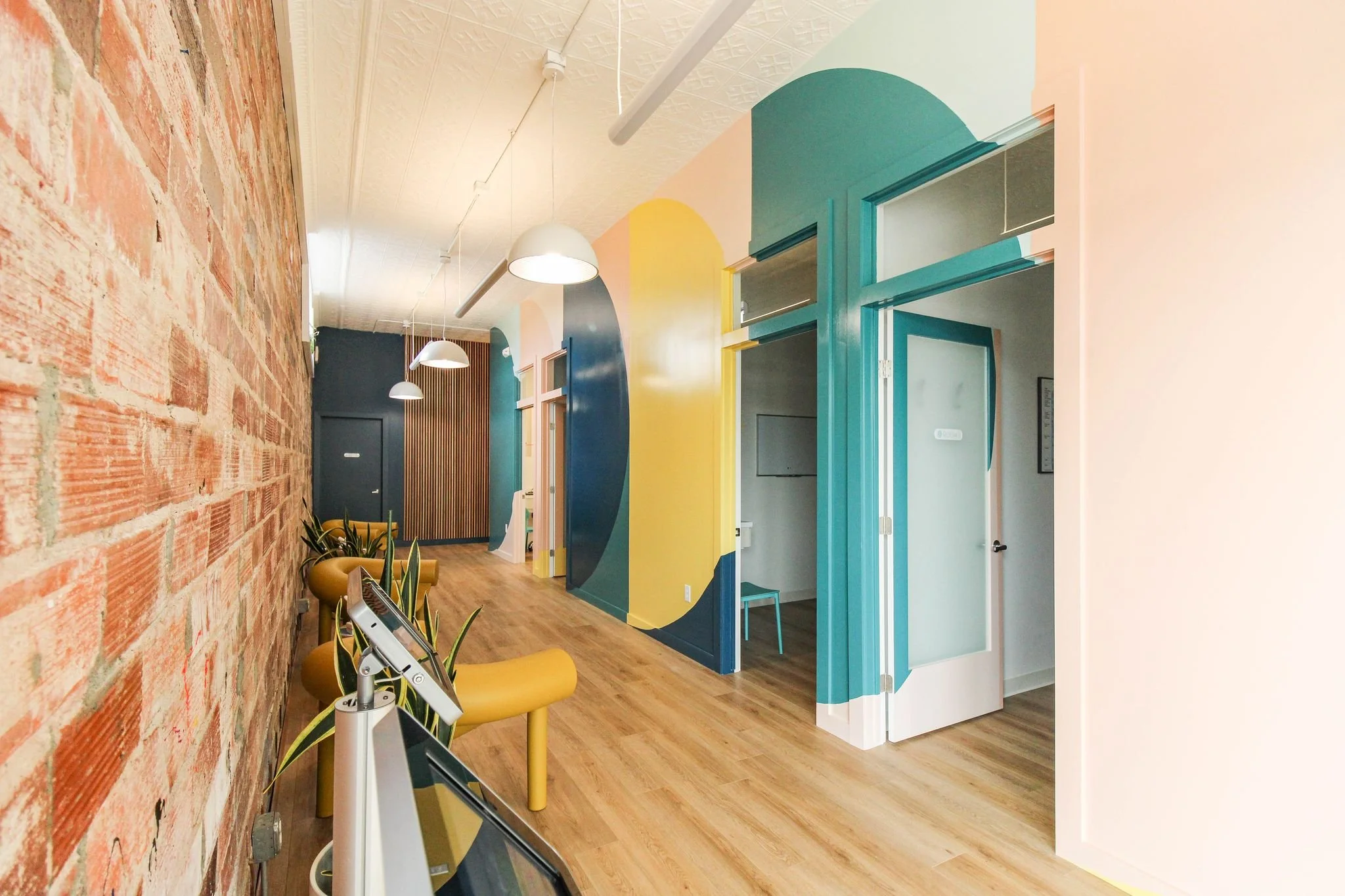
Best Commercial Design: Capital Chiropractic & Rehabilitation Center

Capital Chiropractic & Rehabilitation Center relocated into the corner storefront building at the Shops of Roosevelt. With their new location, there was a new chance to bring in a good vibes experience for all who enter.

The narrow shell of the existing space made easy choices for the layout with patient rooms along one side, and the common corridor serving as both the reception check-in, waiting area, and only path of travel from the front to the back of the building. As prominent as this hallway was to the experience, we addressed it with BOLD color - starting with our proposal of the mural wall. A fun color pallet and abstract shapes along this giant wall was not initially a hard sell. And neither was the vertical wooden slat wall that would compliment the mural with natural texture.

An alternative lighting scheme throughout the space was chosen to highlight the newly painted fleur-de-lis ceiling tiles. We made use of the existing exterior brick wall displaying it’s texture, and worn in but charming character. Lastly - we hunted high and low for affordable furniture pieces that would hold up in a commercial setting: comfortable & cool!


Overall Best: Jess’ Home

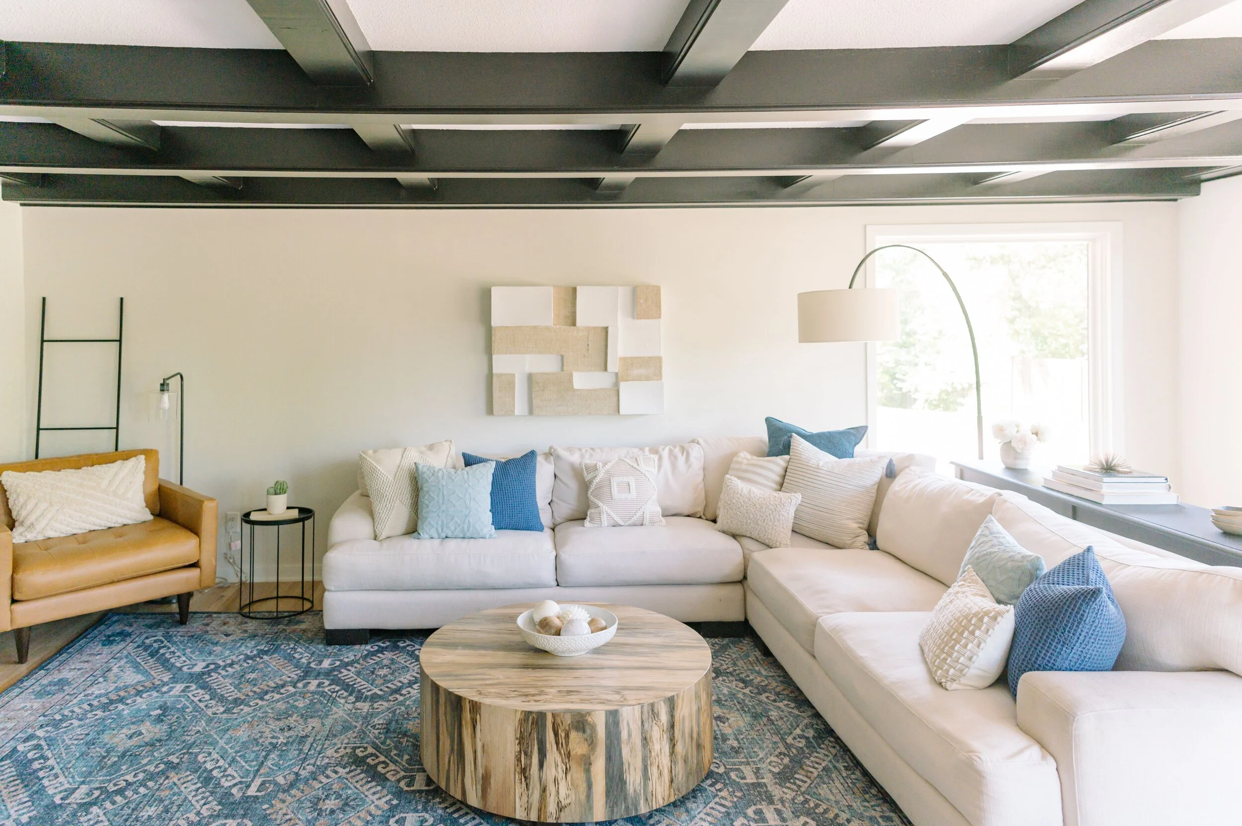
When Jess and her husband, Tony, first walked through this 1972 home, they didn’t really have any strong feelings about it. They loved the location, the price, and the square footage. At first glance the home seemingly had some charm but after the first walkthrough, they started noticing a lot of bad things: beat up 3” trim and casings, hollow doors, and walls that had been painted a 110+ times + there were 17 different types of flooring throughout due to various remodels over different time periods. An awkward floor plan, flow, an under-utilized kitchen layout - and the list continued to climb, and so did Tony’s anxiety. One dollar sign… two dollar sign… three dollar sign.

Jess didn’t have an immediate direction she wanted to go with the home. In the past, she has been driven by one specific feature - i.e. doors, trim, fireplace already in the home, but that wasn’t going to be the case here. She could LITERALLY start fresh. One of her biggest influences is Australian Coastal style. Neutral Nordic foundation but accented with pattern and texture. Character and personality was important to Jess, but it can be a little tricky to recreate it from scratch. We’d say mission accomplished with creative lighting, custom painted mural, unique cabinets, and hardware, a beautiful slat wall design, and topped with kickass furniture pieces and accessories.

Three words: BEST OF 2021.