HI!
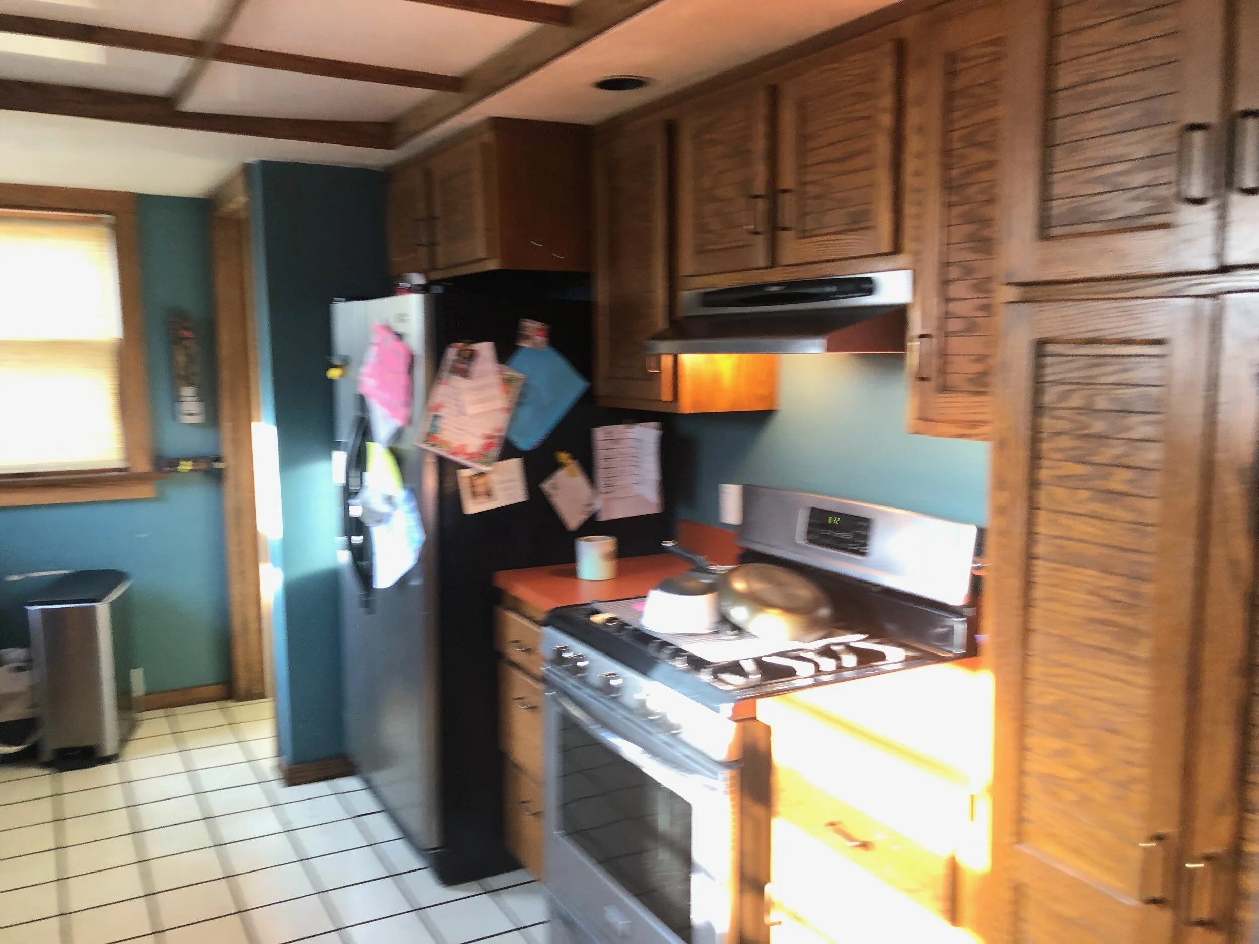
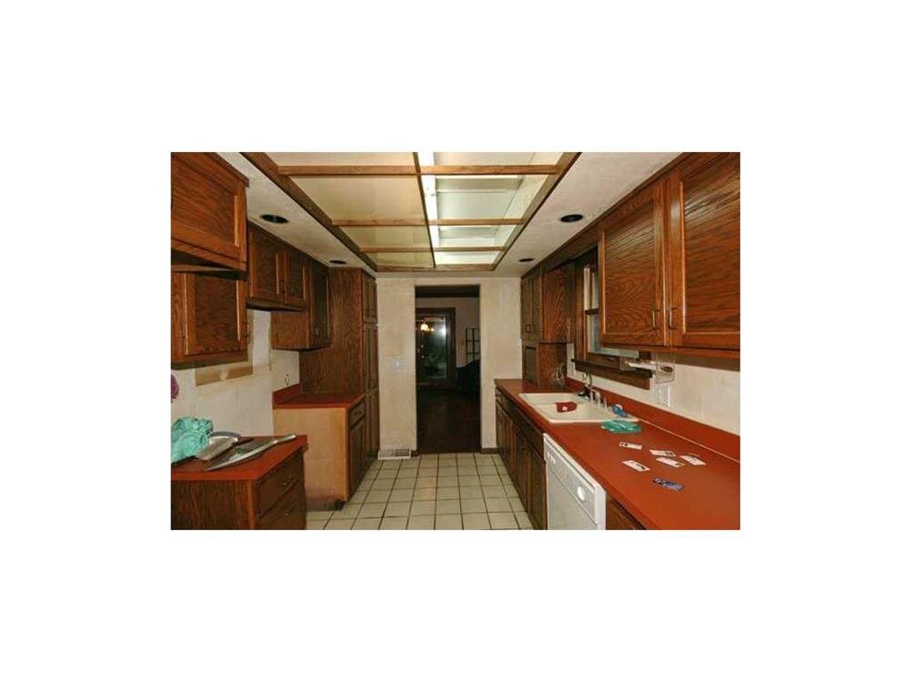
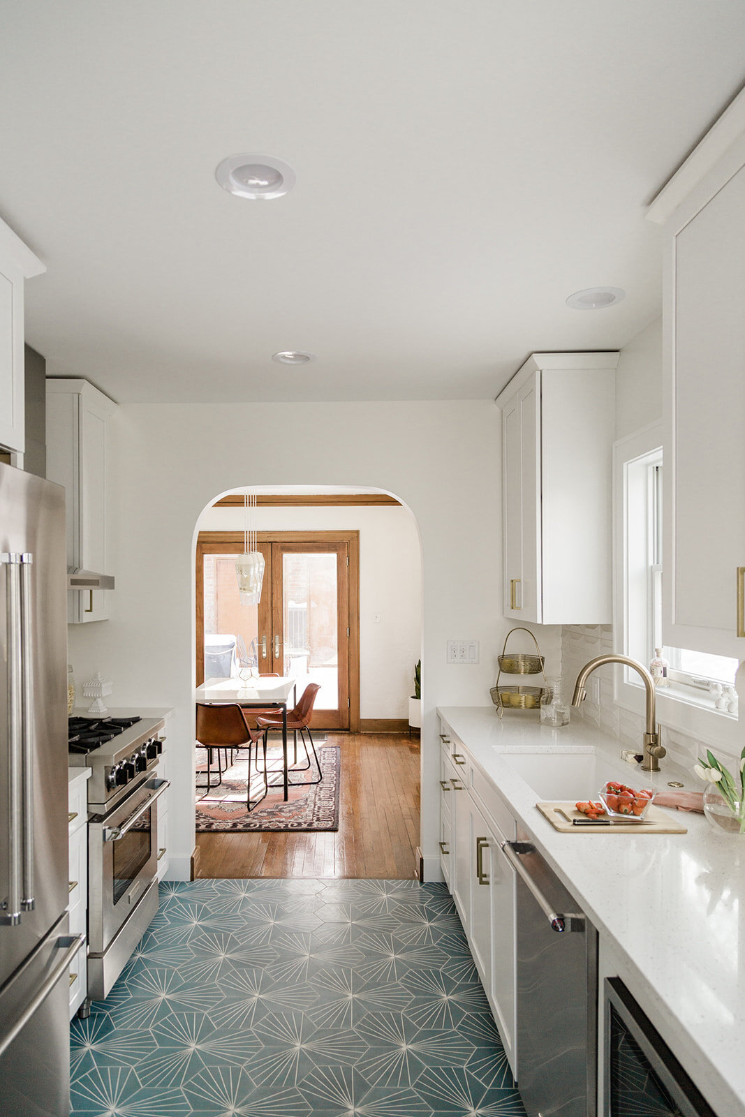
First off I want to make something clear- this is the same kitchen…I promise :)
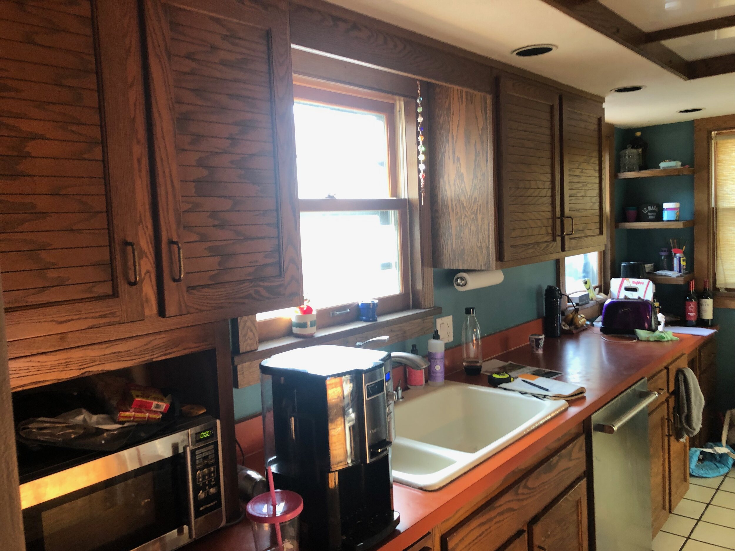
This Beaverdale Brick galley kitchen needed some major TLC from Zenith Design + Build and me. All the brown, the orange, yellowed floors and the ceiling was so drab and totally sad.. As you could tell, I wasn’t digging the cave vibe and either were the Collins’, the homeowners. It was time to get Collins out of the dark and into the light stat.
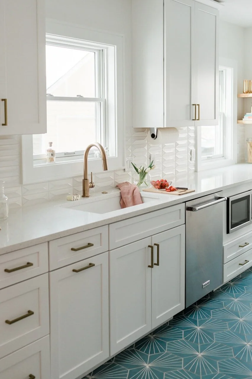
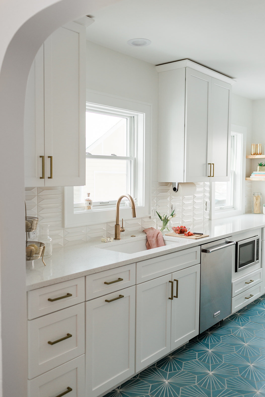
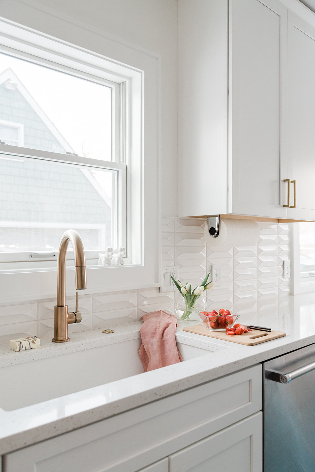
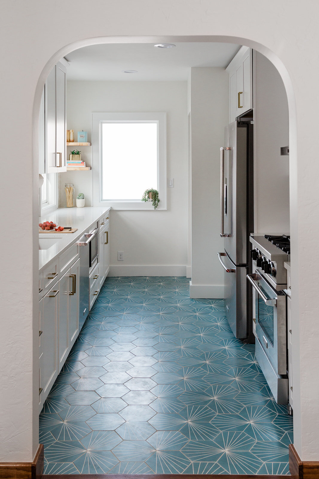
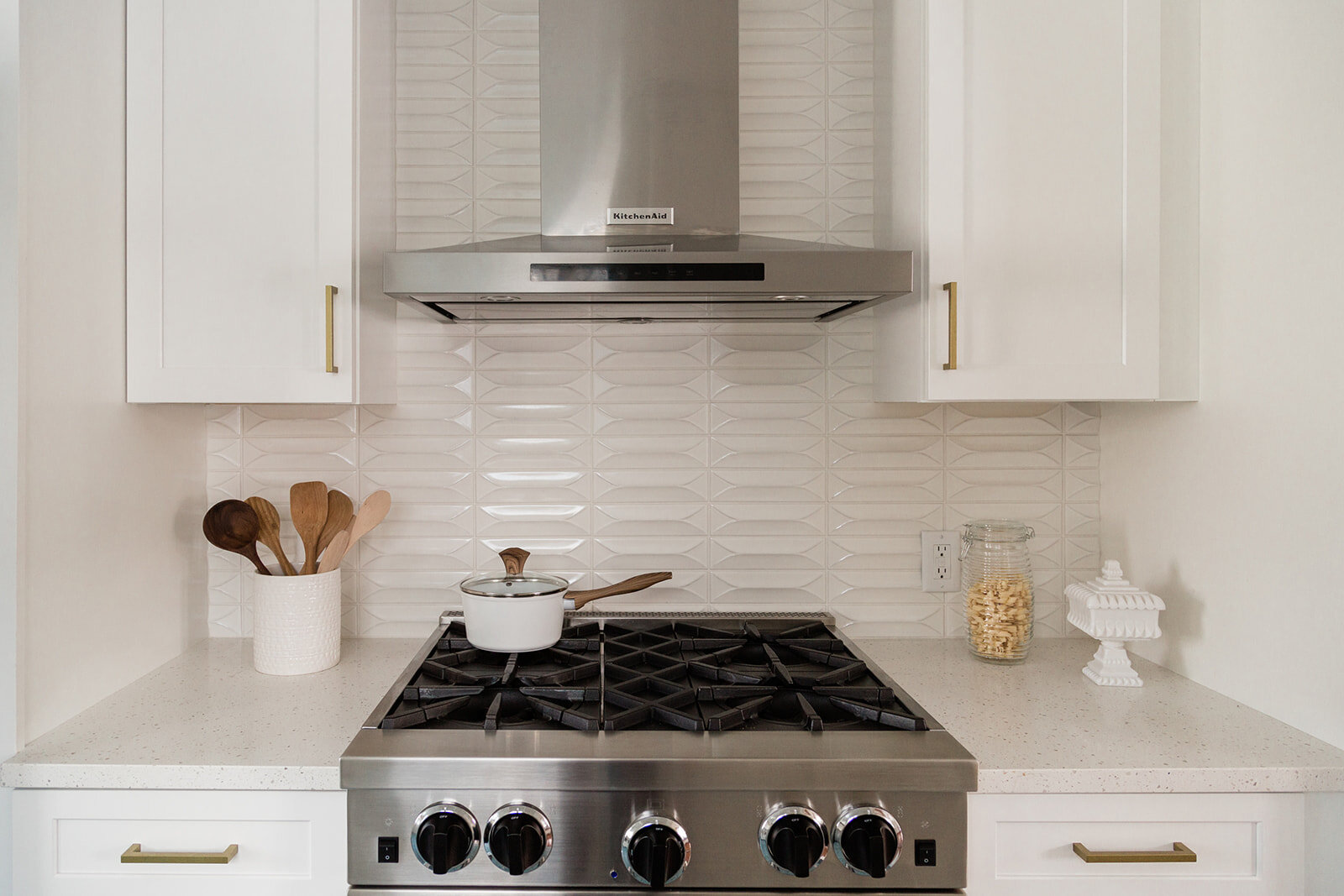
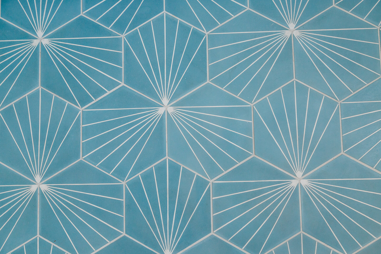
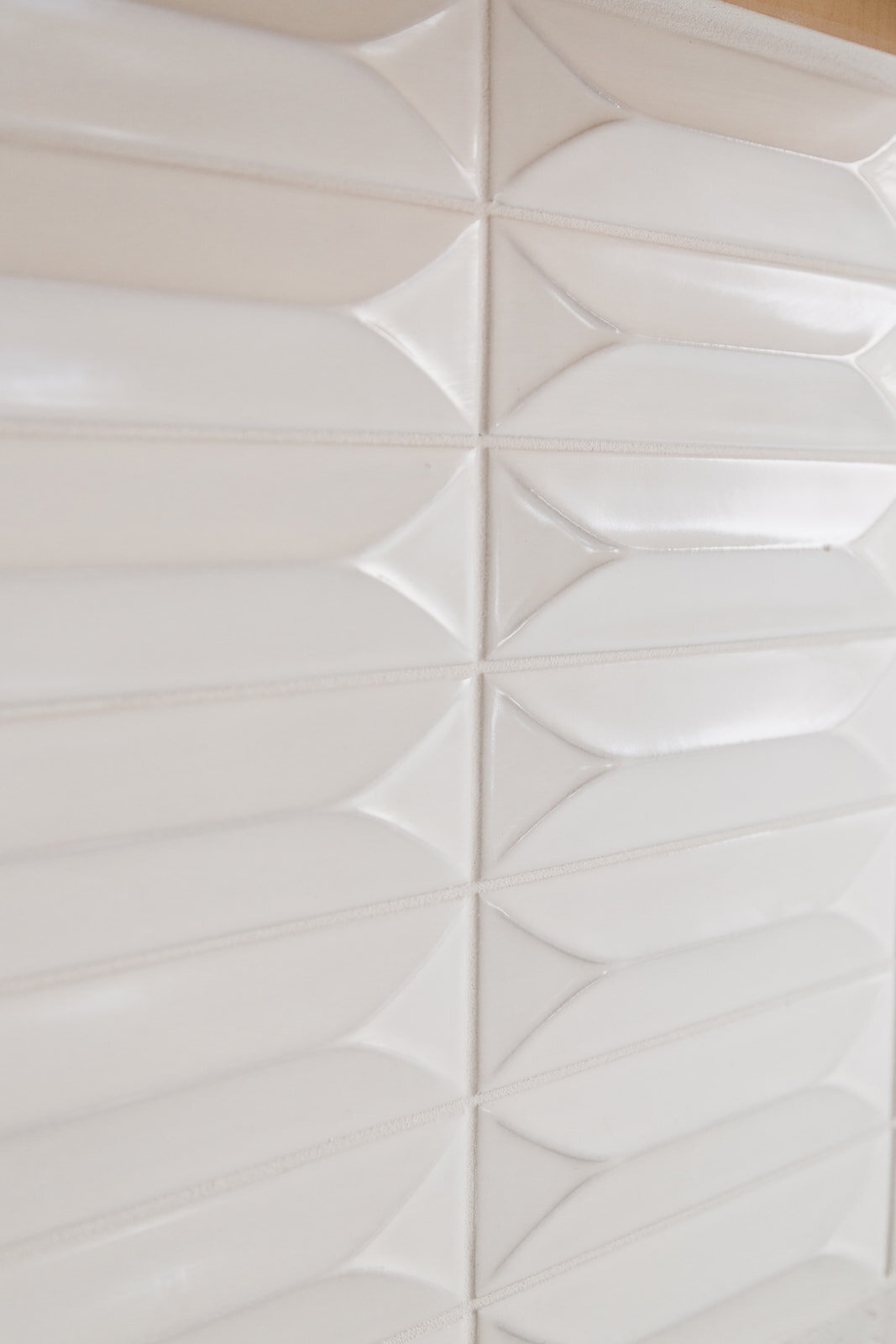
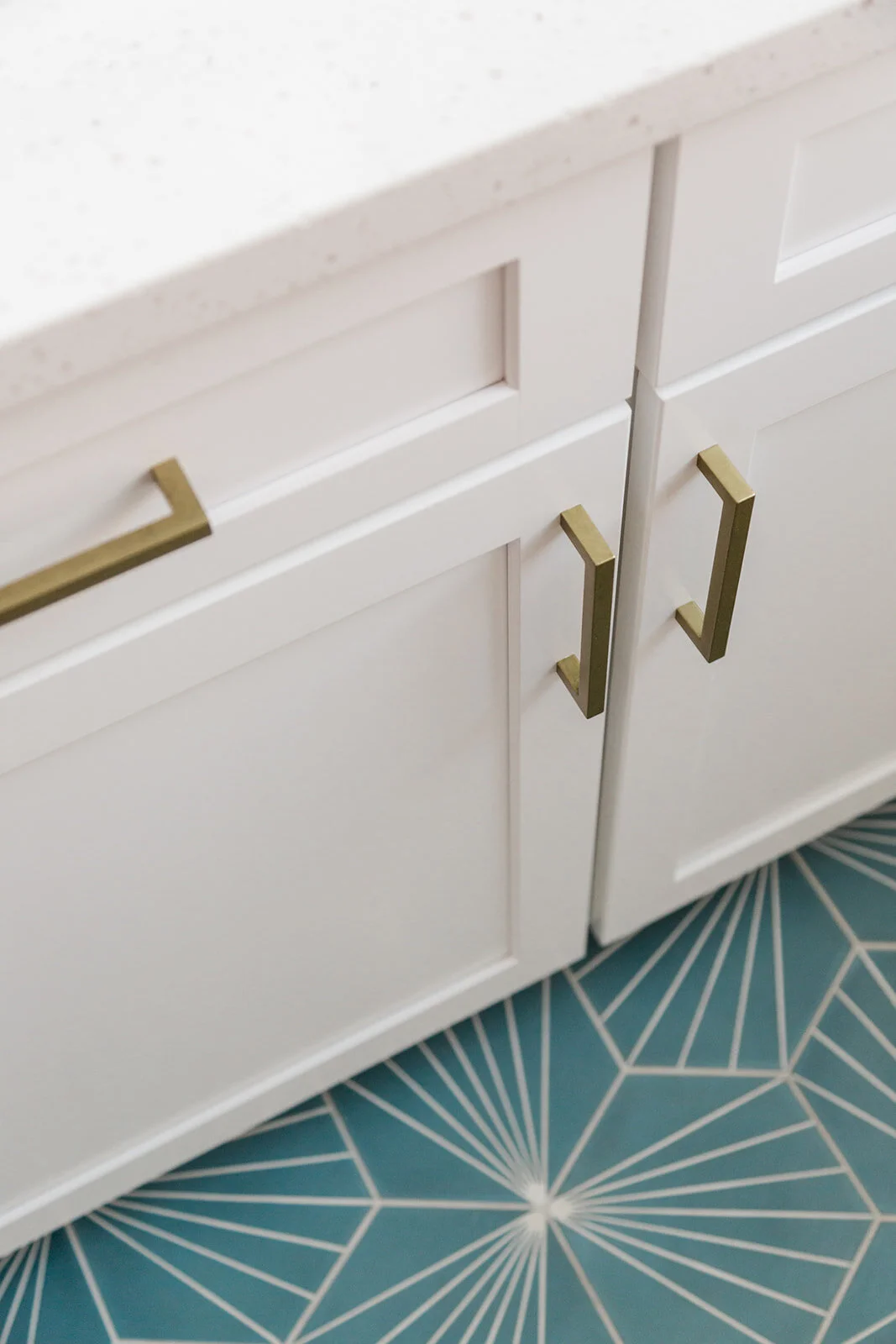
The first thing I asked the Collins was “Can we do a fun floor?!?” Due to the smaller footprint of the kitchen installing a statement tile felt right and just. They said yes. Due to the nature of the floor it needed to be the main act and everything else needed to support it. From there, we needed to keep it simple and white but add in some texture (my favorite). The 3D subway tile elevated the look, added interest without being distracting. The gold hardware provided the needed warmth that was missing with all the white. We also widened the entry and added the arch to match the rest of the home’s character. By removing the florescent light box, we were able to rise the height of the ceiling which also made a huge difference. The kitchen literally looks double the size which is really incredible for not altering the original footprint of the kitchen.
Who’s next?!
Best,
Jess
Photography by Lauren Konrad Photography


